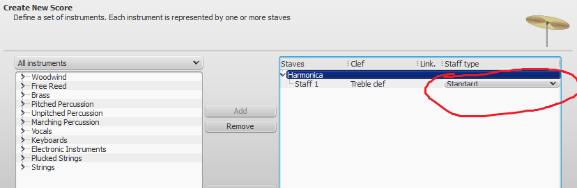
not enough space under "Staff Type" in windows classic theme
I'm sure lots of people have noticed this, but I did a search and didn't find an open issue for it.
There's not enough vertical space under "Staff Type" in the new score wizard.
See attached screenshot.
Edit: This bug seems to appear only in windows classic theme (not in windows aero theme)
| Attachment | Size |
|---|---|
| staff type selector.png | 19.07 KB |
Comments
Which OS and version?
If you want to discuss a possible bug it's better to use the Technology preview forum instead of the issue tracker. http://musescore.org/en/forum/687
latest nightly dc4f40b
Windows 7
I don't understand how to decide whether something should go in that forum or whether it should go in the issue tracker. I think it's definitely not something that should be left in the next stable release.
FWIW, that dialog looks normal to me, and I'm also on Windows 7. There is the appropriate amount of space for the staff type drop down. What are your screen resolution settings? In fact, all of the items in your screen shot look rather more cramped than how it looks for me. Here's a screen shot on my system:
Regarding using the tracker versus the forum, my personal take is that the tracker is best reserved for use by people who a) are using the development (eg, nightly) builds, b) have some understanding of how MuseScore is supposed to work, and c) have discovered a behavior in the current development builds that clearly is a bug and not just a misunderstanding over how it's supposed to work. The Technology Preview forum is a good place to sort out any confusion over whether something is truly a bug or not. I think this particular report seems clearly a bug at least as it relates to your system. But it's something to think about.
Marc, yopu're using a different dialog (Add Instrument) as bausxq (New Score Wizzard).
The latter looks to small to me too. The former just like yours
No problem on Windows 8.1 using ec1c7ed7b7

A lot of things looks smaller in your screenshot. Even the Treeview on the right doesn't have enough space.
ec1c7ed too, Windows 7 Enterprise, 64 bit, 1280x1024 @ 96DPI:

You're right; I was looking at the "wrong" dialog (are they actually different, or just different titles on the same one). But no matter, it looks the same to me either way. At least, it does for me right now accessing it on my iPad via Splashtop, which resets the screen resolution to be 1024x768. I'll check again at home tonight.
EDIT: no, actually, the Create New Score dialog *is* a bit more crowded when accessing via Splashtop. But not as much as shown in the original screenshot. I wonder if his resolution is perhaps below the minimum?
Not at home right now, so I can't test/verify resolution, but I know my resolution is high.
Just a guess, maybe it has to do with the desktop theme? My screenshot (with not enough space) is taken in the windows classic theme (not default for windows 7).
I'll test different themes when I get home. Anyone else want to test different themes to find out how to reproduce this bug?
Changing issue status to "needs info" until we figure out exactly what is required to reproduce it.
Same for me, Windows classic.
and Marc's screenshot is not classic theme...
Yeah, when I change the theme to aero, the problem goes away. It's only in windows classic theme.
Might it be a bug in Qt? or is it in our code?
Note Windows 8 and 8.1 (which Lasconic is using, as do I) has no "Classic" theme. I do find the entries a bit tight (much like Jojo's) but the word "standard" is not cut off. My Win8 window doesn't not look like the roomy one Lasconic showed and I run on large dual-monitors as well (1680x1050 and 1920x1080).