Ottava lines
Width
Is it normal that when I set the ottava line width to 0.00sp, the line is still visible?
What is the more elegant way to hide an ottava line? It doesn't seem to have an explicit setting about that. A workaround is to set the line color to white, or to move the end anchor of the ottava line very close to the number.
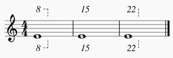
I think that the end anchor very close to the number explains why by default the 15ma (or 15mb) line doesn't appear for single notes:

Alignment
Also, as you can see in the image above, numbers are not centered to note head. If we remove the italic, we see it better for 8va and 8vb (a little bit shifted right):

Shouldn't they be centered?
| Attachment | Size |
|---|---|
| ottava-lines.png | 7.35 KB |
| ottava-lines-3.png | 6.55 KB |
Comments
Also, is it normal that when we change the text style Ottava, ottava numbers in the score are not updated? For example, add an ottava line, then go to Style > Text... > Ottava, remove the italic and apply changes. The number of the ottava line previously added is still in italic. The new text style is applied only to newly added ottava lines, not to the one already in the score.
However, if we test the same steps with staff text, changing the text style automatically update all staff texts already in the score.
1) I don't know if it is deliberately that zero-width lines render other than invisible, but I don't see anywhere that MuseScore is doing this deliberately. Seems to be an artifact of how Qt draws lines. We could easily work around that if we decide this is desirable - simply don't draw the line at all if width is 0.
2) My question is, why do you *want* to hide the line? As you've noticed, it is automatically suppressed if the nominal line length is shorter than the length of the text. You could, I suppose, plant spaces after the "8" to trick this system. That seems to work.
3) The alignment of octave lines over whole notes is something I was actually just looking at the other day. It is only whole notes that are demonstrate the behavior you show above, because whole notes are themselves shifted to the left in order to center over other note types in other voices. So it may or may not make sense to do anything different with ottavas here. We'll be revisiting this when we decide on https://github.com/musescore/MuseScore/pull/1364
In reply to 1) I don't know if it is by Marc Sabatella
Thanks for your comment. About the style not applying to existing ottava lines (my comment 1), do you think it's a bug? Also, about this:
My question is, why do you *want* to hide the line?
Actually, I've not explained clearly. The distinction between not drawing the line or hiding it is not important. I should have written the following (take two): right now, if I want an ottava line with only a number (no line), I set the color line to white or I move the end anchor next to the number, but I wonder if there's an explicit setting (the elegant way) about that (like the checkbox to delete the end hook or the checkbox Visible used for some elements). I though the line width (set to 0.00sp) was such a setting but it doesn't work to hide the line.
In reply to Thanks for your comment. by jpfle
Our posts crossed so I hadn't seen your first response. It is "sort of" a bug that changing ottava styles doesn't affect existing ottavas. The code to automatically update elements using a given a text style only works for "simple" elements of type "text" like staff text. Ottavas and other lines are different in that they are not actually of type "text" at all - rather they *contain* elements of type "text". And not just one but three - the initial text, but also optional text to appear on the the continuation line if it extends across systems, also optional text to appear at the end of the line. It would presumably be *possible* to update the code the search out elements containing text objects, but it might turn out to be kind of an ugly hack.
I think setting line width to 0 *should* make the line invisible. I looked it up, and sure enough, Qt treats zero-width lines as one pixel wide. It's one pixel wide regardless of zoom level, so not a useful behavior for us at all. I'll add the workaround to my existing PR on ottava layout.
But I still wonder *why* you are trying to create ottavas with invisible lines. The only case I know of where it would normally make sense for the line to be invisible is the case we *already* get right - where the line would be shorter than the text.
In reply to Our posts crossed so I hadn't by Marc Sabatella
Thanks for the comment. About this:
But I still wonder *why* you are trying to create ottavas with invisible lines.
It's for typeset when I want to make an exact copy of the original score, for example when the original score has a line 8vb applied to only one note and only the number 8 is displayed, without any line.
In reply to Thanks for the comment. About by jpfle
Also, see this extract from Essential Dictionary of Music Notation (Gerou and Lusk, 1996, p. 100):
In reply to Thanks for the comment. About by jpfle
Understood. Note that *centering* the text over the note is not actually what MuseScore is trying to do. It generally tries to follow the guidlines given by Elain Gould in Behind Bars, which differ from the excerpt you posted. She suggests placing the text slightly to the left of the notehead. We actually align it to the left, except for whole notes currently (again, since they are offset). Not sure if I will change this. As is, left aligning kinds of seems like a good compromise between the two guidelines. And centering strikes me as a bad idea in case where the notes are very closely spaced - text like "15ma" could easily overlap more than one note and it would be less clear which note it actually applies to. I think Gould's suggestion is better. You can always position manually if you prefer centering.
BTW, one concern about zero-length lines - they will then be difficult to see/select later unless you promise to only create zero-length lines with text. Since your case case only includes situations where the line is *already* very short, I wonder if maybe the existing workarounds (move drag line endpoint to left, or add spaces to end of text) might be sufficient?
In reply to Understood. Note that by Marc Sabatella
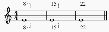
I agree. Centering would definitely be confusing in some cases. Example aligned to left:
Example centered:
In reply to I agree. Centering would by jpfle
For ottava with lines, I agree it should be left-aligned.
Despite what Elaine says, I still think centring won't be ambiguous. I'd be interested in examples where you think it would be.
To me, it mirrors the handling of lyrics in some instances: If applicable to one note, centred; if not, left-aligned.
In reply to For ottava with lines, I by chen lung
See the above example, which demonstrates the problem with centering perfectly. If the text is longer than a single note head and overlaps the preceding note, it is ambiguous. I don't wpsee what a line has to do with it - the line shows the *end* of the ottava. The ambiguity is over where it *starts*.
Lyrics are different in that notes are automatically spaced to avoid that problem. And that is the universal standard for treatment of lyrics (the centering and the spacing). For ottavas, respacing notes would be unheard of.
Again, if you really want a non-standard/ambiguous centered ottava, you have the option of adjusting manually to make that happen.
I was going to post about it at some point.
In this published example, there is no line for an ottava of one note (see bar 2 of Keyboard 4):
![Ottava without line.jpg]()
Perhaps this could be automatic procedure in MuseScore, but does anyone know of exceptions to such 'rule'?
I had thought about ottava overlapping notes (the example does this), but I don't think people will be confused - I think the distinction would be to introduce the line automatically when an ottava spans two notes. Depending on the density, spacing could be automatically increased to ensure the notes don't fall short of the text length.
In reply to I was going to post about it by chen lung
Although this is about ottava, I have a comment about pedaling. They are both lines so perhaps they are actually related.
I write a lot of piano music and often I wish to put pedaling instruction that is only an indicator, not specifically demanded. So, a pedal instruction with out a line would be very useful to me.
Regards,
In reply to Although this is about by xavierjazz
Yes, for pedalling, it is definitely common to *not* draw lines at all, but to always use "Ped" and "*" signs (and thus there is no possible risk of confusion). So that is indeed a good argument in favor of supporting the zero-width line possibility, which in this case case could be set as a style option since it doesn't need to be special cased on the length of the line.
In reply to I was going to post about it by chen lung
Elaine Gould specifically recommends *against* suppressing ottava lines for single notes - otherwise it can be ambiguous. As a player forced to read unclear charts more times than I can count, I agree with her recommendation.
So while I agree it should be *possible* to manually suppress lines if you wish, I don't see any reason to make it particularly automatic. As mentioned, there are already two ways of achieving this effect, and we may add a third. That should be more than good enough.
BTW, regarding the proposed new way of suppressing lines (setting line width to zero) - it occurs to me we could perhaps draw the line on screen greyed out as for other invisible objects.
In reply to Elaine Gould specifically by Marc Sabatella
I agree that lines should always be drawn by default.
FWIW, I've updated my current PR for #35176: Wrong 8va and 8vb end position if preceding a clef change to "fix" alignment for ottavas over whole notes (now left aligned like over other notes) and to support zero-width textlines (which includes ottavas and pedal among others). Zero-width textlines will be drawn gray on screen, unless you turn off the Show Invisible option; they won't print in any case.
In reply to FWIW, I've updated my current by Marc Sabatella
I think it is important to maintain consistency. What I mean is that if setting the width to 0 works for some elements (elements are not displayed) and doesn't work for others (elements are still displayed), it will be very confusing.
When setting the width to 0 doesn't work (it still makes the element to be displayed), I think that a minimum value of 0.01sp (for example) should be set for this field, so it would prevent users to add a value 0 that just doesn't work.
I made tests about that in the "Edit Style" dialog:
Here are the results ("Edit Style" dialog):
----------
----------
----------
----------
----------
----------
----------
----------
----------
----------
----------
----------
In reply to I think it is important to by jpfle
Thanks JP. Great collection.
Regards,
In reply to I think it is important to by jpfle
Looks like a good candidate for your next PR ;-)
In reply to I think it is important to by jpfle
Consistency is good, but from a practical perspective, I don't really see nearly as much value in making any of those other things work with zero width lines. After all, they can simply be made invisible. The reason textlines are different is that you might want the text to show but not the lines.
Anyhow, I'm not opposed to see them work; it just doesn't seem very important in comparison.
Btw, for articulations, different articulations have different behaviors. Some are defined to be placed relative to the note, others to the staff. So settings will only affect relevant markings.
EDIT: but setting the minimum to 0.01 for lines that don't support 0 is definitiely a good idea, and easy - minimum values are set in the UI file...
In reply to Consistency is good, but from by Marc Sabatella
I created a report specifically about that: #36721: Clean up null values
In reply to Consistency is good, but from by Marc Sabatella
Btw, for articulations, different articulations have different behaviors. Some are defined to be placed relative to the note, others to the staff. So settings will only affect relevant markings.
Maybe there's something I don't understand, but I really think there are bugs:
Result: nothing. I would expect that articulations with anchor Chord Automatic would be affected.
Result: nothing. I would expect that articulations with anchor Above Staff would be affected.
Result: almost all elements moved, except these ones: sforzato, staccato, tenuto and marcato.
In reply to Consistency is good, but from by Marc Sabatella
Consistency is good, but from a practical perspective, I don't really see nearly as much value in making any of those other things work with zero width lines.
Actually, by consistency, I don't mean that it should be possible to hide all elements with a null width, but that when an element is not hidden with a null width, a minimum value should prevent to enter 0.00sp.
In reply to Consistency is good, but from by jpfle
I don't like the use of a zero line width to hide a line. This should be explicitly stated in a property. If its desirable to hide some parts of an element, a dedicated property should be added. That whould be consistent for me.
Really hiding an object should not be possible at all as it will never be accessible again.
So special code is needed to still paint the zero width line in gray which adds overhead and in my opinion is overengeneering.
So why not stick with the current implementation which by definition paints a zero line width as the thinnest possible (one pixel) line?
In reply to I don't like the use of a by [DELETED] 3
I have nothing against a special property to hide a line; I was just trying to keep things simple - for me, anyhow :-) - by using a property we already have. The new property could be just for text lines, then, since for other lines is the same as "visibility". It seems we would still need code to draw the line in gray though, wouldn't we? So I'm not sure chaing it from zero-width to a new decidated "hide line"property really helps with the layout overhead. In any case, I already added that code, and there is very little to it.
BTW, Qt claims it draws a zero-width line as one pixel wide, but from what I have seen, it actually looks *wider* than ordinary ottava lines, at least at 100% or smaller screen magnifications. Could be that it looks better on printing; I didn't test that.
In reply to I don't like the use of a by [DELETED] 3
So why not stick with the current implementation which by definition paints a zero line width as the thinnest possible (one pixel) line?
There are a lot of elements that currently disappear (and so are not selectable) with a value of 0.00sp (stem, brace, barline, arpeggio, etc.). That's why I propose a minimum value of 0.01sp.
Also, with a value of 0.00sp, there are sometimes glitches. Example with a volta at zoom 1600%:
Hook by default at 1.90sp (hook height):
Hook at 0.01sp:
Hook at 0.00sp: