Updating MuseScore artwork
I'd like to have a quick sprint before 0.9.6 RC1 to update the artwork of MuseScore. Here are the things that could use an update:
- The default paper background paper3.png should be replaced with something more commonly used. A rather bright (white) pattern.
- The current splash window needs an update. Find proposals attached made by Zachary Chione and Gustavo Fernandez.
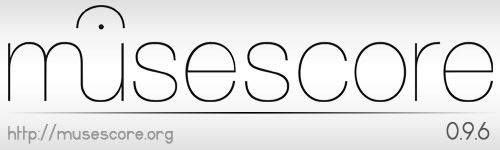
- The old logo should be replaced by the new one
| Attachment | Size |
|---|---|
| splash-1.png | 80.35 KB |
| splash-2.png | 76.91 KB |
| splash_v1.jpg | 45.76 KB |
| splash_v2.jpg | 58.53 KB |
| splash_v3a.jpg | 39.23 KB |
| splash_v3b.jpg | 47.61 KB |
| splash_v4.jpg | 42.27 KB |
| splash_v5.jpg | 72.15 KB |
| splash_v6a.jpg | 102.83 KB |
| splash_v6b.jpg | 77.63 KB |
| splash_v6c.jpg | 84.67 KB |
| splash_v7.jpg | 63.6 KB |
| splash-thin_v1.jpg | 36.56 KB |
Comments
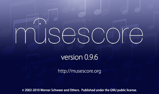
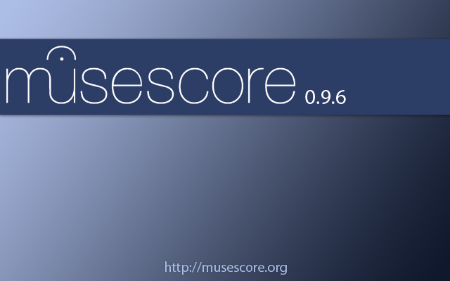
I think we could narrow the choice of splash screens to:
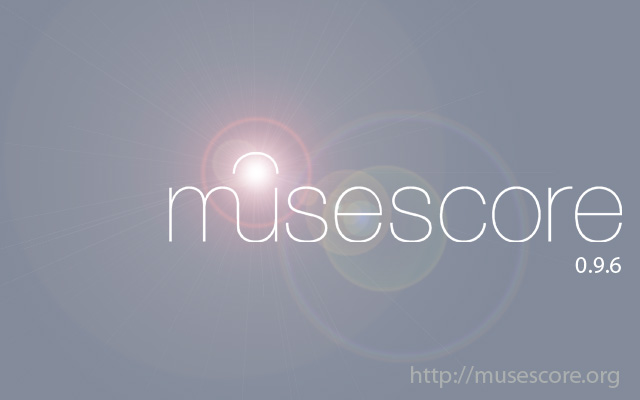
The last two ("splash_v4" and "splash_v5") clips the bottom of the word "musescore" (notice that the bottom of the letters is too skinny). With the first one ("splash-1") the bottom of the letters is actually too fat. It looks like this is a problem with most of the PNG files on the logo page http://musescore.org/about/logos
Also "http://" looks antiquated to me. In professional printed/promotional material it would be more common to see "musescore.org" or "www.musescore.org". The "http://" is also a small usability hurdle. If the "http://" is printed I've seen several less technical people attempt to copy that portion, make mistakes copying, or take a second or two to double check that they entered the seemingly random characters correctly.
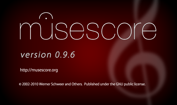
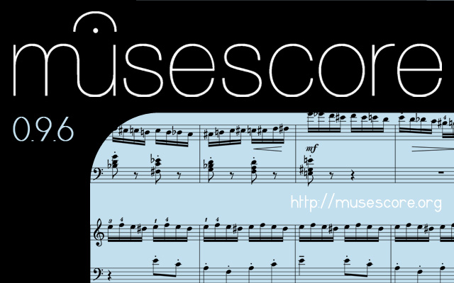
Zach came back to me with an updated version of splash_v5. The svg is also attached.
Here are his comments about it: "I think the problem he mentioned with the text being too wide or too narrow has something to do with the way the image is rendered in the program that creates it. Anyways, I believe I was able to eliminate the effect in the image "splash_v5." I have attached the revised image in both jpeg and svg format. (Please note that the svg format is not actually a vector image in this case and I am unable to create it that way because the sheet music is a raster image.)"
I quote him regarding the default background: "Regarding your comment about the default paper background, I immediately changed it to just a plane white solid color when I started using MuseScore. The texture was kind of neat but too distracting for me. I'm just saying that a solid white color as default would be my choice for the background. "
Perhaps we should consider this instead of using a texture, knowing that the MuseScore video tutorials are also made with white background.
The revised splash_v5 looks very good. The motivation for asking for the SVG was to allow changes to the text in the future (such as the version number). If he is not able to create an SVG file in this way then maybe he can attach a copy of the background without any text and/or include a copy of the original source file he is working from (GIMP, PhotoShop?).
I'd like to add that splash_v4 is painful to look at and doesn't really have anything to do with music. Drop it from consideration and narrow the choices to 3.
Personally, I prefer #2, although I like the colour of #1.
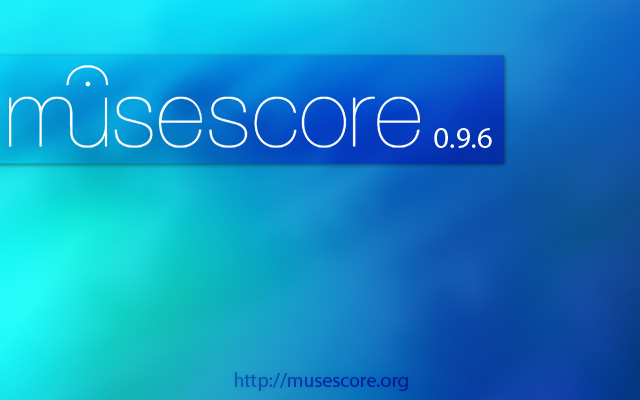
I attached all the proposals on the first post for archiving purposes, but we shall move forward with v5 for the 0.9.6 release. I'm in the process with Zach to further refine it. The svg file will be posted in this issue for final review before it will be committed to the code repository.
For future versions, I'll open up the possibility again to change the splash screen. My personal battle plan is to end up with a house style for MuseScore for the 1.0 release. As I'm not a designer, I seek support & help from designers during this process.
Two little comments:
1) v5 is very clean, readable and neat. However, I miss the "FREE music notation software" sub-title: I often use MuseScore during my regular and boring train trips and this line makes for good advertisement (I do not think I'm the only one!). Maybe to be made shorter, but I think it useful.
2) if the "http://" part of the URL is removed, I think "www." should be added otherwise many will not understand it is a URL.
Anyway, I like the new style very much!
Thanks,
M.
My preference order:
v5, 1, v4, thin_v1, 2, v3a, v3b, v6b, v6c, v2, v7, v1
Comments on the top ranked ones:
v5: Just make sure that the notation was created in MuseScore (not some other source).
1: I like the colors a lot, but doesn't match well to the colors of the current version of the program (beige, blue-gray & gray). Highlights the logo nicely.
v4: Has good potential, with a great allusion to "the sky is the limit", or "a new horizon/dawn in music notation software" which would be a suitable version 1.0 spash screen logo. Problem is that the flare obscures the dot in the fermata. Another problem is that it is a stereotypical effect in Photoshop, so somewhat cliche. If these two problems can be fixed, then it would be a very good spash screen graphic.
thin_v1: nice minimalist design which matches the logo.
2: Similar in effect to v5, but a darker feeling (perhaps too serious).
For splash_1, some alterations might be useful:
(1) make the distance between the version number and the web address match the distance between the
web address and the copyright notice (keeping a wider distance from the version number and the musescore text).
(2) The brightness at the middle of the top of the image is somewhat distracting. it would be better if the
change in brightness were less noticeable from left to right at the top by placing the origin of the glow above the
image rather than inside of it.
Issue reported on the mailing list with the current logo in the repository: http://n2.nabble.com/Icon-almost-invisible-on-dark-themes-tt4883913.htm…
New splash screen with consistent font usage. The question from Craig makes total sense whether the sheet was made with MuseScore. We'll make sure it is.
In the meantime, there is a new 48*48 icon in the repository to fix the Ubuntu issue (see previous comment) and I'm compiling the set icons with lasconic for Mac. To be continued with screenshots.
Looking Good.
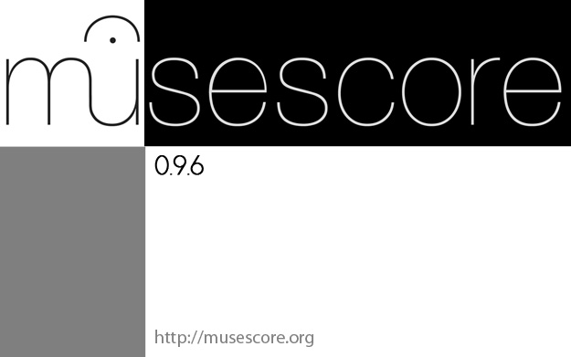
Some updates were made to the artwork in the repository like bg1.jpg and installerhead.bmp. The strategy we follow with this general artwork update is to make everything consistent with the current wordmark, which means black & white.
This is however a temporary situation because for the next release, I want to work towards a house style for MuseScore with a set of colors. So consider this as making a tabula rasa from which we can build up the new MuseScore identity for 1.0.
in r2965, the background is white by default and the About Box is updated with the new logo and style.
Please reconsider the white background. Its horrible and hurts the eye. The contrast ist way to hight and i doubt anybody can work with such an unergonomic setting.
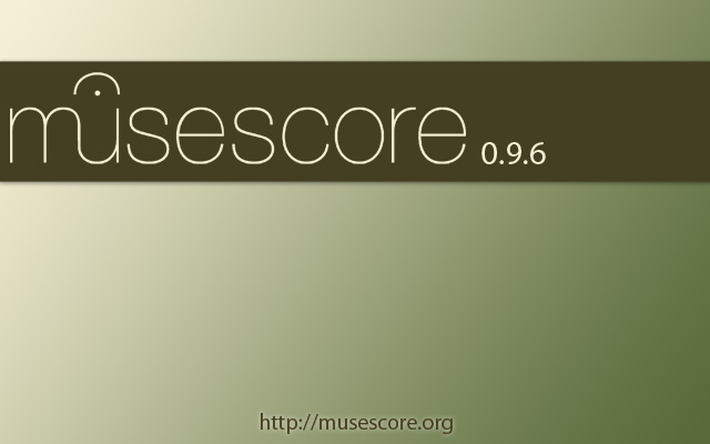
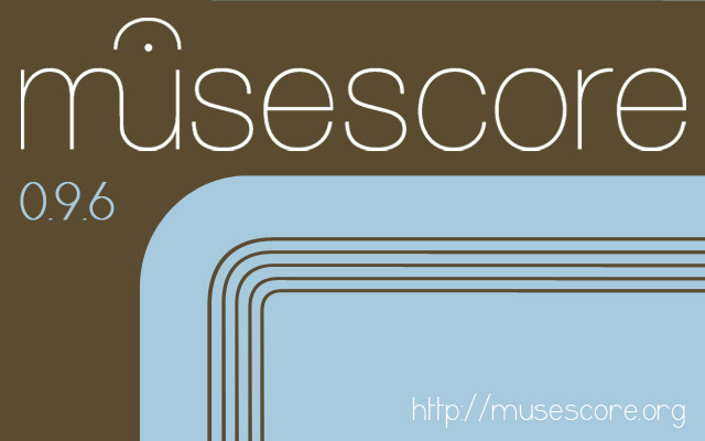
New proposal.
I tend to agree... What do you think about the recently commited paper4.png ? or a more textured paper like the one attached?
paper4.png is ok. I like paper5.png better but probably only because i am more used to yellow which i also use as bg for text editing. paper6.png is a little bit too textured. For best ergonomics i believe any texture is bad. I used a default texture just to show that mscore can do it (and sibelius also used a texture) :-)
I commited paper5.png and make it default.
paper4.pngis also a resource now.New 0.9.6 splash screen is committed: bitmap, vector
Thank you Zach!
For the moment, I will put this issue on fixed. If there is anything in the latest build which has still the old logo or graphics, don't hesitate to reopen this issue again.
I'm wondering what the sheet music in the background is.
@Deathgleaner: Golliwogg's Cakewalk which you can find in the demo folder of MuseScore
Automatically closed -- issue fixed for 2 weeks with no activity.