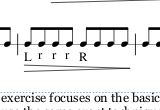
Lower case sticking appears in superscript position and Offset values do not change location.
Reported version
3.5
Type
Graphical (UI)
Frequency
Once
Severity
S4 - Minor
Reproducibility
Always
Status
active
Regression
No
Workaround
Yes
Project
When entering sticking text, a lower case entry always appears in a superscript position in comparison with the Upper Case letter. The happens even when the selecting the various alignment choices (top of reference point, bottom of reference point, middle.) Sometimes after cycling through the alignment choices, the two (upper and lower case) will align the bottoms of both but it is not predictable and the alignment choice does not hold for future entries.. (Picture attached)
In addition, changing offset values does not relocate the sticking text position. So this function does not appear to be working. (Picture attached)
Comments
a sample score would be helpful
In reply to (No subject) by Jojo-Schmitz
Sample attached.
But only the 'r', not the 'l' apparently, very strange
Lower case "Ls" appear okay because the letter is a "full height letter." But, if you put in a lower case "P" for example, it defaults with the o part of the p to the top of the area and does not extend the tail below the base line. This is much like old time dot matrix printers handled lower case letters with tails (p and g for example.
There is a workaround but it is very time consuming. "Select" each lower case "r" then left click, hold and move all selected letters down to desired location. This is a real PITA.
Also tried resetting to see if that helped. It did not.
It looks to me that the small (short) letters like r and p are not superscripting but rather all letters are being top aligned. That why little L's don't look superscripted. I tried playing with the alignment buttons (to the right of the justification buttons) and the tops always stayed aligned. You can't tell unless you adjust the Y offset (I used -17), but if you move the stickings above the notes, you will see that the bottoms are aligned as expected. This seems to be by design, but I'm not sure it's a good design. Perhaps @oktophonie knows the proper alignment.
Actually, I think what is going on is something a bit different. I think it's just non-optimal choices of default for the sticking position. If you turn off autoplace, you can see the capital letters move up a bit, closer to the staff. That is where the style setting wants to place them. But, autoplace sees the 0.50 sp minimum distance and pushes those capital letters further away (about 2.2 sp in practice). The lower case "r" doesn't need this adjustment; it is already far enough.
So, I think the default value for the vertical offset should be a little farther away from the staff, since that's where it's going to end up anyhow.
Meanwhile, that's the solution - pick a better style value for vertical offset. Or, reduce minimum distance set the R doesn't actually get pushed further from the staff, but then you'll have collisions with notes that go below the staff.
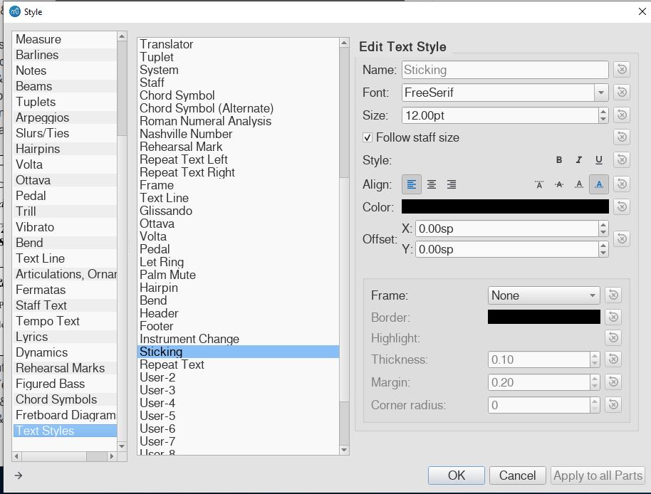
You are correct about the placement of the letters being affected by something. I tried playing with the style offsets to see if there was a change but the offsets have absolutely no effect on the sticking letters. The others settings seem to work fine, but neither X nor Y offset does anything.
Indeed, the offsets in the text style don't seem to be hooked up to anything at all currently, at least nothing that actually works. I meant the offsets in the Inspector, though. Change from 2 to 3.5, then hit "S", works perfectly. There is a distinction between the offset defined for an element type (usually in Format / Style / NameOfElement) versus what is defined for the text style (Format / Style / Text Style / NameOfTextStyle). Gets complicated for elements that support both above and below placement.
Changing that to 3.5 does work (it is a bit too much, 3.15 seems enough), but only as long as the notes are upstem, needs 5.5 when downstem, that in turn looks bad (too far away) if upstem
Indeed, that could potentially be a reason to look at having the automatic alignment by system as for lyrics. But, I also think drum music with sticking typically isn't written in a way where this is an issue. Staves would typically be all stems up or all down anyhow, so simply setting a good offset is sufficient. Unless I guess you want some instruments stems up, others stems down, but have sticking always on the same side regardless of stem direction. No idea how common that is.
Problem is that there is no good default setting for stem up and stem down
Right, but as I said, I'm not sure how often these are actually mixed. Also, the difference is only relevant if you are always putting the sticking on the same side regardless of stem direction. I'm not at all convinced that would be the case - I suspect that even if you mix stem directions in a single score, you put sticking on the notehead side always. or stem side always. But it would be good to hear from people who actually deal with this type of music regularly.
The problem is you don't know which direction the stems will point in a given score until the user makes that decision. Jojo is saying he can't find one default that will work no matter which option the user chooses. Perhaps your idea of treating them similar to lyrics would work. Make a default for stems down and use a top margin to move everything up or down depending on the stem directions on a given note, staff or system.
It is not a matter of mixing them.
It won't be an issue if sticking is always om the notehead side.
Got it, we want to find a good default. Here's where I really rely on input from people who actually use this to help decide what makes the most sense.
BTW, the current default is only an issue when using sticking below and when using lower case letters. Could also be that this combination isn't very common.
In reply to Got it, we want to find a… by Marc Sabatella
Sticking notation below and use of lower case (for tap/non-accented notes) is VERY COMMON in drum music so a "default" correct relational location placement of "sticking text" for upper and lower case is really needed. I'll play around with the above info and see if I can enter a style change that results in a "permanent" environment for sticking input.
How about stem up and stem down, how common are those and are stickings always below staff or always on the notehead side?
I don't know if this is a similar issue as the OP, but I put a "Fp" dynamic on a note, but the p was too soft. So I went into the inspector and changed the velocity change to more reflect a Fmp setting. I edited the Fp symbol to put a 'm" in the middle. The "m" gets very small like a subscript. Didn't know how to edit the "m" to make it larger.
fmp is unrelated, ask the question in the forum and someone will answer it. I don't want to much extra stuff in this issue report.
In reply to fmp is unrelated, ask the… by mike320
OK. So it looks like we have another program bug. I will report it as an issue.
Thanks
It's not a bug. Ask the question in the forum and I'll explain, but not here.
In reply to Sticking notation below and… by ddonald228
Literally this is unbelievably common.
I have been writing drumline scores for years, and I use Uppercase for accented notes and Lowercase for unaccented notes.
This is such a common practice, that I'm surprised Musescore still hasn't fixed it. Going back and meticulously moving each lowercase sticking to be even with the uppercase was terrible, I only did it once to write a cadence for the high school drumline this year. Never again. I ended up going back to Finale to write the show music. It would have taken me hours upon hours to go back and manually align all the upper and lowercase stickings in a 10 minute show.
I would have rather written the show with Musescore this year, but this issue is detrimental for writing battery percussion scores.
You could avoid this by choosing to use uppercase only for sticking, but that adds a layer of confusion to the players when reading the music for the first time and it looks messier overall, but the majority of drumline composers I know prefer a mix of upper and lowercase.
Dear Musescore, please acknowledge this is a common enough issue. While this is the first and only post I've seen on it, frankly I'd bet that is only because someone experiencing this issue would rather just go back to Finale or Sibelius than take the time to report the "bug" and wait for it to be fixed.
In reply to Literally this is… by SeanLemonMeringue
No one has denied it's an issue, and we've requested feedback from users about what a better default height should be. So far no one has responded here, unfortunately, ort the change probably would have been made already. We all agreed that the default should be fixed, but you certainly shouldn't 't need to move each manually. You just need to set the default height a little lower, as explained previously (see for instance https://musescore.org/en/node/308840#comment-1018050). And once there is a consensus among users what the right defaults are, the change can be made for a future update.