Roman Numeral Analysis: two bugs (MuseScore 3.3 RC)
Hi everyone.
There are two bugs I'd like to report relating Roman Numeral Analysis on MuseScore 3.3 RC.
-
Incorrect spacing of Roman Numeral Analysis before barline
Steps to reproduce:
a. Add some note before a barline.
b. Add text as roman numeral analysis under that note.
Result: the text will go over the barline. -
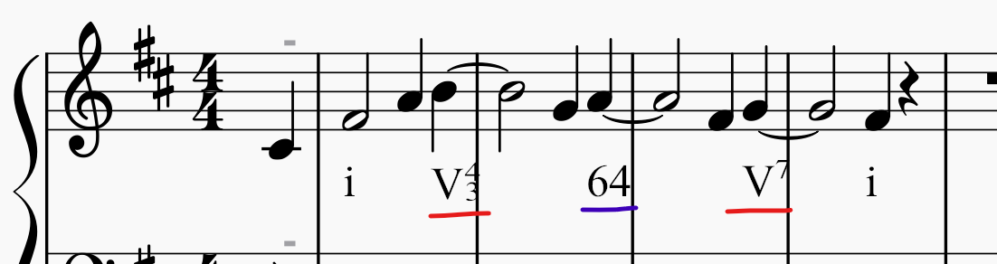
Numbers-only texts are not formatted correctly.
Steps to reproduce:
a. Add a roman numeral analysis with text "64".
"64" should be formatted as in "i64" or "V64".
See screenshot.
| Attachment | Size |
|---|---|
| screenshot.png | 42.63 KB |
Comments
Please report that in the issue tracker
Edit: thanks for #295504: Roman Numeral Analysis with numbers only not formatted correctly
Thanks for the reports!
Neither of these are actually bugs; I have responded in the issue reports. The first is more of a feature request - for a new facility to automatically prevent text in general from crossing barlines. The second is a possible suggestion for a change in behavior of the font that I suspect some would approve of but others would not (there is no reason to assume numbers not preceded by a Roman numeral should get any special formatting). But if enough others say they want this, then it could certainly be changed. Probably better to start a new forum thread with a more descriptive title, like "How should RNA elements with numbers be formatted"? Could be useful to get opinions from outside the MuseScore community - a general music theory forum somewhere, perhaps.
In reply to Thanks for the reports. … by Marc Sabatella
However, in harmony analysis when you have for instance I6 followed with I64, often the root is not repeated in the annotation of the second harmony i.e. you have I6 64. Then 64 inherits the root from the previous harmony (I in this case). This is kind of short annotation. Perhaps, that was the question of the original poster?
In reply to However, in harmony analysis… by hstanekovic
In that particular context, I think that's a reasonable assumption, sure. The question is, would that be the only type of situation anyone would ever use a number by itself in the context of RNA? Or would there places you wanted a number to just be a number?
In reply to In that particular context,… by Marc Sabatella
IMHO Roman numeral analysis is quite well standardized. Any latin numeral that appears shold have meaning of figured bass.
In reply to IMHO Roman numeral analysis… by hstanekovic
It's actually not that well standardized, and that's a big part of the problem. There are many different ways of representing some pretty basic things - like major versus minor (some use capitalization, others use all caps but add modifiers), how to represent cadential 64 chords, then there are things like the Mehegan use of "x" for non-diatonic dominant sevenths, how to represent inversions in a jazz context where "6" pretty universally (except for Mehegan) denotes a sixth chord, etc. There really are a great many cases to consider here, which is I'd love to get input from others on how they use numbers in an RNA context.
Meanwhile, I've coded up substitute rules for Campania that seem like they could work well. Right now we only superscript numerals in specific contexts - after letters or certain symbols like the degree sign for diminished chord, or within a construct like V4-3. I'm experimenting with expanding this to basically superscript "most" uses of numbers, but with some exemptions I feel are necessary, like after a slash (I/3 is a common way of indicating a first inversion chord in a context where 6 is more likely to suggest a sixth chord).
What I'd still want to see is some input on what other cases we might want to not superscript. Like, I'm not so sure about what makes sense after, say, a comma, or closing parentheses/brackets.
Given the timing of this, it's not terribly likely these changes would be in 3.3 but could potentially be in the next update, and in any case, I can push the changes to the repository for the font itself so people can download and install it standalone for use in the mean time. but I want a little more feedback first.
In reply to It's actually not that well… by Marc Sabatella
Also, I would say that chord annotations are in the realm of jazz music while RNA is in the realm of classical music, especially common practice period.
Important distinction is that while jazz music uses lot of different chord types, RNA/common practice period uses triad chords and seventh chords (sometimes dominant ninths anotated in the root position). Basically, all other musical notes are declared as nonchord tones and are ignored in RNA. That may drive basic priorities, in my opinion (if can be of help).
In reply to Also, I would say that chord… by hstanekovic
Actually RNA is used extensively in jazz as well. Not in the actual lead sheets we play from, but for analysis purposes, same as classical. So it's important to support both usages to as great an extent as possible. Providing "options" isn't viable - font don't support options, not in this way.
But I wouldn't have implemented this using a font if I didn't believe it was possible do so in a sufficiently general way, and I still do believe that. I thi k the tweak I am working on now should cover the cases we need it to - I just still hope to see more examples.
In reply to Actually RNA is used… by Marc Sabatella
Wow, that is very interesting. Sorry that I could not help. You are fighting over much wider territory than I initially thought. Good luck!
I think that if you are struggling to implement RNA that suits needs of both classical and Jazz musicians, in the case of collisions, it would be fair that classical musicians needs should have a higher priority than the needs of Jazz musicians because RNA came from the classical music. But I understand that you are a Jazz musician and may have different point of view :)
In reply to IMHO Roman numeral analysis… by hstanekovic
RNA and figured bass are totally different concepts and are entered using different methods completely. Also, MuseScore uses completely different methods to enter them into a score. In actuality you could have both if you wanted them.
In reply to RNA and figured bass are… by mike320
That's an excellent and important point - Campania (and the corresponding RNA feature in MuseScore) is not meant for figured bass notation, which is a really different thing. There is already a separate facility for that in MuseScore. Also, FWIW, a wonderful open source font called Figurato (https://github.com/fkretlow/figurato) that works much like Campania (and was in fact the inspiration for Campania), allowing you to simply type figures and have them formatted by the font itself without needing special program support. Not that you need Figurato with MsueScore since we have our own native support, but the point is, Campani and the MuseScore RNA facility is designed to solve a different problem. I actually first thought I would try to get the RNA support into Figurato and discussed this with its developer Florian Kretlow, but the requirements of the notation are just two different. So we agreed it made more sense for me to develop a font separately (and he was extremely helpful as I learned about the finer points of OpenType substitution and positioning rules).
That said, I do think I understand the context of the original point being made here, which is that sometimes even in the context of RNA, we may see notations that look more like figured bass in that they are missing, well, the "Roman numeral" part of the Roman numeral analysis :-). In particular, if only the inversion changes, not the root or quality, we do sometimes see a 6 by itself or whatever - that 6 is understood to apply to the previous Roman numeral, and should be superscripted accordingly. So I do want to support that, while also supporting things like I/3 (or, for that matter, just /3) in which the 3 is not superscripted.
Bottom line: the more I understand about how people use numbers within the context of RNA, the better I will be able to make Campania (and hence MuseScore) meet those needs.
In reply to RNA and figured bass are… by mike320
Yes, I know that RNA and figured bass are different concepts. I said that in typografic context i.e. that typografic of latin numerals in RNA is the same as in figured bass. I was imprecise, sorry. IMHO latin numerals in RNA say which inversion (or root position) is used for a chord and they correspond with the figured bass that this inversion or root position would have when in the close position. Thus, in that way, RNA and figured bass are strongly related.
However, I was not aware of the other variants that were mentioned by Marc. Probably, it is impossible to cover all this without giving some options to users to choose (preferences).
In reply to RNA and figured bass are… by mike320
Yes, but RNA is itself a development in late 18th/early 19th century based on the baroque figured bass notation. Although they're different concepts in MuseScore, and partly in modern usage, they are related and hence not "totally different concepts".
I'm attaching a file showing some examples of RNA notation extracted from harmony books (Aldwell & Schachter, Laitz, Kostka, Benward).
In reply to Yes, but RNA is itself a… by josiasmat
!! The first two examples, on the face of it, are "extremely curious"; the cadential 6-4 chord is not V, but I. Perhaps the author means "the whole measure is conceptually V" and the numbers are "figured bass, not part of the RNA"—Schachter is a famous Schenckerian exegete, so conceptual "reduction" of the whole measure to V comports with that system. At any rate, people do intermix these notations as these examples illustrate.
In reply to !! The second example, on… by [DELETED] 1831606
I think you are right, the whole measure is V, but 2 nonchord tones at the start of the measure are annotated in this way to show their voice leading (from the start to the end of the measure). I think suspensions are often annoteted this way.
If I remember correctly, in the YouTube videos of Seth Monahan (a professor from Yale School of Music), this was explained very nice. All of his YouTube videos are beatiful and can be wholeheartedly recommended!
In reply to I think, you are right, the… by hstanekovic
Monahan's stuff is great; I know it and recommend it to others. "Roman numerals" for chords means that the roman numeral denotes the root of the chord. Otherwise, the system cannot be explained. Notating the full tonic 6-4 as a dominant chord is calling white just an extreme shade of black, IMHO. The Ninth symphony of Beethoven is just a D minor chord with a lot of nonharmonic tones at different points ("Extreme Schencker", but what does "Symphony #9 in D Minor" mean, if not that?)
In reply to Monahan's stuff is great; I… by [DELETED] 1831606
The thinking among those I know of who use this notation is that the whole I64-V idiom is all dominant function, so seeing g the first chord as a V with a double appoggiatura (6-5 & 4-3) isn't quite so farfetched.
In reply to The thinking among those I… by Marc Sabatella
It certainly is a double appoggiatura (or suspension, more usually), but labelling it "V" is inappropriate. Figured bass handles this without ambiguity or this problem. Calling it RNA is questionable. One could say that RNA fails here (figured bass also has cases where the details and paradigm rules defeat clarity).
Is the subdominant-function "sixth chord" on the fourth degree (e.g., FACD in C major) ii 6-5-3 (the first inversion of the seventh chord on the second degree) or IV 6-5-3 by this thinking? In what cases does the Roman numeral shift from the root of the chord to the actual bass? is it deterministic?
In reply to It certainly is a double… by [DELETED] 1831606
We can everyone have our opinion about the most appropriate form of analyzing chords, but I think a software should have sufficient flexibility to meet the needs of everyone. So we should be able to write I64 V, V64 V, V64-53 or 64-V as we want.
I suppose this isn't a music theory forum, so it's out of scope to discuss the correct RNA notation here. Even the examples I gave above from theory books show various notation possibilities, and their authors certainly wouldn't agree on everything.
I just think MuseScore should be capable of handling the maximum possible number of use-cases. Maybe RNA and figured bass should be fused into one feature capable of handling both?
In reply to We can everyone have our… by josiasmat
As I said, I think I already have it figured out to allow all the notations shown above. Before developing Campania we did briefly investigate trying to get RNA happening within Figurato, but we came to realize the requirements were just too different.
Here for example is what I have going:
In reply to As I said, I think I already… by Marc Sabatella
That's terrific! I look forward to it being on the .com server.
In reply to As I said, I think I already… by Marc Sabatella
wow, that's excellent!
In reply to The thinking among those I… by Marc Sabatella
Yes, thinking I64-V as V(64--53) is the standard reasoning in much of today's american music theory, strongly influenced by schenkerian analysis.
In reply to Yes, thinking I64-V as V(64-… by josiasmat
Suppose in the next measure there was the dominant chord with an arpeggio in the bass. (Let's say in C major). I guess you couldn't call G major with D in the bass V6-4 because "that means something else", then. This is fraught with ambiguities (although the need for Campania to handle it is indisputable).
In reply to !! The second example, on… by [DELETED] 1831606
I have seen that notation for cadential 64 chords as well, I forget where, but yeah, this is actually one of the specific things I had in mind when I mentioned them as something not standardized.
Anyhow, thanks for the example, it has a nice variety of symbols. let me play with it a little and when I get a version of Campania that seems like it handles this (maybe the one I just made will, need to test it more though) I will post it here and let you guys have a go. Once we're all happy, I'll push the changes to the main repository and then we'll pick it up for a future MuseScore update as well.
In reply to I have seen that notation… by Marc Sabatella
Nice.
Now I saw that in my messages I wrote "latin numerals" instead of arabic numerals. Embarrassing but I can not change the messages any more :(
In reply to Nice. Now I saw that in my… by hstanekovic
If you've ever worked with Arabic-script languages, which have their own somewhat cryptic (today) digit numerals, the terms "Arabic numerals" and "Roman Numerals" (as in "Times-Roman") become hopelessly confusing ...
In reply to If you've ever worked with… by [DELETED] 1831606
They (the Arabs) are using (old) Indian numerals nowadays...
Indeed very confusing and a great disappointment when my wife and I were in Eqypt in the 80s, we knew about not being able to read arab letters, but though to be able to read their numerals. Not so... (although we lerned them pretty quick)
OK, I would greatly appreciate if those with an interest in this topic would try installing the font in the attached ZIP file and seeing how it works for you.
Normally I would say you just need to install it normally and MuseScore will use it in preference to its built-in version. But this doesn't seem to be happening for me (Windows 10, using the 3.3 RC or my own self-built debug executable). So the most reliable way to test it would be using staff text in 3.2.3 - just select Campania as your font in the dropdown in the Inspector, maybe hit "Set as style" also. I want to make sure that the nothing that currently works has stopped working, and that the expected things happen if you start a "word" with a number, or with a hyphen, or with an equals sign (which you can use to create two stacked hyphens). I'd want this to work both for "words" where that's the entire text (eg, a staff text consisting of nothing but "64") as well as word delimited by a space (eg, "I64 53", the "53" starts a new word and should start a new stack. It all works for me in my testing but as this discussion shows, we all do things a bit differently, so I want to be sure i didn't miss something important.
Here's specifically what I expect to be different:
1) Starting a word with a number should do the same as entering numbers after a Roman nueral (eg, superscript the first number, subscript the second, shift the whole thing up to accommodate a third, also interpret "-" and "=").
2) A leading "-" will now be superscripted, and a leading "=" will produce a stack of superscripted/subscripted hyphens
3) After starting a hyphen or a stack of hyphens, further presses of "-" or "=" will extend the lines, so you can get arbitrarily long dashes.
4) The things that I think shouldn't superscript won't: 1/3 doesn't superscript the 3, IV-V doesn't superscript the hyphen. I'm not sure what I think about a hyphen after a closing parent/bracket/brace, right now it superscripts.
In reply to OK, I would greatly… by Marc Sabatella
(oops, you did address that explicitly. My bad)
In reply to Doesn't MS's own Campania… by [DELETED] 1831606
Maybe it does for Windows, using Qt 5.12.5, but not for Mac, using Qt 5.9.x
Edit: reply no longer relevant as the question got removed ;-)
In reply to Doesn't MS's own Campania… by [DELETED] 1831606
It always used to be the case for MuseScore on Windows and Linux (not sure about macOS0 that an installed font took precedence over a builtin one. But that doens't seem to be the case for me right now - the builtin font keeps winning. That's why I'm suggesting people use 3.2.3 to test - it has no builtin Campania font (and no RNA feature, hence the suggestion to use staff text).
In reply to It always used to be the… by Marc Sabatella
you could PR it using build_artifact maybe?
In reply to you could PR it using build… by Jojo-Schmitz
I could, but I knew @BSG at least is on macOS...
In reply to I could, but I knew @BSG at… by Marc Sabatella
I know (too) ;-)
In reply to It always used to be the… by Marc Sabatella
Trying it in 3.2.3, as recommended, it works as advertised! This is extremely damned good!
In reply to V64-53 works. V64(53) does… by [DELETED] 1831606
Is there any chance this can get into 3.3? If it doesn't get on the server, no one can use it in scores they intend to post.
In reply to V64-53 works. V64(53) does… by [DELETED] 1831606
Thanks for the feedback! I have to say it's been an interesting and rewarding process learning about these font features.
It's remotely possible it would go in 3.3, but officially we are close enough to final freeze that only critical regressions from 3.2.3 are being fixed. Issues with new features are of course not regressions :-), but we do need to make sure the new features work. I'd still say the RNA features works as intended, this is more of an enhancement. Had this feedback come in during the beta beriod it would have been a no-brainer, but it may be too late now for 3.3.
However, as with any "major" minor release like this, I'd be expecting a 3.3.1 not long after. It's already an official milestone in our tracking. So, not to worry, I'm sure this will be on the server soon enough.
BTW I got email notification about a post lsiting some symbols that didn't work as expected, but I don't see that post here - did you edit that away subsequently? I tried the symbols mentioned but they do work for me? No doubt we have posts crossing as well.
In reply to Thanks for the feedback! I… by Marc Sabatella
I was erring in thinking I didn't need to use 3.2.3, and, surprise, it didn't work. When I went to 3.2.3, it did, so I edited away the erroneous post.
In reply to Thanks for the feedback! I… by Marc Sabatella
Word is this enhancement will indeed wait for 3.3.1. Which, again, I don't think will be long, we pretty much always do an X.Y.1 pretty quickly to deal with whatever regressions get reported immediately after release of an X.Y. I think this is fine - it gives more time for more testing this change, but also, I fully expect other requests will come in, and it will make sense to deal with them together.
In reply to Word is this enhancement… by Marc Sabatella
Fine.
In reply to Word is this enhancement… by Marc Sabatella
It works! Thank you very much!
In reply to OK, I would greatly… by Marc Sabatella
Since there is time before 3.3.1, I'm still tweaking, and am open to other suggestions. One thing I just got going was a leading accidental before a number - so instead of just 6, you can have b6 and have it work (it doesn't in the version I posted earlier today). A related thing I know someone will ask for sooner or later is to be able to stack altered intervals - eg, #6#4 for a literal spelling of a French sixth. Doing this in a general way would be complicated, but doing it just for a small number of "common" predefined stacks could be handled via ligatures, if there were general agreement on what set would be especially useful.
In reply to Since there is time before 3… by Marc Sabatella
Here's an updated version. I made the change to allow accidentals on those leading numbers, hopefully I didn't break anything else.
In reply to Here's an updated version. … by Marc Sabatella
I'm not sure I'm getting the right version. Does "iib7b5" work for you (i.e., stack the b7 and b5)?
In reply to I'm not sure I'm getting the… by [DELETED] 1831606
No - multiple alterations like this continue to layout horizontally. As I said, I'm sure someone will ask for stacking of these eventually, but it's difficult to pull off, so it's not implemented. I did suggest that if we developed on a consensus on a small number of specific altered stacks that were most desirable, I could special-case those using ligatures.
So to be clear; the only difference you should expect in this different is that typing "b6" or the like all by itself should now work, the version I posted earlier would not have converted the "b" to a flat.
In reply to No - multiple alterations… by Marc Sabatella
And convert the b it does.
I have updated the main Campania repository to version 2.006, adding the support for the standalone inversions, possibly with leading hyphens or (single) accidentals, also standalone hyphens. And I've submitted a pull request here to incorporate the updated font. I would definitely appreciate continued testing.
Here is where you can always download the latest version of the font: https://github.com/MarcSabatella/Campania
I have to say, while I do like what I was able to achieve, I did feel a twinge of doubt earlier today as I was creating a worksheet where I wanted some analysis that wasn't RNA but was just identification of intervals, scale degrees, etc, and realized that Campania wouldn't work for this. But that's OK, I guess I can still use the RNA feature for the navigation and basic positioning but set a different font for the formatting.
Here's my current demo:
In reply to I have updated the main… by Marc Sabatella
I dunno, that may be a copyright violation of Jobim's One Note Samba.... :) ...I can sort of hear those very jazzy harmonies for it ... but ... very non-classical ....
In reply to I have updated the main… by Marc Sabatella
I can confirm. This works great for me! ... but there is only one thing (which is perhaps characteristical only for me?).
What i did is:
I used the portable (no installation) MuseScore v 2.1.0 for Windows. In this old version (which has no support for the Roman numeral analysis), before few years, I was doing some Roman numeral analysis on the HARD way i.e. using the system text together with superscripts, changing some font sizes manually and when needed also overlaying the figured bass (which was already supported in this version) - in short version: don't ask :) Now, I just installed the font, adjust a few things, change the font to Campania and voila! - the result is in the attachment.
The only one thing:
I use "enh" before the chord annotation or Roman numeral annotation to say that the chord in the score is not equal but only enharmonically equal to the annotation. However, the Campania changes h to natural sign. (you can see this in the attachment). Perhaps, you can add some escape sequences (computer developers call this like that). For instance, if character "h" has special meaning "/h" will revert it to showing the standard "h" and this can be used for as many cases as needed (of course, it is always the same prefix which is called the escape character - here I used "/" as an escape character).
In reply to I can confirm. This works… by hstanekovic
Good point! I can certainly add that override. Or, I could change the shortcut for natural to something less likely to be used elsewhere - any suggestions? "h" is what is used in figured bass, also we have Ctrl+Shift+h to enter a natural sign directly into any text - but that's only in MuseScore, and I want something that would work in any program using this font.
At first I thought you were going to say you had a problem with the equals sign changing to two stacked hyphens. And actually, I could see that being a problem. Open to suggestions on whether I should consider changing that to, so equals can just mean equals. I ghuess one obvious call is to use underscore to explicitly create the lower hyphen.
I can also try to get clever with context detection, withn the limits of what OpenType supports. For instance, I could make "h" turn into a natural sign only when used right before a number, or perhaps when used standalone, but remain "h" other times. But not so sure about "=", seems the cases where one might want to use it to mean equals are probably indistinguishable from the times one might want it to mean stacked hyphens.
In reply to Good point! I can certainly… by Marc Sabatella
H is also a notename, in German at least. Not sure it'd collide here
In reply to H is also a notename, in… by Jojo-Schmitz
I don't see that conflict as an issue here, since the whole point of RNA is to not depend on specific notes in the first place. Which is great because it means I don't have to do so much special casing around "b" either.
In reply to Good point! I can certainly… by Marc Sabatella
When you mentioned equal, I remembered that in math there is a distinction between the equal and equivalent. While equal sign is "=", equivalent sign looks like three dashes stacked one above the other (like so called "hamburger" icon which is used to open a menu on mobile apps). I do not know if this character is available in font and is it meaningful in music to use it to annotate enharmonicaly equvivalent, instead of "enh"?
In reply to When you mentioned equal, I… by hstanekovic
Hah! Just had the same discussion in my theory class this morning, I used the triple "equivalent" sign on the whiteboard to indicate enharmonically equivalent intervals. So, sure, I could add this symbol to the font, and we could decide on what you would need to type to get it. But I don't know how common it is to use this symbol or how likely it would be for anyone to discover whatever shortcut we came up with. I'm more interested in knowing what people actually use and what they'd naturally try to type, and seeing if I can find a way to support that.
So, do people use the "equivalent" symbol in their own RNA (done by hand, presumably, unless you know how to get this symbol in other fonts)? Do people use the equal sign for this - or any other - purpose?
In reply to Hah! Just had the same… by Marc Sabatella
"equal sign" (=) is the easiest and usable.
I'm using a composite sign when I type manually: g# <=> ab // or g# ⇔ ab (equivalent)
The triple equals (≡) is also available but I'm not sure about the meaning. (identical to?)
In reply to "equal sign" (=) is the… by Ziya Mete Demircan
So are you saying you actually use the equal sign in your RNA? Can you show an example?
Right now, again, UI have repurposed the equal sign to draw two parallel dashes connecting vertical stacked intervals (eg, 64=53 in my posted example). So if I change it so typing equals actually gives you an equals sign, we'd need a different thing to type to get the parallel dashes. Unloess it's somehow possible to tell the intent based o content, which is why it's important that I see real-world examples of people actually using the equals sign. I already know when people expect the dashes and where they'd be used; I don't understand where people use the equals sign.
In reply to So are you saying you… by Marc Sabatella
Hmm, ISTR ≙ or ⇔ being used for equivalency? Never seen ≡ before. Then again my math lessons are quite a while ago ;-)
As far as I can tell ≡ means identical, which those are not, they have the same pitch, but a different names, so are not identical. a ≡ a, but a !≡ b, even if a = b.
And doesn't ⇔ (also?) mean "if and only if"?
In reply to Hmm, ISTR ≙ or ⇔ being used… by Jojo-Schmitz
Probably you are right that identity is used as a stronger claim than equality in math so this is not corresponding well for enharmonicaly equivalent. My math lessons were also long ago so I had better check things before making suggestions. Anyway, I would prefer using "enh" over some math symbol.
Math symbols are shown here: https://www.rapidtables.com/math/symbols/Basic_Math_Symbols.html
So it is perhaps also possible to use even approximation or weak approximation symbol?
But I really do not know is there any book of eminent author that explicity marks that an annotation of chord or harmony is only enharmonic relative to this what the composer actualy wrote in the score. I mentioned this issue because it looks to me as a very good pedagogical practice.
In reply to Hmm, ISTR ≙ or ⇔ being used… by Jojo-Schmitz
It is difficult for the user to write these marks practically.
I'm doing this mark "<=>" easily when writing with the pen but I need to investigate the unicode list to make the double-headed arrow as a single character. (I interpret this sign as interchange with each other)
For this reason, I have written above that the "=" sign (for input) is most easily used.
If the equal sign is used for something else, the ":" column can also be used....
It is up to you what will appear in the score after this step: "Enh.", " ≡ ", or anything
In reply to It is difficult for the user… by Ziya Mete Demircan
The reason I'm asking for specific examples, is so I can see exactly what you have on either side of the sign, so I can understand how I could possibly design the font to detect that context. For instance, if the first character after the equals sign is always a Roman numeral rather than a number of an accidental, that's extremely useful information to me. But if it can be an accidental after (and I suspect it can), that is more unfortunate as this can also happen when using the other notation.
So maybe scan & show me some you've done by hand, or show type them into MuseScore using something other than equals (which actually gets removed when you edit the chord symbol currently, my pending PR will fix that). So, maybe just an underscore - the angle brackets also seem to cause problems (! - I guess I need to look at that too, same issue for chord symbols with which RNA shares underlying code).
In reply to The reason I'm asking for… by Marc Sabatella
One possible solution would be to create specific characters for enh., <=> and other not so common symbols that doesn't map to common characters, and add a drop-down menu that shows these uncommon options. I remember some time ago when I used Sibelius, it had specific drop-down menus for different kinds of texts that allowed to insert common and not-so-common symbols which didn't have any mapping to easily typable characters. This would be nice even for lyrics text: e.g. everytime I need to write an elision slur I need to open the special characters pallete, and it is very boring. If lyrics had a drop-down menu with options for common characters used in lyrics text, it would be much better, and the same for RNA text, and chord symbols text, etc. But this of course is another feature request...
In reply to One possible solution would… by josiasmat
Indeed, that's a separate deal. Special Characters meanwhile could be used to enter the equivalent symbol, except that dialog doens't work in RNA (another holdover from chord symbols).
Still, I'd love to understand the extent to which any of this is actually common in the real world.
BTW, regarding h and natural - similar issue with "b" turning in flat sign at potentially inopportune moments. Without a good understanding what how people actually use these (informated by real world examples), again, I won't have anything to go on in trying to figure out a way of differentiating based on context, which is still my preference where possible.
In reply to Indeed, that's a separate… by Marc Sabatella
Here is (in the attachment) one example from the real word which is related to the usage of = sign in RNA.
It is from book Tonal Harmony by Stefan Kostka, Dorothy Payne & Byron Almén. I hope this can help.
In reply to Here is (in the attachment)… by hstanekovic
Thanks, just the sort of thing I am looking for! Right now, I don't have a good solution for this sort of case. My current development version of the font does handle this correctly, and also if you reversed the equation to Ger+6=V7/N, but change the "6" to "64" and then the equal sign gets reinterpreted. Or if you add spaces around the equal sign.
On the other hand, what I might suggest here is to enter the V7/N and the Ger+6 as two separate RNA elements, and the "=" as a separate piece of text in a different font. It actually makes a little more sense that way anyhow. But still, I need to keep thinking about solutions. Letting you type "\=| to force the equals sign not to get converted is possible. Not using the equal sign for resolutions but instead using, say, underscore, is another possibility.
BTW. you may have noted the version of Campania in 3.3 does not do nice things with the "+". This was reported to me elsewhere the other day, I have a pending fix for that. Also better handling of three-way resolutions (864-753).
In reply to I can confirm. This works… by hstanekovic
BTW< looks like you are using staff text or the like for chord symbols also - I can tell because I see "b" and "#" rather than flat and sharp signs. That also means they won't transpose, export properly, etc.
In reply to BTW< looks like you are… by Marc Sabatella
Yes, you are right. I did use text even for chord annotations, mainly so that I can make superscripts as I want (maybe that was overkill) but in the latest version of MuseScore there are more formating options for chord annotations so probably I would not do that any more.
Another update, I'd love it if people would help test. You can download from here:
https://github.com/MarcSabatella/Campania/blob/master/Campania.otf
Again, it probably won't work to install this and use it with 3.3, unfortunately you need to test using a version of MuseScore that does not have a version of Campania built-in (eg, in 3.2.3), using staff text or some other text type;
This one contains the following new improvements
Plus the improvements from the last version:
In reply to Another update, I'd love it… by Marc Sabatella
Thank you very much for implementing all this, it sounds as a great work! I'll try to find some time to try it today or tomorrow.
In reply to Thank you very much for… by hstanekovic
Marc Sabatella, I'd like to thank you very much, indeed it was a lot of work and it's incredible you implemented all these things using just a font!
In reply to Marc Sabatella, I'd like to… by josiasmat
Yes, it is remarkable.
In reply to Another update, I'd love it… by Marc Sabatella
Thanks for the kind words! Yes, I'm also amazed at what can be done with "just" a font, and there's something very gratifying about seeing this in action. I should also reiterate I never would have known this was possible if not for Florian Kretlow and his Figurato font for figured bass (https://github.com/fkretlow/figurato), and he was very helpful in getting me started.
I do hope those of you with a stake in this will help with the testing. Plan of record is still that these changes will wait for 3.3.1, but who knows, with another RC scheduled, maybe there is some small chance of seeing it by 3.3 - and the testing will be useful in any case.
In reply to Thanks for the kind words! … by Marc Sabatella
I found a typo in my font definition that may cause leading accidentals to not function in some programs (including MuseScore, at least on Windows). Will have n update soon, and will also make a MuseScore build available for Windows that includes the change.
In reply to I found a typo in my font… by Marc Sabatella
Font updated on the github, so you can grab the OTF (should be version 2.008):
You can also try this Windows build of MuseScore that includes the font:
https://ci.appveyor.com/api/buildjobs/8v1y5hk3d8cn57g3/artifacts/MuseSc…
In reply to Font updated on the github,… by Marc Sabatella
Hi. I discovered (what a discovery...) that it is possible to test the font in LibreOffice, which is much easier to setup (just select the font and start typing) than MuseScore <= 3.2.x. It works out-of-the-box and, consequently, the font can be used even in text editors. More than once I found myself pasting bitmaps with 64 in LibreOffice, and now the problem is solved! Curiously, in MS Word it doesn't work.
So, I tested the font and found that accidentals only appear in front of the upper interval, never in front of the lower interval. See attached screenshot please. In the first example, the #3 should be below the 6. And in the second example, the sharp symbol should be in front of 3, not in front of 6.
In reply to Hi. I discovered (what a… by josiasmat
Thanks for testing! Yes, this is true of all the versions, for a few reasons:
1) it's very hard to make them align reasonably
2) my assumption is, this is something people do more with figured bass, not RNA
3) the current behavior is optimized for a very typical jazz usage of RNA where additional alterations would be typically listed after the initial extension, not below it
If I'm wrong about 2) and there is sufficient demand then I can try to see about making it happen. But anyhow, this isn't something my recent changes broke, which is good as far as I am concerned.
One way I could solve the alignment problem, BTW, is to not solve it in general but instead special-case any particularly common combinations.
Regarding LibreOffice - yes, one of the reasons I implemented this as a font rather than hard-coding everything into MuseScore was so it could be used elsewhere (another was, frankly, intellectual curiosity about what was possible). It doesn't work by default in Word only because for some reason they have disabled OpenType features by default, but you can override this - see for example https://medialoot.com/blog/how-to-enable-opentype-features-in-word-phot…
In reply to Font updated on the github,… by Marc Sabatella
Still seems to be V.2.007 on GitHub as far as I can see.
I wonder if you would mind checking that the new version (2.008) is there from your end?
Many thanks.
I haven't found any problems with previous versions in my testing, but I will just say that the problem I was having a while ago with the OTF version not printing properly on my old system (MuseScore 2.3.2 on Windows XP) has gone away now I have a new PC running Windows MuseScore 3.2 on Windows 10) - printing works just fine on the new machine.
Thanks again.
In reply to Still seems to be V.2.007 on… by MarkWWW
Ooops, I forgot to merge my own pull request! Should be good now. And I used the correct version within the MuseScore build I made.
In reply to Another update, I'd love it… by Marc Sabatella
Did anyone here test this on macOS? I'm getting reports of the font not working on that OS. I need to understand how pervasive this issue is, and ideally have some assistance in tracking down the problem.
The changes are in 3.3 RC 3 just released yesterday, so you should be able to test without going through any special handstands (and indeed, you should uninstall any standalone versions of the font you may have installed previously).
In reply to Did anyone here test this on… by Marc Sabatella
I guess I didn't (should be more than 1 of us!). Since it's in 3.3RC3, I will try it tonight.
In reply to Did anyone here test this on… by Marc Sabatella
I have only limited familiarity with macOS so I unfortunately can't be of too much help. What Matt McClinch tells me, though, is that the RC3 fails for him - the font just doesn't do any of the formatting it should. And yet, when he builds a version himself to test, it works. So, it's one of those really hard to pin down problems :-(.
I know on macOS the font is available somewhere within the application package - although I can't tell you how to get there. If it's possible to simply replace a file within the application package, then try the one I have included in this ZIP. You can also try installing it normally and using it within TextEdit, but given the unpredictable nature of this problem, I'm not sure that really tells us the same thing.
In reply to I have only limited… by Marc Sabatella
I reproduce total failure of the font to format in RC3. I have not tried the new zip; I don't know where the fonts go in the application package, but maybe I could figure it out.
In reply to I reproduce total failure of… by [DELETED] 1831606
I installed the .otf in zipfile in Resource/fonts under the name Campania.otf, renaming the old one. I executed that exact executable in that .app tree (MuseScore 3 Beta.app) and it totally failed to format, too.
In reply to I installed the .otf in… by [DELETED] 1831606
That's unfortunate, but I could imagine any number of reasosn that night not have worked. Apparently it does work when built into the program, or even when installed normally, so I'm pretty sure the font itself is OK. I should be able to test for myself later today.
My latest version of the font (2.009) is now incorporated into the nightly builds at https://musescore.org/en/download#Development-builds. Please, we need help testing this to make sure it works as expected on all systems - especially those running something other than Windows (where I can test for myself). The font is functionally identical to what was in RC3, it was just built using a different set of options that should work better on macOS and did in my own test, but that wasn't actually built in to MuseScore. We need to make sure it works "for real". We don't want to release a version of 3.3 that doesn't support your particular system!
All I need for this sanity check is for people to uninstall any existing copy of Campania you may have been testing, then download and run the nightly build and try to enter some RNA. If I64 does it is supposed to, we're good as far as the emergency fix I just made goes. But feel free to play around with the other new things I added based on the feedback I got here and described previously (support for stacked numbers by themselves, ability to defeat the automatic formatting of a character by preceding it with "\", etc). And then report back!
In reply to My latest version of the… by Marc Sabatella
Will do immediately.
In reply to Will do immediately. by [DELETED] 1831606
Good news! RNA works entirely correctly.
OS: macOS 10.15, Arch.: x86_64, MuseScore version (64-bit): 3.3.1.24061, revision: ff43723
Bad news: Try saving a "snapshot" to a file in "screenshot mode", and you get a Save dialog that can neither be confirmed nor cancelled, and the app must be killed (Force Quit) from the OS. This is a blocker/critical.
In reply to Good news! RNA works… by [DELETED] 1831606
I could not reproduce the latter alleged failure.
In reply to I could not reproduce the… by [DELETED] 1831606
Nope, if you switch away from the app and back, the Save dialog loses its close buttons and Save doesn't work and the app is stuck. I'll try to get a repro failure.
In reply to Nope, if you switch away… by [DELETED] 1831606
Anyway, here's the RNA image
-3BSG.png")
In reply to Anyway, here's the RNA image… by [DELETED] 1831606
Backslash escaping (and lack thereof) works, too.
In reply to Anyway, here's the RNA image… by [DELETED] 1831606
Thanks for the quick confirmation!
Regarding the dialog, I don't doubt it happened, but I do doubt that anything is new about this - we use a standard file dialog and that code has not changed to my knowledge in quite some time. We do use a different version of Qt on Windows for 3.2.3 vs 3.3, but I think on macOS that's not true. So I suspect whatever it is you are seeing is a Qt 5.9 issue that probably existed in earlier versions as well but wasn't noticed because it actually requires some very specific scenario to trigger. Would be interesting to see if there are steps that are reproducible for others, though - and then continue that discussion in a new thread.
In reply to Thanks for the quick… by Marc Sabatella
Yup. My heart was in my mouth, as they say, as I tested the RNA, for I really really wanted it to work and not hold up the release. But the Qt 5.9-forever thing is starting to gnaw.
In reply to Yup. My heart was in my… by [DELETED] 1831606
That's yet another discussion of course, and right now it's only speculation that Qt is involved here. But FWIW, I would assume at some point we'll decide it's OK to lose support for older macOS releases and update our version Qt for all platforms. Maybe someone will volunteer to maintain a special build of MuseScore with older Qt.
In reply to That's yet another… by Marc Sabatella
Yeah, I've thought of that, too. As I've said before, plugin code is going to get ugly quickly when plugin authors on Windows use very handy Javascript features that are years old now and ....
In reply to That's yet another… by Marc Sabatella
Replying here so that all of you will get a notification (at least, I hope that you will) about a new plugin that I authored. I hope you will like it. I'm happy with it.
https://musescore.org/en/project/musical-harmony-analysis-tool-musical-…
In reply to Replying here so that all of… by hstanekovic
Screenshot looks quite impressive, I'm looking forward to trying this out!
In reply to Screenshot looks quite… by Marc Sabatella
Thanks. I would love to here your opinion.
In reply to Thanks. I would love to here… by hstanekovic
So far I can't get it to run, I don't have QtWebEngine installed, working on how to make that happen.
In reply to So far I can't get it to run… by Marc Sabatella
Hmm ... that are bed news. Why it works for me? Are you on Windows and MuseScore 3,3? Are you online?
I have Chrome installed, can that be the reason?
In reply to Hmm ... that are bed news… by hstanekovic
I am on Linux currently. I do have Qt installed as part of my build environment, and was able to run the plugin by setting an environment variable to tell MuseScore to use my installed Qt over the Qt bundled with the application. I think right now you can't rely on QtWebEngine being present on the system, at least not on Linux.
Anyhow, as I said, I was eventually able to get it to run. Nice, I was able to get it to show me the harmonic possibilities for various combinations notes, great job!
In reply to I am on Linux currently. I… by Marc Sabatella
Thanks. I hope that it works at least on every Windows computer. I hope that one day QtWebEngine will be present on all platforms (bundled with MuseScore).
The possibilities to interact with the web pages using QtWebEngine are great. It is really nice solution for people that are good in HTML/CSS/Javascript development and not in Qt.
I think that it is possible to enhance this plugin to get the info on selected chord or harmony from QtWebEngine and let the user to annotate the selected chord or harmony by clicking the button that should be added to plugin window. Is it possible to annotate musical chord or harmony using API from plugin?
In reply to Thanks. I hope that it works… by hstanekovic
on my windows7 machine (32bit) it worked only if launched from menu.
It didn't work when copy I pasted the code in the plugin creator: I got a black window. It's bizarre though.
In reply to on my windows7 machine … by ecstrema
Also on my Win 10: when I run the plugin from the plugin creator, the docked window does not appear. Maybe the problem is with docking (I think that during development I switched to docking at the very end)
In reply to Also on my Win 10: when I… by hstanekovic
Docking plugins are hard to manage in the plugin creator. When I debugged mine, it showed up hidden by the left column (the code) in such a way that i had to move the left border to expose it.