Parentheses around optional/ghost notes look horrible
Whenever I add parentheses around a note (from the ‘Accidentals’ or ‘Noteheads’ palette), they look ugly as a mud fence:
— They are too close to the note.
— They seem too stretched vertically, overlapping with other notes from the chord.
— They overlap with the flags of grace notes (semiquavers and shorter).
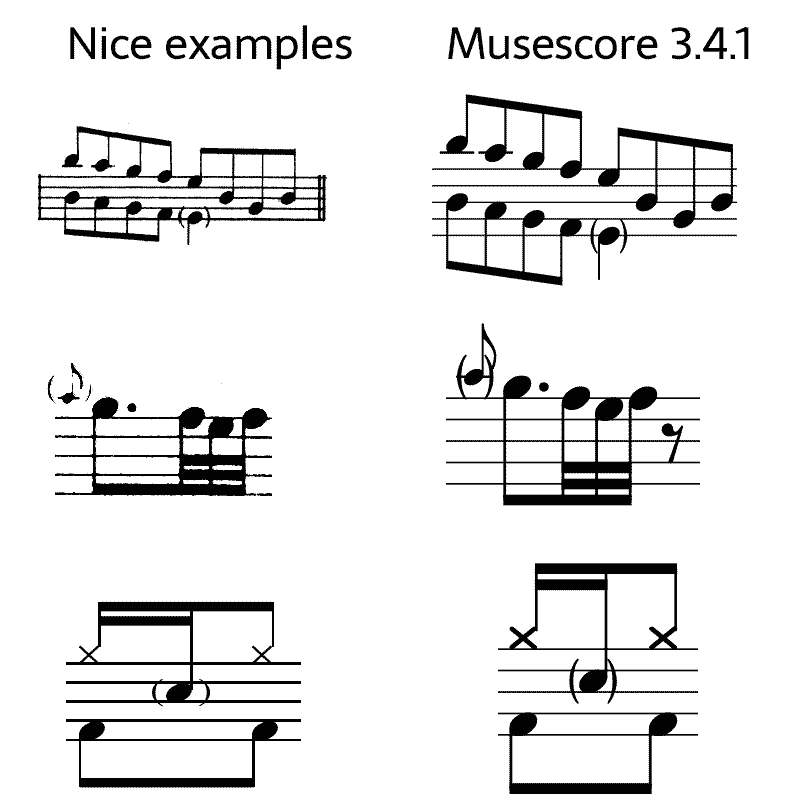
Compare the nice typeset examples on the left with the Musescore output in the attached image. In all these examples, the engraved version is more rounded, more lightweight (there is more contrast between the end and middle thickness), shorter in height, and further away from the note in question.
Can we improve the quality of ghost note appearance?
| Attachment | Size |
|---|---|
| comparison.png | 12.83 KB |
Comments
Feel free to switch to one of the other music fonts available in MuseScore, via Format / Style / Score to see if any of them are more to your liking.
In reply to Feel free to switch to one… by Marc Sabatella
Dear Marc,
I strongly believe that the defaults, using the default font, should look better out of the box. Spacing is not a question of font: it is consistently bad with every font (too tight). Same goes for scaling. It is a placement issue. Do you find that the examples in the attached image on the left differ for the result on the right in more than a font? If a user has to manually adjust every kind of bracket of this type or to change font, changing everything else, as you suggest, it means that the defaults are bad and ought to be improved. Let’s see which way other users prefer.
In reply to Dear Marc, I strongly… by Fifis
My point is that the appearance of these symbols is not really up to MuseScore per se, it's an attribute of the particular font used. So it's kind of like posting to a Microsoft Word forum pointing out that one of the characters in time New Roman doesn't look the way you'd want.
That said, although we didn't create any of these fonts, we do have the ability to make changes to some of them. So if there is indeed widespread agreement that the smaller parentheses would be preferable, we can probably edit Emmentaler at least.
And indeed, appearance of the symbol aside, the position of them is definitely under our control, and clearly, we could do better by default. An issue that has come up before though is disagreement about whether, for instance, accidentals or dots should be encompassed. Another complication is the very fact that the symbol looks different in different fonts, so spacing that is optimized for one font may not work well with enough. In theory, though, this could be a style setting we associate with the font and automatically change when the font changes. We do that for a few other similar settings.
In reply to My point is that the… by Marc Sabatella
Instead of changes, one could implement an option. If fonts support scaling, then... why can’t we scale the parentheses separately? If it is text, then maybe one could add the ‘Text’ section into the ‘Inspector’ panel? Scaling and font size, and even the font itself, could be handled there?
In other words, why don’t these parentheses have the same adjustable text parameters as dynamics and expressions do, despite being text?
In reply to Instead of changes, one… by Fifis
In general, most symbols are designed to be used at a particular size, but indeed for some this is subjective, and there is no obvious reason a scaling factor couldn't be added to the Inspector for that.
Meanwhile, you can certainly add the parentheses as text yourself, and it's not uncommon to do that here and there. I'd use "Fingering" for that, and set a custom text style to prevent the otherwise automatic determination of the optimum position based on piano vs guitar etc. You either use standard parentheses characters, or press F2 while editing the text to get to the Special Character dialog.
You can also add various sizes of parentheses from the Symbols palette. In fact, I'd take that over scaling text. You can also drag them from there your own custom palette. Looks like the small parens are available. You'd still need to position them manually a bit, though.
In reply to In general, most symbols are… by Marc Sabatella
Dear Marc,
![sort-of.png]()
I tried to do as you advised, and at the end of the day, it looks better than before, but... instead of going to ‘Fingering‘, adding a text digit to the left, then adding another, moving it to the right, changing the text, nudging in order to get perfect spacing and ending up with highly custom values... shouldn’t there be a built-in option? It looks like it is almost there: since the parentheses, when added by default, can be treated separately, moved, removed etc., and their automatic positioning to the left-right is quite good, will it be easy to add a new ‘Accidental’ or ‘Notehead’—a pair of customisable text bracket symbols from the text font rather than a rigid, invariable, pre-build special character?
I tried adding custom left or right ones from the ‘Special Character’ dialogue, their alignment was okay, but the size was still slightly off — and this could have been mitigated if an opportunity to align custom text to the left or right of the note existed. The ‘Below’ and ‘Above’ options of guitar fingering are not allowing one to select them to the left or right.
The one in the screenshot is a symbol, not text, and not being able to scale it by a tiny bit is a tad frustrating.
In reply to Dear Marc, I tried to do as… by Fifis
Not sure what you mean about adding digits and all that - once you've added these to your palette, there are no digits, no further need to mess with size. You do it once and you're done. But yes, as I already said, adding scaling to other symbols sounds like a nice enhancement for someday.
The font designers are professional engravers, by the way, so if they think larger parentheses have value, I'm not inclined to argue just because one particular edition you cite happens to use smaller ones. So I'm not convinced there is anything "wrong" with the default size, just doesn't happen to meet your personal preference. I'd need to see a lot more evidence from the literature.
But yes, as I already said, no doubt we could figure out a way to position better by default. But I also mentioned what the complications proved to be with that, which is why we settled for a simple predictable default to use as a basis for manual adjustments.
In reply to Feel free to switch to one… by Marc Sabatella
Your suggestion does not improve the spacing. In the Emmentaler font, they are too large. In Gonville, everything is much worse. In Bravura, the size is OK, but the spacing is too tight.


There is another problem: the user cannot change the size of this element, because, unlike, say, dynamics, they are not defined as text, and their size cannot be changes arbitrarily. A note itself can be made small. Text can be set to an arbitrary point size. However, neither of these opportunities are available for parentheses.
Bravura:
Gonville:
In reply to Your suggestion does not… by Fifis
This is an interesting problem. I think your comments (Marc) about font designers miss the point: they designed the brackets as part of a text font. Properly speaking brackets to go around notes (or other symbols like accidentals) should be designed as part of the music (symbol) "font". After all, a slur is just a bracket put through some extra transformations, and you would not expect to see Times Roman slurs looking different from Bodoni slurs (there's a thought!)...
I was just looking at one of my typography books (Betty Binns), talking about how the "point size" simply does not directly relate to the size of the letters and symbols, so you cannot convert from note size in 'sp' to font size in 'pt' and expect perfection. Whereas, brackets designed just as slurs are would be made to fit the note size.
In reply to This is an interesting… by Imaginatorium
Actually, no, music fonts are designed first as music fonts. Apparently the professional engravers who designed those fonts do prefer larger parentheses around notes.
Slurs are not font symbols because they need to be sized and shaped individiually. So rather than using a font symbol, they are drawn as graphics, using Bezier curves and so forth.
Music fonts are designed so that symbols should display at the proper size when set to 20 pt. Everything is then scaled accordingly.
In reply to Actually, no, music fonts… by Marc Sabatella
The font immediately above is labelled "Gonville". Are you saying this is the "Gonville music font" designed by an otherwise competent person, who thought that brackets extending over an approximate vertical range of 2sp were appropriate to mark a single note??
In reply to The font immediately above… by Imaginatorium
I can't speak for that designer in particular - more about Emmentaler and Bravura. But Gonville is indeed a music font.
In reply to Actually, no, music fonts… by Marc Sabatella
Incidentally, you do realise, I suppose, that brackets are also "drawn as graphics, using Bezier curves" (not sure what the so forth would be). And the letter "P".
In reply to Incidentally, you do realise… by Imaginatorium
Not in the same sense at all. MuseScore doesn't draw brackets as Bezier curves, nor does it draw the letter "P" that way. We have no knowledge of the shape of those symbols. We simply ask the font subsystem to draw those characters for us. Only slurs, ties, and other symbols designed to be resizable get calculated and drawn directly by MuseScore.
In reply to Not in the same sense at all… by Marc Sabatella
I think it's worth exploring the possibility of having MuseScore draw parentheses the same way it draws slurs and ties instead of asking the font subsystem to do so. That way the parentheses can be sized and shaped perfectly in every context.
In reply to Your suggestion does not… by Fifis
For Bravura('s too tight spacing of those parentheses) you can open an issue at https://github.com/steinbergmedia/bravura/issues
In reply to For Bravura you can open an… by Jojo-Schmitz
I think the spacing is ours. I mean, Bravura might specify a default position to draw the symbol relative to the "cursor location" (origin?), but it's up to us to set that.
In reply to I think the spacing is ours… by Marc Sabatella
Hmm, I thought about kerning info in the Musical Text font I guess
Isn't this about what you want? If you were to ask Simon Tatham, who I expect went to Gonville and Caius College, and who describes himself as a software engineer and free-software author, I think it is extremely unlikely he would say "Well, I'm a professional music font designer, so you can't question it". (Actually I very much doubt if there is enough music font designing in the world to support even one person fulltime for a lifetime.) It's more likely that parentheses are copied from a text font, and applied, somehow. And it is not clear that there is a single "somehow" that would cover all cases.
In a text font of a given size, the parentheses are designed to match the text font, using a standard size, whether the text is capital or lower case, with or without ascenders and descenders. So (COW), (dog), and (ram) all look fine. But in music it is not reasonable to expect the same size to fill all purposes. For example, accidental are of height about 2sp, and you would expect the brackets to be at least 2sp high. But to mark a single note in a dense chord, this is obviously unsuitable.
Perhaps someone here can explain the relation between the actual music font size (i.e. sp), and the nominal font size of the parentheses as part of a text font.
In reply to Isn't this about what you… by Imaginatorium
The font is based on Gonville, but got substantially modified by Grzegorz Pruchniakowski alias Gootector, see also https://musescore.org/en/node/18773 (one post I found in a quick search)
More found via https://musescore.org/en/search/content?keys=gootville
In reply to The font is based on … by Jojo-Schmitz
Quote: 2.1.3. Brackets! - only... 575 brackets :D
I wonder what that means?
In reply to Quote: 2.1.3. Brackets! -… by Imaginatorium
Sorry, confusion with American: it doesn't really mean parentheses.