Continuous view needs space for lyrics
Reported version
3.0
Type
Graphical (UI)
Frequency
Once
Severity
S5 - Suggestion
Reproducibility
Always
Status
duplicate
Regression
Yes
Workaround
Yes
Project
1) MS file created in MS2 (see attached)
2) File opened in MS3, with "reset to default" clicked on import.
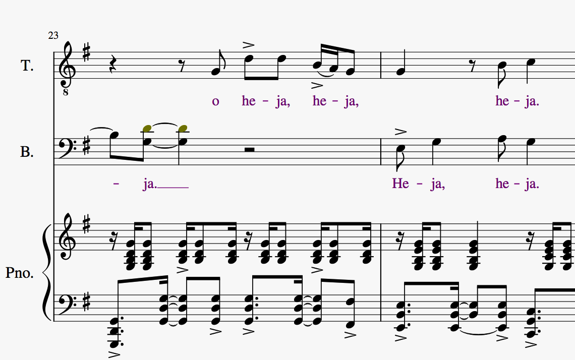
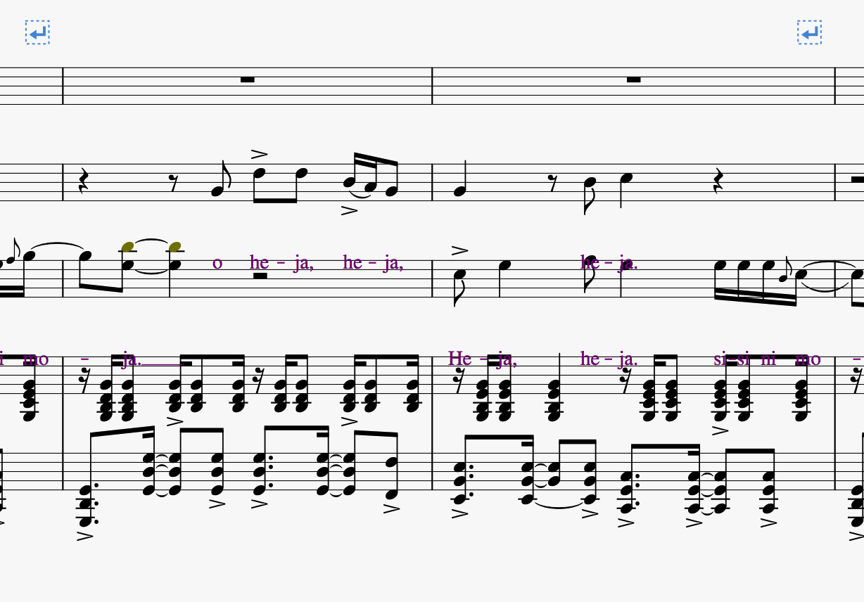
3) MS3 shows lyrics correctly in Page View
4) Continuous view shows lyrics super-imposed on measures of the next lower stave. (see attached screenshots)
(MS2 displays lyrics properly in both views.)
| Attachment | Size |
|---|---|
| Page view.png | 90.86 KB |
| Continuous view.png | 99.64 KB |
| Sisi Ni Moja TBB.mscz | 57.79 KB |
Comments
I also have this issue - driving me nuts
I'm changing this to a suggestion since it's actually by design, and a mistake in my opinion. To work around this use a spacer, from the breaks and spacers palette, to allow space for the lyrics. You only need one for each staff in continuous view, and I suggest that you put them in the first measure so it will be easy to see all of them at once. After you have entered the lyrics and the staff below them, you can delete the spacer(s).
In reply to I'm changing this to a… by mike320
Mike,
Can someone explain why MS3 is "designed" to necessitate the extra steps you describe, just to make the score appear properly in Continuous View?
The design decision was that there would be minimal formatting accomplished in continuous view. I almost always work in continuous view, so I'm not happy with the decision that items from staves would crash rather than allocating more space between them in continuous view for items such as lyrics.
This discussion was made during development and I indicated my dislike at the time and it wasn't changed. If enough people indicate it's a problem, then perhaps Anatoly-os will change his mind to please us users.
By the way, I have been adjusting my workflow the last few days to get accustomed to using page view, and I'm getting used to it, though I would prefer to use continuous view.
Changed the name for the suggestion and indicated it is a regression (worked this way in version 2.x) and there is a workaround.
I find Continuous View indispensable for working with long scores prior to paginating them. Was it the aim of Anatoly-os to have users revert to Finale or Sibelius, where Continuous View is not "crippled" like MS3?
In reply to I find Continuous View… by tomfeledy
I suspect the motivation was to make continuous view respond faster. There has been a lot of talk among the programmers how to make this happen.
Though I'm not happy with the decision, I don't think continuous view is crippled. Adding a spacer is not complicated, and deleting them all at once is also simple. Right click one and choose select>all similar items, then press delete. It's not worth a few hundred dollars to me for this process to be automated.
Pretty sure speed is indeed one big reason. Page view has a nice optimization where we only update the layout of systems that have changed, but since continuous view is one long system, that doesn't help.
But also, consider, what if only one system in page view had 10 lines of lyrics, or whatever else might cause lots of extra space between those staves (remember, in MuseScore 3, lyrics are not the only thing that can automatically add space). In page view, that's fine, you have one system larger than the others, but in continuous view, do you really want the entire score to suffer because of those few measures?
Now, either of these problems could be solved if we applied a "current view" optimization similar to what I described for "current system" in page view, where we relayout and apply system spacing only for the measures actually in view. But that's actually rather more complicated, since a system is a pretty significant element in MuseScore that kind of needs to be handled all at once.
To me, a possibly simpler solution is a new kind of spacer that is only active in continuous view, so you can choose how much extra space you want in continuous view - just enough for the lyrics on the "average" measure, say, and then not worry about the few measures that need more. Or just go all the way and make them as big as you need. Not ideal, to be sure, but it beats adding them then deleting them.
In reply to Pretty sure speed is indeed… by Marc Sabatella
Hi All, I don't mind how it's done, but I am still on 2.3.2 because of this issue. Hoping someone will sort this soon, as students keep installing version 3 and I have to tell them to roll back to rehearse their tracks! I am sure I am not the only one!
While I agree it will nice to improve this, I don't understand why this should prevent your students from using taking advantage of the tremendous improvemMuseScore 3? If they don't mind using page view, or needing to manually add spacers occasionally if they choose to use continuous view, why should that affect anyone else? You can have both 2.3.2 and 3.0 installed simultaneously if you are concerned you won't be able to review their work.
Anyhow, I do have an implementation of a facility where spacers could be added in continuous view that would only affect continuous view. So if you add space there to make working in continuous view more comfortable, it won't mess up the actual score in page view. Drawback is that if you want to edit that spacer later, you have to find it first - you may not remember what measure you attached it to. So I'm thinking what might be better is to resurrect the "Shift+drag" mechanism we used to have as a shortcut for modifying the "extra distance above staff" setting, and instead use that to add the extra space in continuous view. Same idea, the space would be ignored in page view.
better is to resurrect the "Shift+drag" mechanism...the space would be ignored in page view
Excellent idea.
In reply to While I agree it will nice… by Marc Sabatella
After watching you talk about this in the MuseScore café I was wondering whether it might make sense for Continuous View to take some account of system or page breaks as a way of handling the issue where opening up space for lyrics for a few measures in one part of the score has rather severe and undesirable side-effects for the rest. At the moment, if I understand aright, system or page breaks are just ignored in this context. If a lot of space has been opened up for lyrics might it be possible for the opening up of that space to be cancelled / reset after a page or system break.
That's the basic idea. On the whole, you don't expect the things that continuous view is good for avoiding - again, as illustrated in the café - are going to come up where you have put in system break. But maybe that won't the case all the time. So if the idea has merit at all, it might need to be developed a bit. A variant approach might be offer the option of a "soft system break", the whole function of which would be to create a little gap between one part of a score and and another in continuous view. Such a break might be a no op in Page View just as "hard system break" is a no op in continuous view. That said, maybe introducing a new kind of break for this issue would be overkill.
That's an interesting idea! I think one drawback of that type of approach - I had also thought about just looking at the measures currently in view - is that it means the staff spacing doesn't stay constantly as you scroll. I think people would find this extremely disorienting (I know I would).
Another thing that occurs to me. I had wondered why people didn't complain in 2.x about having way too much space between staves through their score just because one measure needed it. Maybe it's because in 2.x, only lyrics and fret diagrams (?) could cause this behavior automatically . In other cases you needed spacers, so you had some control over whether space was added. I don't know. I don't use continuous view enough to have a really good sense of the workflow. But reverting to the 2.x behavior is certainly a possibility. We could still implement Shift+drag or similar overrides. What I don't know is how going back to automatic spacing is given the "partial layout" we are now doing for performance reasons - it's possible this will slow things down significantly. But it may still be a win overall.
why people didn't complain in 2.x about having way too much space
I didn't complain in version 2 because I had to go back and enter spacers into the page view score any way. If I needed to enter a spacer in continuous view, it would normally be useful in the same spot in page view. I wouldn't need to move it unless I wanted all of my spacers in the first measure of the system. In version 3 the only spacer I normally find useful in page view is the one that lets you set the staff distance because auto placement got over zealous in spacing. All others would need deleting, which really isn't a big problem. Going back and deleting all of the spacers I entered in continuous view is outside of my normal workflow though.
There is another option that's missing in version 3. You can't put custom spacers in the Breaks and Spacers palette, so you must adjust every spacer if you don't want it to be exactly 3 spaces tall. If I continually made 4 verse songs, I would know the size of the spacer I need and in version 2 I would have ctrl+shift+dragged it to my custom palette, this isn't an option in version 3. I actually had 1, 2 & 4 space spacers in my palette and I would use the proper one rather than adjusting most spacers.
Right, but in page view, the spacer you added would be there for just that one system. In continuous view, you don't need that extra space for the entire score, and yet you get it. Which I guess people are just OK with?
And yes, I remember you mentioning the palette issue a while ago. It's #279117: Cannot add custom lines spacers to custom palette. The discussion morphed into one about the actual behavior of the up spacer, and as I just noted, I changed this some time ago. See #283365: Staff spacer up need to "invade" the top line of the upper staff in order to start inserting space.
I tend to agree with you that the staves moving up and down as you scroll left and right if continuous view automatically updated the space between staves isn't good. For that reason, I was always quite happy to see a consistent amount of space between staves in version 2. In version 2, on the rare occasion the space was ridiculous for most of the score, I would later find the offending spacer and replace it with one that was more reasonable for the rest of the score.
Duplicate of #276141: Space is not made for multiple verses in continuous view
The problem is that MuseScore is now moving the lyrics lower to avoid the hairpins that are below the staff. Simply select all hairpins on the vocal staves, set them to Above in the Inspector, and the lyrics move back to a more reasonable position. Or, since in your original you had actualy set all the hairpins above via the offset in the style setting, just go to Format / Style / Hairpins and set the default placement above.
It's still the case no extra space is allocated when in continuous view, but that's the issue being discussed in #276141: Space is not made for multiple verses in continuous view, so please keep that discussion there.
Now, as to why the hairpins ended up below the staff on import even after answering "no" to the reset question, that's another matter, worth filing as a separate issue. It has nothing to do with continuous view or lyrics - just a simple matter of hairpins that were placed above the staff via a style setting not being recognized as such on import. In general, that's supposed to work, and does for hairpins that were placed above the staff manually But not, apparently, if the change was made globally via style setting.
Just wanted to hop in to say that this has been driving me NUTS! I am really regretting downloading - I only did it because someone sent me a score that was written with version 3 so I couldn't open it with the old one. I shouldn't have deleted the old one! It worked perfectly for all my needs - I had ZERO complaints! I don't need a ton of space - I only want one line of lyrics below each staff. That isn't too much to ask. The old version just did it for me. At the very least I could move the lyrics manually. Now they're just stuck and obstructing my view and distracting me from working.
If it's true that a lot of complaints might lead to a fix, I wanted to throw my complaint in,
It surely won't help here, as this is closed as a duplicate
In reply to It surely won't help here,… by Jojo-Schmitz
Where is the active thread for Hannah to post her complaint?
In reply to Just wanted to hop in to say… by Hannah Friedman
Hannah,
I continue to use version 2 for this reason. I consider version 3 unnecessary for my needs. Perhaps you can drag the version 2 installer out of your trash and reinstall it. The two versions exist side by side on my Mac. On Windows I've only had v2 installed, so I don't know what v3 would do if installed there.
-Tom
scroll up to see the link...