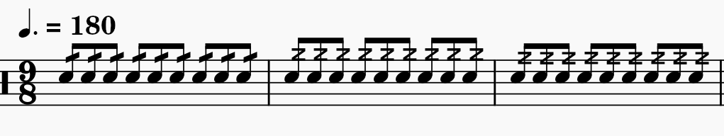
Z Tremolo Marking Higher than Other Tremolo markings
When putting in the Z tremolo marking the new 3.6 font puts it at a height higher than the other tremolo markings making it inconsistent with the other stem heights which makes it look off. This becomes a problem when engraving drumline music where the single tremolo and Z are used commonly, and sometimes right next to each other.

Showing from left to right the stock single tremolo, the stock Z tremolo, and my modified Z tremolo.
Is there anyway to make my offset to the marking default?
| Attachment | Size |
|---|---|
| Musescore suggestion.PNG | 15.07 KB |
Comments
That's not a difference in 3.6, same thing happens in 3.5(.2) too (with Emmentaler), so defininitly not a matter of the new font Leland. It happens with all fonts actually. Just maybe to a slightly lesser extent