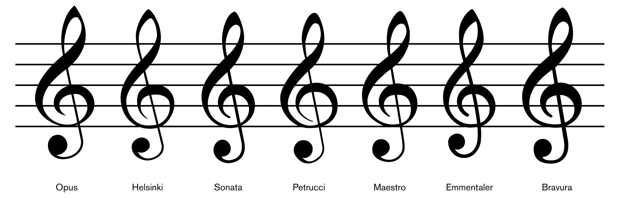
MuseScore makes the Bravura treble clef too small
I've come to really like Bravura in MuseScore 2. The only thing about it I felt was a little less than perfect for my tastes was that the treble clef seemed small.

But just now I was reading about the font at http://blog.steinberg.net/2013/05/introducing-bravura-music-font/, and noticed something—the examples posted and linked to in the post don't look quite the same as Bravura does in MuseScore. In fact, it looked larger.

(Bravura is on the far right in this example from http://blog.steinberg.net/wp-content/uploads/2013/05/g-clefs-comp.png.)
It wasn't just the way it was displayed in that particular comparison, either. MuseScore's friendly rival LilyPond supports Bravura (which they call Profondo). In the middle of the second page of http://lilypondblog.org/wp-content/uploads/2014/09/font-sampler-all-fon…, they demonstrate it. It's quite unmistakeable. MuseScore definitely does make the Bravura treble clef too small.
What to do about it?
Oh, and I'm not sure, but I think it's only the treble clef. The bass clef seems the same size.
Comments
That post is a couple of years old; that image was produced using a very early draft of the font. I don't see any particular to assume they didn't simply change the glyph since then. Do you have evidence to the contrary? MuseScore doesn't normally scale the glyphs that I know of, so it's pretty much what we see is what you get.
EDIT: see this post, which shows the clef in Bravura in LilyPond looking more like it does in MuseScore 2.0:
http://lilypondblog.org/2014/02/feta-and-bravura/
EDIT: more curiously, see the image at the top of the originally posted Steinberg blog, with the big close-up diagram of the treble clef glyph:
Sure looks like this was the intent, but perhaps the comparison later on - which may have been created in Sibelius, like the "Lento" excerpt above it - is off. Perhaps because Sibelius was not interpreting the brand new font correctly.
Would be good to understand for sure, but at this point, all signs do seem to be pointing to. we are displaying this correctly.
What a pity. As I said, it felt small to me, and I really liked the look of those larger examples. The one at the top of the blog post looked to me like the blue lines—horizontal, vertical, and diagonal—had been added to an image of the clef by itself, and didn't necessarily reflect how it should be positioned in context. But I'll accept that this is the way it is.
Well, to me to the inconsistency between the examples is noteworthy enough that I still wonder what is going on. Would be nice to know for sure.
What's the current status here ? We can't do much about it I'm afraid. It would be a bug in MuseScore if we would display the clef smaller than defined in the font, but I guess it's not the case ?
I guess probably close as "by design."