Improve the position of the cursor after a barline.
I vividly remember when entering notes with the mouse in the first Nigthlies some months back.
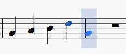
To entry the first note, near a first barline, I had a sentiment, with the cursor (entry notes area) of a lack of space, really. As if one were to paste the note at the barline for succeed. This done:

I was really surprised and bugged by this.
The cursor begins on the end ot the previous measure, extend about the barline, and finally on the beginning of the next measure (the measure of entry notes). This is the issue, I think.
For those using the keyboard, the problem is probably not very sensitive. But for all the others (including beginners), I think it's a downer.
Especially after working with 1.3, where the cursor is clearly positioned after the barline.

I had learned to live with, but I really think now it would be a nice improvement, right?
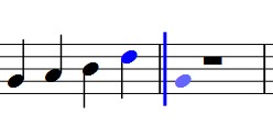
(to achieve this expected result, I simply shifted the barline a little to the left)

Of course, I do not know if this would have negative implications on other areas (layout, other?) Thanks to tell me. But I strongly hope that not! :)
| Attachment | Size |
|---|---|
| cursor nigthly.jpg | 6.28 KB |
| cursor 1 et 3.jpg | 6.31 KB |
| expected.jpg | 6.33 KB |
Comments
I'm not sure I understand why this is a problem, even for beginners or mouse-users. After all, it's not like you have to actually click within the box in order to enter a note by clicking. I think the idea is that it is centering the box around the position where the note will be entered, and this happens to extend a little to the left.
However, the fact that the "ghost" note shows up directly against the bar line does suggest a very specific thing that is going on that could be improved. Because the measure is empty, it doesn't *know* where that first note will be positioned - the layout code has nothing to work with. So it puts it right at the very beginning. A very simple improvement would be to add in the Style setting that controls the distance from barline to first note.
If it's that simple, I'll do it. Not sure it's worth spending a lot of time on if it turns out to be more complicated, though.
Well, it *does* look like it is that easy, so:
https://github.com/musescore/MuseScore/pull/1178
Fixed in e6121a9010
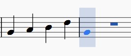
The cursor is in a better position. Thanks :) But the "ghost note" is always "pasted" to the barline.

One would expect that this ghost note may be centered in the "box":
- as is already the case for the other beats : 2, or 3 etc.
- or in Tab staff

- close a clef :
I leave it to you to closed the feature request if you think that improvement is not possible easily. Thanks.
fixed in 5785896bf
Thanks Marc!
Does look nicer, for sure - thanks for pointing it out. I'm all in favor of removing as many of these little annoyances as we can. Would be a shame for things like that to spoil the impression.
It was indeed a pretty minor thing, but had a quite annoying and irritating touch to it, so great it is fixed
Wow...looks very fine now !
Yes, thanks Marc:)
I was really convinced it was a nice appearance improvement in the entry notes process (of the first note after the barline of course). Really better. In fact, just perfect! :)
And I note that I was not alone in thinking this way;)
Automatically closed -- issue fixed for 2 weeks with no activity.