Polices de caractères compatibles lors des uploads de partitions Musescore
Bonjour.
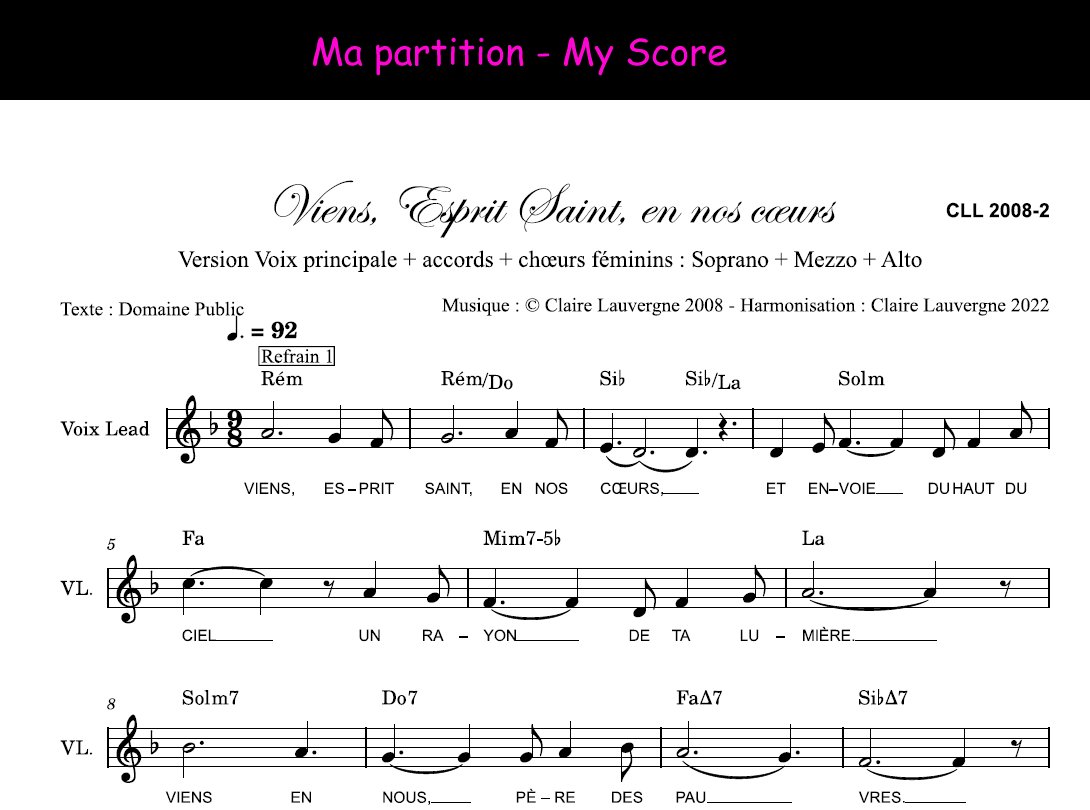
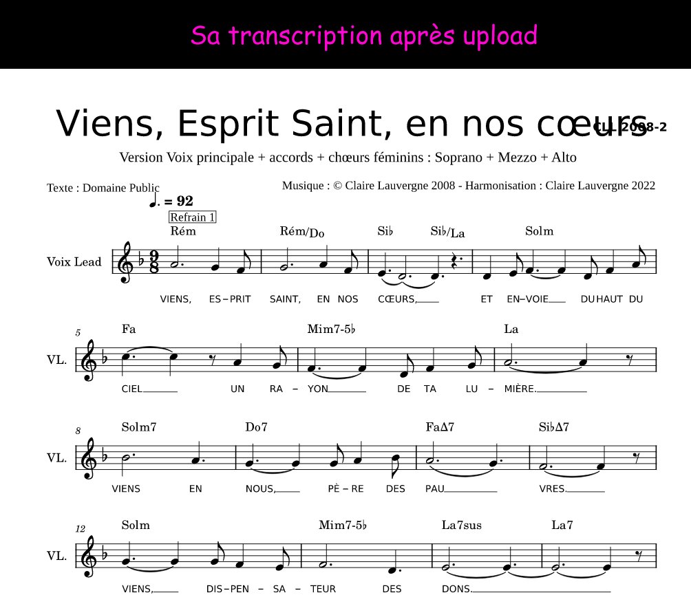
Quand je tape mes partitions, j'utilise pour le titre une police de caractères assez courante appelée Edwardian Script. Mais quand j'uploade la partition pour la publier, cette police est remplacée par une autre, qui ne prend pas le même espace et, soit déborde de la page, soit empiète sur le nom de l'auteur et du compositeur.
Je voudrais savoir si :
1) Il vous serait possible d'ajouter Edwardian Script aux polices utilisables, afin que quand j'uploade mes partitions, elle ne soit pas remplacée par une autre police.
Et à défaut :
2) Quel choix de polices je peux avoir pour mes titres, en l'absence d'Edwardian Script. Je voudrais une police chic si possible dans le style cursive.
Merci d'avance pour votre aide.
Claire Lauvergne.
| Attachment | Size |
|---|---|
| 220804ProblemePoliceTitre1.jpg | 106.34 KB |
| 220804ProblemePoliceTitre2.jpg | 114.46 KB |
Comments
Musescore.com doesn't have all fonts available that this planet has to offer.
In reply to Musescore.com doesn't have… by Jojo-Schmitz
Please instead of laughing at me and being derogatory, Jojo, please answer my question: what font can I use for my titles so that my scores don't get defaced when I upload them ? Where can I find the list of usable fonts? I thank you in advance. Si c'est pour vous payer ma tête, inutile de répondre ! Quelle condescendance ! De plus, Edwardian Script est une police très courante.
In reply to Please instead of laughing… by Claire Lauvergne
I'm not laughing at you and were not derogatory at all. Just stating facts. Sorry if it came across as that.
If you need to know what fonts are available on musescore.com, please ask there, not here on musescore.org. and don't ask in French in an English Forum when a French forum is available.
In reply to I'm not laughing at you at… by Jojo-Schmitz
Alright Joe. But precisely: I first asked the question on musescore.com, and they answered me this, with musescore.org links:
Paula (MuseScore)
"4 août 2022, 15:14 UTC+2
Hello,
Thank you for reaching out to us.
We provide support for the free notation software via the Musescore forums.
You can report an issue or ask a question here.
Feature requests can be posted in this thread.
You can find the full list of the forum threads here.
So please repost your message in the forums and members of our community or our developers will help you out.
Looking forward to seeing you in our forums!
Best regards,
MuseScore Support team
Paula"
It makes me think of the French administrative services which always refer to another service (see: Asterix Gladiateur), which is why I honestly have the impression that people are making fun of me.
Thank you for answering me and have a nice day.
In reply to Alright Joe. But precisely:… by Claire Lauvergne
This is unfortunately not the first time they get this entirely wrong. Your question is about musescore.com and about that only, nobody here on musescore.org can answer that question.
In reply to This is unfortunately not… by Jojo-Schmitz
Thanks, Jojo.
If I use the web safe fonts (see their list in my answer to Marc), maybe it should work.
In reply to Please instead of laughing… by Claire Lauvergne
I recommend sticking to the defaults. Those are the only fonts that not only musescore.com but every single system on which someone might choose to download your score will be guaranteed to have. Any font not actually included with MuseScore is a font that someone who might want to view your score won't have,
In reply to I recommend sticking to the… by Marc Sabatella
Thank you, Mark, for answering to me. But the default fonts, like Edwin, are not suitable: they are Serif fonts which are often too large and not legible enough because of their Serif character for the lyrics or for the chords. I replace them with Arial. For informations, like subtitle, composer name and copyrights, I use times new roman. And for the titles, I would like to find a pretty one. You wouldn't have an idea? I publish a lot of scores elsewhere on the internet (often with Harmony Assistant from Myriad Software, a French company) and all of them have a title in Edwardian Script, lyrics in Arial etc. My layouts allow me to immediately recognize that these are my scores. I started musescore because an app for which I type sheet music requires files in this format. So, unfortunately, your answer does not help me.
I'm taking computer classes and I have a list of fonts that are supposed to read on all browsers :
Web Safe Fonts
So it is among these fonts that I have to choose mine so that my scores are not disfigured during the upload ? Some of they are cursive. However Edwin does not figure there.
Have a good day.
In reply to Thank you, Mark, for… by Claire Lauvergne
See on musescore.com : https://musescore.com/groups/improving-musescore-com/discuss/5082661
De mémoire (et sous réserve), dans votre liste, les polices Arial, Verdana, Trebuchet, Times New Roman, Courier, sont supportées sur musecore.com. Peut-être aussi Tahoma, Georgia, Comic Sans (à vérifier) et il me semble également (toujours de mémoire), les Google Fonts
In reply to Thank you, Mark, for… by Claire Lauvergne
Edwin and FreeSerif are built into MuseScore, so save to use too. As far as I remember most or even all Google fonts are available on musescore.com.
In reply to Edwin and FreeSerif are… by Jojo-Schmitz
Merci Jojo. Je ne connaissais pas l'existence des google fonts. J'essaierai cela dès cet après-midi sur une partition. Je voudrais également essayer de coupler les partitions publiées avec certaines vidéos de ma chaîne Youtube, mais je n'ai pas encore bien compris comment cela fonctionne. Avant de m'y mettre, je voulais m'assurer que les partitions apparaissent correctement une fois que je les ai uplaodées.
In reply to Thank you, Mark, for… by Claire Lauvergne
Legibility is in the eye of the behold of course, but be sure you are not assuming your own personal bias towards sans-serif fonts applies to the people reading your score. There are reasons why virtually all published music uses serif fonts for lyrics and most other text. To be honest, I could tell you what they are (!), but in any case, it's what people are accustomed to. So simply by looking different from what people are used to, music using sans-serif fonts runs the risk of looking less readable, independent of whether or not there are studies that show sans-serif fonts truly are more readable in general.
But that said, if you are positive that your own readers also prefer sans-serif fonts, then FreeSans is the one obvious choice if you want to maximize compatibility, since it is provided by MuseScore and is thus available to everyone who might view your score.
The fonts you list above might be supported within web browsers, but that doesn't mean they are available to users on their own computers, and it doesn't mean they are available for scores on musescore.com, since they are actually pre-rendered by software on the server and are not actually using web fonts at all. I don't have most of those fonts on my system, for instance (Linux). So if I downloaded your score, those fonts would be replaced with some default that probably would not be what you want.
For titles specifically, it is of course traditional to use more "decorative" fonts. Here, I recommend a compromise - add the real title in text (so it is accessible to blind musicians using screen readers) but make it invisible, then add your fancy version as an image (so it looks the same on all systems).
In reply to Legibility is in the eye of… by Marc Sabatella
Re-bonjour Marc.
Vous avez l'habitude des partitions en langue anglaise. Moi, je tape des partitions de chants liturgiques en français, et la plupart des partitions de chants liturgiques en français utilisent des polices sans serif pour les paroles. ( Visitez par exemple les sites officiels chantonseneglise.com ou http://chants.ilestvivant.com/ ou encore mon site chantsdeglise.fr )
Une amie informaticienne me recommandait aussi le sans serif pour la lisibilité dans mes sites web. Maintenant que je vieillis et que ma vue n'est plus aussi bonne, je remarque que je lis bien mieux les polices sans serif : pour la même taille, elles sont plus grosses. En plus, en français, nous avons des accents, des cédilles, qui compliquent encore la lecture. Les chorales paroissiales sont souvent composées de personnes âgées, pour qui les polices sans serif sont plus lisibles, pour les mêmes raisons.
J'ai beaucoup de choses à apprendre avec Musescore encore, bien que je me sois inscrite à la formation Mastering Musescore School en français et pratique depuis un an. La solution de remplacer le titre par une image me plaît, mais il faut que j'apprenne la technique. En html, on utilise un texte descriptif pour les images, je me demandais si ça ne pouvait pas fonctionner ainsi avec Musescore : pour le référencement, le texte remplace l'image.
Mais pour le moment, je suis contente de la police de remplacement Montecarlo (voir fichier joint), qui fait partie des Google Fonts, dont Jojo-Schmitz m'a appris l'existence aujourd'hui. Je remarque que celle-ci est bien transcrite, du moins dans mes navigateurs, lorsque j'uploade mes partitions.
Maintenant, je souhaite apprendre à synchroniser une partition uploadée avec mes vidéos Youtube, ou avec des fichiers audio que j'enregistre.
Je vous remercie pour tous les renseignements. À moi de travailler maintenant.
Je vous souhaite, ainsi qu'à Jojo-Schmitz, un excellent week-end.
Ou alors, est-il possible de transformer le titre en image ?
In reply to Ou alors, est-il possible de… by Claire Lauvergne
Yes, using the image capture tool
In reply to Yes, using the image capture… by Jojo-Schmitz
Merci pour tout, Jojo-Schmitz. Vous pouvez regarder la réponse que je viens de faire à Marc pour plus de détails. Visiblement, les normes de polices pour les partitions anglophones diffèrent de celles des partitions francophones.