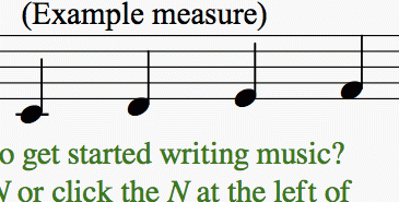
Score sizes distorted in MuseScore display and exported PDF/print
This might have something to do with #68006: Some palettes, eg clefs palette, have a poor rendering . It's particularly obvious using Bravura, because of the difference in the size of the note heads. A simple way to observe the problem is to take any score (I tested with this one ), go to Syle -> General… and switch the music font to Bravura, and open and view it in both 2.0.1 and the latest nightly (b52f6b2). Zoom in and compare. You can also export as a PDF (I've attached examples).
Note that the spacing also changes, which is why the "(Example measure)" text in the GIF here moves also.

| Attachment | Size |
|---|---|
| Getting_Started-2.0.1.pdf | 1.38 MB |
| Getting_Started-Nightly.pdf | 1.43 MB |
Comments
I see the difference in your two PDF files, and of course in the GIF, but to me, it looks like the noteheads were actually too big before, and now they are corrected.
I tried backing out the change for #68006: Some palettes, eg clefs palette, have a poor rendering and don't see any difference. I suspect the change here is actually due to the change to freetype for font rendering, which happened a coupe of months ago, and that this is indeed a change for the better. Font rendering used to be more system-dependent but should be more consistent now. Your current PDF and what I see are quite similar, where what you show as normal for 2.0.1 on your system looks pretty far off.
But I don't know how these glyphs are *supposed* to look here. Your 2.0.1 image looks clearly too big - see how the "F" in the first measure is actually larger than the staff space? The current version, on the other hand, is perhaps ever so slightly too small, at least with Bravura.
I could have sworn that I saw a forum topic a while back that asked that question—something like "Aren't the note heads too big for the staff spaces?"—and the answer was "No, they're supposed to be a little bit larger so it's easier to read." I'll have to spend some time searching for it.
Bravura is not a good example to compare any rendering. Especially the noteheads.
MuseScore 2.0.1 used Bravura 1.12. Here is the changelog https://github.com/musescore/MuseScore/blob/v2.0.1/fonts/bravura/FONTLO…
MuseScore nightly are currently using Bravura 1.18. In between the noteheads in Bravura have been made smaller. See https://github.com/musescore/MuseScore/blob/master/fonts/bravura/FONTLO…
So if this is the only thing you see as "distorted", it's the expected behavior.
Actually, the exact same thing happens with Emmentaler—only the difference is a lot more noticeable in Bravura. I guess I can put the "a lot more noticeable" down to that change, though (which I'm not a fan of—just saying).
Well, Bravura is not our font; if the designers want the noteheads smaller, that's their business.
With Emmentaler, I take it the difference is more subtle? If so, I will continue to assume it is the result of the freetype implementation that was merged shortly after 2.0.1, and that the change may have made certain glyphs appear larger, others smaller, and the specifics depend on your specific system, but the bottom line should be that things are more consistent between systems now.
Still would be nice to see evicence confirming this, so until then I think we should leave this open, but it definitely "needs info" before we can even begin to think this change is a bug rather than a fix.
It turns out that with Emmentaler it really is a change in MuseScore's display only, and the output is identical—or almost identical. The fact is that there is one single difference—the distance between the time signature and the first note. This changes slightly the spacing for the whole first line, which is why the "(Example measure)" text was moving (attached to the first line) but the "o get started writing music?" text (attached to the second line) was not. I'm ready to mark this issue as "closed", but I still "need info" on why that distance is changing.
I don't know of any changes that are directly relevant. The value of the setting "Style / General / Measure / Clef/key right margin" hasn't changed, not has any of the code I see that deals with it. I guess it's possible that the freetype change somehow affected this calculation. Maybe the width of the time signature itself comes out differently?
No! I refuse to believe that the intention is for Bravura to look like this:
![Screen Shot.png Screen Shot.png]()
After all that talk about how Bravura is meant to be a bold, classical, legible music font, this cannot possibly be right. If this is really what it looks like in the latest version of the font, then I need to contact Daniel Spreadbury and point this out to him, because he made a mistake.
From what I can see, it looks like the noteheads placed in a space go exactly from the mid-point of one staff line to the mid-point of the next staffline. Whereas in Emmentaler, they go from the bottom of one staff line to the top of the the other - clearly a bit bigger. I have no insight into who is right or wrong, but that's what I am seeing.
The only thing I am quite, quite certain of is that there is not supposed to be space between the note heads in a chord like that.
Closed in favor of #68461: Switch to larger noteheads (ss05) in Bravura for 2.0 and 2.0.1 compatability.