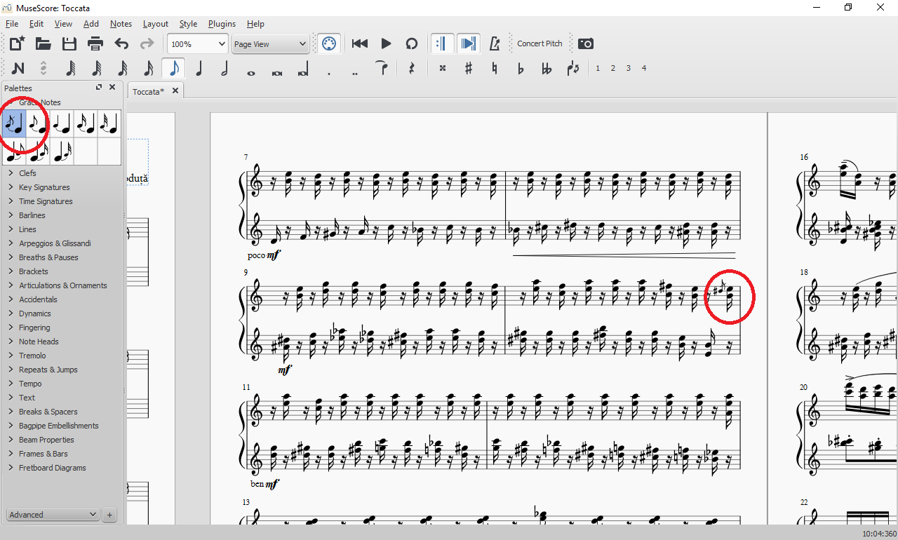
The icon in the screen shot appears fine to me as well. It is true that the icon shows a slur, because slurs do often accompanying grace notes, whereas MsueScore requires you to add the slur manually in your score if you want one. But that isn't a bug - it was just the design choice that was made for the icon.
If you meant something else, please, indeed, elaborate. Otherwise we can close this issue.
That design choice is wrong then, international notation always adds slurs to grace notes, that should be so by default.
And since that decision is in place, why does the icon for grace notes still show a slur if it won't put one in in the end?
At least whatever decision is made, it should be consistent.
Obviously I thought it was a bug since all respectable music notation software do grace notes with slurs, or at least are visually consistent in terms of WYSIWYG.
In Sibelius, the Acciacatura does not have a slur, therefore, WYSIWYG.
In MuseScore, it does have a slur, but when you use it, it doesn't put a slur in.
Why then does the icon have a slur? It's simply misleading.
Ideally we'd have a choice of both, with and without slurs.
The scores I'm digitizing will take me 10 years now with non-slur acciacaturas... (as in, having to manually add the slur for each and every acciacatura and appoggiatura......)
You do have a choice of with or without slurs already. by default, it is added without a slur. if you want a slur, simply press "S" to add one afterwards. BTW, it is not true that "international notation always adds slurs". Some style style guides recommend them so some publishers use them, others don't. it's a personal choice. I think it makes more sense to not add it by default so that those who prefer them can add them. It makes more sense to me than making the rest of users *delete* them, and in any event, I don't like the idea of a single icon adding two totally separate elements to the score (the grace note and the slur).
I agree, though, the icon should probably not show the slur since it isn't added by default. But then, it doesn't add the main note either, and that too is depicted. I think the ucon is simply trying to show some context so you understand what the symbol is - if it literally just showed the grace note and nothing else, it wouldn't be obvious what it was.
There isn't an icon choice of an acciaccatura with a slur.
There is only the choice of one without, the addition of a slur being a separate element.
Again, the best way forward would be two icons, one with and one without the slur, and people will use both as needed.
International notation is consistent, if it shows a slur, it will have a slur.
As for the note the acciaccatura attaches to, no one expects that to be there, it is already understood what the symbol means. But having the slur in the icon is totally confusing.
My point is you *can* add an acciccatura with slur - it just takes two steps. First double click the icon, then press "S" to add the slur. No need to double the number of icons by having separate versions of each with and without slur. But I agree the icon should probably not show the slur.
And WHY would you not want to save users the time it takes to put the slur on by giving them an icon that already has it?
Have you thought of the collective time you would save everyone on the planet using MuseScore if you'd spare them from manually having to do that?
You should see how cars are made by robots, any split-second improvement ends adding up to hours and hours of saved time as the improved operation is repeated over and over.
The problem is, it would save you personally two seconds if you didn't have to press an additional key to get the slur you wanted, but a lot of other people would lose twice as much time pressing [Esc] and then [Delete] to delete the slur they didn't want. Unless you're asking for duplicate grace note palettes, one of which adds notes with slurs and one of which doesn't, which (again) you would maybe find useful but would be bothersome for others. However, it's a good thing you raised the issue, because we've now cut to the real problem: the palette icons show potentially misleading slurs. I'm changing this issue's title with that in mind.
This has of course been the issue all along. With other such issues I've experienced in the past, lead developers would have an eagle's eye for seeing precisely that to begin with. I merely thought it was a bug to begin with due to it's inconsistent behaviour. I never expected the note it would be attaching to to be put there, but I did expect the slur to be.
But, I have already stated that the ideal solution would be separate icons for both options.
Why not have an expert mode for the palette that would be built-in with all of these, as in, with slurs and without slurs, and, hey, we could even add smorzando there and people wouldn't have to waste time finding out how to configure it for themselves manually. Not that your average musician understands MIDI velocity and would know exactly how to even approach implementing smorzando by themselves...
So much for being easy to use for beginners and new users. Not everyone is a developer you know, and not everyone know all the technicality behind MIDI velocity and what would be proper to set up in the inspector. Say I want to create smorzando for myself, where do I even begin, and just how much velocity do I take away from it and then add and then take away again in a sort of a muffled fashion? I wouldn't even know where to look for international velocity standards in the midi format and so on so forth. This is all very discouraging for someone who just wants to write a score and hear it back. Especially when composing.
Okay, well I'm stating that that would not be an ideal solution. How about we double the number of palette icons again, one set with stems pointing up and all of them again with stems pointing down? I think it's a reasonable to have one icon, and a super-duper-easy way to change the result (in this case, hit [X] after entering the grace note).
I'm sorry this is discouraging for someone who just wants to write a score and hear it back. Except that with MuseScore you can write a score and hear it play back. It doesn't sound exactly like a human, but you can get a very close to accurate idea of exactly what it's going to sound like (did you even realize that MuseScore plays notes differently with staccato, marcato, tenuto, and sforzato accent markings?). Which isn't something a composer should need, anyway (can't you write with a pen and paper?). If you're really more focused on getting a synthesized audio recording than creating beautiful, professional sheet music for people to read, you can export a WAV file from MuseScore and tweak it to your heart's content with Audacity
.
Now, is there some consensus that the palette icons should be modified to show grace notes (and large notes) without slurs?
My personal feeling is that a palette element should add a single element only. The grace note icons add grace notes, the slur icons add slurs, the accidental icons add accidentals, etc. To me, it's more logical, more natural, easier for the user to understand, to understand, and keeps the program itself simpler. But it's obviously not a big deal either way.
Comments
Could you elaborate a little? It doesn't quite seem self-explanatory to me. Is it something to do with the slur shown in the icon?
The icon in the screen shot appears fine to me as well. It is true that the icon shows a slur, because slurs do often accompanying grace notes, whereas MsueScore requires you to add the slur manually in your score if you want one. But that isn't a bug - it was just the design choice that was made for the icon.
If you meant something else, please, indeed, elaborate. Otherwise we can close this issue.
The slur is precisely the problem.
That design choice is wrong then, international notation always adds slurs to grace notes, that should be so by default.
And since that decision is in place, why does the icon for grace notes still show a slur if it won't put one in in the end?
At least whatever decision is made, it should be consistent.
Obviously I thought it was a bug since all respectable music notation software do grace notes with slurs, or at least are visually consistent in terms of WYSIWYG.
Sorry, what exactly do you need more info on?
In Sibelius, the Acciacatura does not have a slur, therefore, WYSIWYG.
In MuseScore, it does have a slur, but when you use it, it doesn't put a slur in.
Why then does the icon have a slur? It's simply misleading.
Ideally we'd have a choice of both, with and without slurs.
The scores I'm digitizing will take me 10 years now with non-slur acciacaturas... (as in, having to manually add the slur for each and every acciacatura and appoggiatura......)
You do have a choice of with or without slurs already. by default, it is added without a slur. if you want a slur, simply press "S" to add one afterwards. BTW, it is not true that "international notation always adds slurs". Some style style guides recommend them so some publishers use them, others don't. it's a personal choice. I think it makes more sense to not add it by default so that those who prefer them can add them. It makes more sense to me than making the rest of users *delete* them, and in any event, I don't like the idea of a single icon adding two totally separate elements to the score (the grace note and the slur).
I agree, though, the icon should probably not show the slur since it isn't added by default. But then, it doesn't add the main note either, and that too is depicted. I think the ucon is simply trying to show some context so you understand what the symbol is - if it literally just showed the grace note and nothing else, it wouldn't be obvious what it was.
Sorry, you are missing the point.
There isn't an icon choice of an acciaccatura with a slur.
There is only the choice of one without, the addition of a slur being a separate element.
Again, the best way forward would be two icons, one with and one without the slur, and people will use both as needed.
International notation is consistent, if it shows a slur, it will have a slur.
As for the note the acciaccatura attaches to, no one expects that to be there, it is already understood what the symbol means. But having the slur in the icon is totally confusing.
My point is you *can* add an acciccatura with slur - it just takes two steps. First double click the icon, then press "S" to add the slur. No need to double the number of icons by having separate versions of each with and without slur. But I agree the icon should probably not show the slur.
And WHY would you not want to save users the time it takes to put the slur on by giving them an icon that already has it?
Have you thought of the collective time you would save everyone on the planet using MuseScore if you'd spare them from manually having to do that?
You should see how cars are made by robots, any split-second improvement ends adding up to hours and hours of saved time as the improved operation is repeated over and over.
The problem is, it would save you personally two seconds if you didn't have to press an additional key to get the slur you wanted, but a lot of other people would lose twice as much time pressing [Esc] and then [Delete] to delete the slur they didn't want. Unless you're asking for duplicate grace note palettes, one of which adds notes with slurs and one of which doesn't, which (again) you would maybe find useful but would be bothersome for others. However, it's a good thing you raised the issue, because we've now cut to the real problem: the palette icons show potentially misleading slurs. I'm changing this issue's title with that in mind.
This has of course been the issue all along. With other such issues I've experienced in the past, lead developers would have an eagle's eye for seeing precisely that to begin with. I merely thought it was a bug to begin with due to it's inconsistent behaviour. I never expected the note it would be attaching to to be put there, but I did expect the slur to be.
But, I have already stated that the ideal solution would be separate icons for both options.
Why not have an expert mode for the palette that would be built-in with all of these, as in, with slurs and without slurs, and, hey, we could even add smorzando there and people wouldn't have to waste time finding out how to configure it for themselves manually. Not that your average musician understands MIDI velocity and would know exactly how to even approach implementing smorzando by themselves...
So much for being easy to use for beginners and new users. Not everyone is a developer you know, and not everyone know all the technicality behind MIDI velocity and what would be proper to set up in the inspector. Say I want to create smorzando for myself, where do I even begin, and just how much velocity do I take away from it and then add and then take away again in a sort of a muffled fashion? I wouldn't even know where to look for international velocity standards in the midi format and so on so forth. This is all very discouraging for someone who just wants to write a score and hear it back. Especially when composing.
Okay, well I'm stating that that would not be an ideal solution. How about we double the number of palette icons again, one set with stems pointing up and all of them again with stems pointing down? I think it's a reasonable to have one icon, and a super-duper-easy way to change the result (in this case, hit [X] after entering the grace note).
I'm sorry this is discouraging for someone who just wants to write a score and hear it back. Except that with MuseScore you can write a score and hear it play back. It doesn't sound exactly like a human, but you can get a very close to accurate idea of exactly what it's going to sound like (did you even realize that MuseScore plays notes differently with staccato, marcato, tenuto, and sforzato accent markings?). Which isn't something a composer should need, anyway (can't you write with a pen and paper?). If you're really more focused on getting a synthesized audio recording than creating beautiful, professional sheet music for people to read, you can export a WAV file from MuseScore and tweak it to your heart's content with Audacity .
Now, is there some consensus that the palette icons should be modified to show grace notes (and large notes) without slurs?
My personal feeling is that a palette element should add a single element only. The grace note icons add grace notes, the slur icons add slurs, the accidental icons add accidentals, etc. To me, it's more logical, more natural, easier for the user to understand, to understand, and keeps the program itself simpler. But it's obviously not a big deal either way.