Logic of musescore.org header = ?
I don't really get this:

| Attachment | Size |
|---|---|
| org vs com.png | 60.55 KB |
I don't really get this:
| Attachment | Size |
|---|---|
| org vs com.png | 60.55 KB |
Do you still have an unanswered question? Please log in first to post your question.
Comments
Yup, it does muddy the waters a bit
+1
why do we have any links to a site that refuses customer service to their clients? We get well over ten complaints a month about musescore.com. Then someone has to explain, "blah blah blah." Don't y'all already have enough troubles with me being here?
In reply to why do we have any links to… by Rockhoven
Not that musescore.com has 5 star support but the vast majority of the complaints about them here should say, "I didn't read why I was giving musescore.com my credit card number and now a wish I hadn't..."
Though this is the free site where you get the free software, it is still owned by the people who own musescore.com and com is short for commerce. They are in the money making business and want people to visit musescore.com and WANT to pay them for their services. One more thing, you do use their login to access this site.
I'm inclined to give the consumers the benefit of the doubt. If musescore.com is offering a "free trial" then they should not be charging anything to a consumer's credit card until after the trial period has expired. Also, the failure to give anything short of a full refund upon demand, during the trial period, means that the trial was not free. it is costing these people money.
In reply to I'm inclined to give the… by Rockhoven
.
In reply to Yay! Agree. by [DELETED] 1831606
BSG - Has anyone ever told you that you have beautiful punctuation?
In reply to BSG - Has anyone ever told… by Rockhoven
...
In reply to ... by [DELETED] 1831606
More to the point :)
In reply to More to the point :) by jeetee
A bit redundant. If he wanted to punctuate his punctuation, he could have done it more concisely. A simple '..' would suffice. He overdoes it with '...'.
In reply to A bit redundant. If he… by Rockhoven
'..' ? ! .... :)
In reply to '..' ? ! .... :) by [DELETED] 1831606
Yes, '..' is enough punctuation to punctuate '.'. I think we all get the point.
Jeetee - Did you see what BSG posted before supplanting it with '.'?
In reply to Yes, '..' is enough… by Rockhoven
I had agreed with you, but reading later info by jeetee I decided that doing so unconditionally was too strong. Hardly the end of the world. Yes, I think the situation with the two sites is confusing, feels like a trick, etc etc, and the historical reasons are not-so-interesting to people who are confused. Is that ok?
In reply to I had agreed with you, but… by [DELETED] 1831606
I stand by my original assessment:
"I'm inclined to give the consumers the benefit of the doubt. If musescore.com is offering a "free trial" then they should not be charging anything to a consumer's credit card until after the trial period has expired. Also, the failure to give anything short of a full refund upon demand, during the trial period, means that the trial was not free. it is costing these people money."
Unless the complainers inform me differently. Until then I give the consumer the benefit.
Jeetee, how do you know anything about this?
In reply to I stand by original… by Rockhoven
I agree with every one of these points, including "consumer benefit of the doubt", although my opinion in this matter (as opposed to technical matters) isn't worth a free download.
In reply to I stand by original… by Rockhoven
I already responded to your assessment, which is built on top a big if. Namely musescore.com charging people at the start of the free trail.
I'm quite confident in my reply that they don't.
Why?
Because of the dozen people that complain about such a thing publicly on the forums each year, it turned out that none of them actually subscribed to the free trail. But that they during their order process switched their order from "free trail + 1y at full price" to "1y at reduced price" (which is without a free trail).
So far, the initial statement thus empirically has been invalidated.
Could the order process have been more clear for those users? Perhaps.
All I have here again is my own experience when I ordering for the first time. But when I see two choices side by side and their price differs (with one being about half the cost of the other), then yes, I read what the offer is. And it was in normal regular print, not small hidden letters somewhere linked off page.
Is the refund policy (too) strict?
For those that have the free trail? In my opinion, yes.
For those that never ordered the free trail in the first place? I'm less inclined to say yes in that scenario.
In reply to I already responded to your… by jeetee
For what it's worth, I had to give deployable payment information to a cable content provider yesterday, even though I wanted the month free trial and expect to cancel in that time (I really wanted to see a certain offering), so this is not unheard-of (even though, of course,I didn't like it, but I understand their position).
In reply to I'm inclined to give the… by Rockhoven
> "I'm inclined to give the consumers the benefit of the doubt. If musescore.com is offering a "free trial" then they should not be charging anything to a consumer's credit card until after the trial period has expired"
They don't.
However if those consumers during their order process change to the 1-year discount program instead of the 30-day trail and then 1-year at full price; that's pretty much on themselves..
I've checked with my legal team and they have come up with a thing called a "loophole." Loophole 130,000,452 section 2 paragraph b "The customer is always right."
In reply to I've checked with my legal… by Rockhoven
For this discussion to do anything but be annoying you need to move it to https://musescore.com/groups/improving-musescore-com since no one here can do anything about it. See https://musescore.org/en/faq#faq-20657
You are a customer of no one on the forums. I think I've actually seen one employee of MuseScore on the forums in the last 2 or 3 days and he can't do anything more than you about any complaints anyone has about the musescore.com site. Me and everyone else are here in the forums because we want to be and we have no ties to musescore.com.
In reply to For this discussion to do… by mike320
Since musescore.org is owned by .com, we are all tied to .com.
In reply to Since musescore.org is owned… by Rockhoven
Since my butcher and baker are both part of the food industry and owned by the same investors I always go to my butcher to complain about the bread from my baker, especially since they share a customer fidelity card.
In reply to Since my butcher and baker… by jeetee
As the O.P. I agree that this thread is not to discuss musescore.com which should be done on that site, not here.
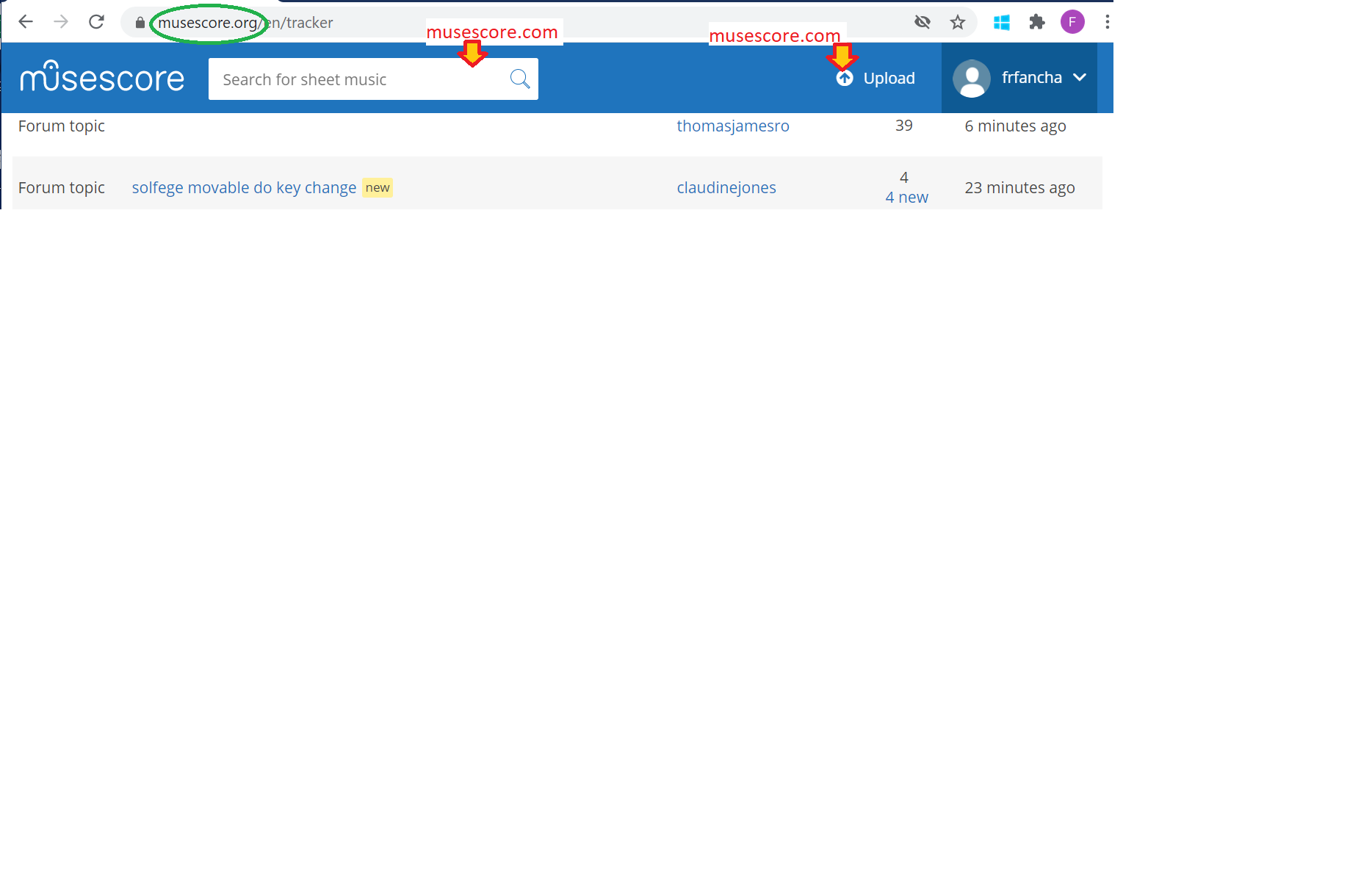
This thread is because I find inconvenient that the only visible part of the musescore.org header once you have scrolled a bit is "kind of" a musescore.com header.
A single clear link to musescore.com is fine, but for the rest quick access to musescore.org functionalities would make much more sense to me.
In reply to As the O.P. I agree that… by frfancha
Yes it is strange that when you use the search tool in the header of Musescore.org it actually searches Musescore.com and takes you to that site without any explanation/warning.
I have not assessed any facts but stated a general principle that we can all agree with - IF .com did x, then y should follow +/or z should not follow. I think we can all agree to that principle. So the first principle has yet to be invalidated. What the facts are, I don't know. Those are particulars that must be considered. I still give the consumers the benefit of the doubt. If they are having to come here for customer service, then they are not getting it at .com. If there is an explanation, they should be given it at .com, not here. The main complaint that I have seen repeatedly is that they get no response to their complaints at .com. It's bad business practice. I have been in business and I bent over backwards to be sure that complaints about the business were not circulating. As it is, I will never give a penny to .com. And that is not my fault. They have poor references. If I were running both .com and .org there would be massive changes here. There are ethical questions, both there and here, that have never been properly addressed.
In reply to I have not assessed any… by Rockhoven
"If they were grinding panda bears to keep the servers running, we'd likely not approve."
You can start discussions about what-ifs, real-ifs and nots; but as long as the subject of them is only .com you might as well be cross-breeding robot-cows with dodo's on a desert cave on Mars. Those discussions, no matter how many valid complaints they address, are simply misplaced here on the .org forums.
Now, to bring this back to the gripe of the OP. Yes the header of .org should differentiate from .com more imho (or rather the other way around). I don't agree that those people using that search field are thrown to .com without warning from the pov that the search area clearly shows you'll be looking for "sheet music".
Do I feel that that search bar should be here on .org? No
A default forum/handbook(/user) search imo would be much more valuable here.
Similarly I don't think the Upload button has a place here.
In reply to "If they were grinding panda… by jeetee
I agree, I don't like the header either. It's like an obstacle. I'm at .org and I want the search for .org up front. I don't think that .com should be so prominent in either the header or the search. Can we just change the header and the search?
In reply to "If they were grinding panda… by jeetee
> I don't agree that those people using that search field are thrown to .com without warning from the pov that > the search area clearly shows you'll be looking for "sheet music".
You are assuming that users understand that Musescore.org doesn't have sheet music and that they will be taken to a different website to perform this search.
In reply to > I don't agree that those… by reddiesel41264
And you are assuming that the grey text in the search field is read and evaluated before searching.
No it isn't when that search field is the only visible search field with a spyglass icon in the header.
It is then the legitimate expectation that the search field searches the site where you are.
Again: when that search field is the only visible search field with a spyglass icon in the header
Clearly the header search field needs to be the one currently in the sub-header.
The one of the sub-header searches MuseScore.org
But:
-is only visible when no scroll has occurred yet
-requires an additional click to be used while the other one conveniently allows to immediately type
In reply to > I don't agree that those… by reddiesel41264
Suggested some time ago
Not very visible but... transparent
Currently on the /it side
In reply to Suggested some time ago … by Shoichi
Changing the name is not the right answer. The right answer is to put the search field of MuseScore.org in the header of MuseScore.org.
In reply to > I don't agree that those… by reddiesel41264
@reddiesel41264: Any such assumption was irrelevant to my post.
The main topic at hand is that it is confusing to have a prominent search field for a different site in your header; most here (myself included by the way) find it to be not so.
One of the arguments given was that is totally unclear for anyone that using that search field would search for scores. I don't agree with that specific argument. That's all I said in that post, nothing more, nothing less.
But to reply to your post and assumption (just because I happen to have been around for some time): I know that at the start of both sites, there was an opposite stream of users looking for sheet music on "MuseScore" (because both the software and the score share platform share the same name) that ended up on .org and where frustrated that they couldn't find/search for sheet music..
So yes, that search field has been there to purposefully guide people looking for sheet music to the correct site to do so.
1. Is it clear that that is what the search field does?
Imho, yes.
2. Should it be there and eat up the space for a convenient search field which this site also need?
In that same humbleness of my opinion: no.
A possible solution could be to have the search function search this site, but also provide a tab with sheet music results. A bit like how when using internet search the results are often presented as site-links on a first "tab" and an option to click through to "images" instead. With a preview of the first x "images" (scores in our case).
In reply to @reddiesel41264: Any such… by jeetee
Good idea Jeetee.
In reply to @reddiesel41264: Any such… by jeetee
FWIW, to me there is a basic problem - that exists for historical reasons going back ten years or so - with having two sites to begin with. Not that having two sites is a bad idea, but managing how users perceive and understand this is a much more complicated problem than just tweaking a header. To me, discussions about minute details of which button does what on which site seem unimportant to me. Really there should be a wholesale redesign of the whole ecosystem. No idea if this is being considered or planned, but in my opinion it should be discussed at least. But, discussion here is probably pointless, this would be high level strategic discussion deep within the company. I suspect that if they want our thoughts as users, they'll ask.
That said:
Ironically, when musescore.com first became a thing, the search facility on musescore.org made sense because people didn't know& about musescore.com. Providing a way to find scores from right here on msuescore.org made perfect sense. And so did making a single login work across both sites, and a coordinated look to the headers as well. Note that none of this was that way to begin with, but kind of evolved over those first early years of musescore.com.
Now that many more people know about musescore.com than about musescore.org or indeed about the MuseScore notation software itself, the idea of a score search facility on musescore.org seems kind of quaint, but also pretty harmless. I'd be in favor of seeing the musescore.org search made more prominent here, sure, but I'd be much more interested in seeing a wholesale redesign of the entire thing.
In reply to FWIW, to me there is a basic… by Marc Sabatella
YAY!!!
There's this:

with the difference explained in an obscure FAQ:
https://musescore.org/en/faq#faq-20657
and a How to:
https://musescore.org/en/node/277874
to which users posting here are often directed.
.
But, for some, it seems more like this:

(Especially for those who complain here about dotcom subscriptions and refunds.)
Barring a ground-up disentanglement of the MuseScore duality, I like the idea of making those dotcom links (especially that Search bar) less visually dominant on this site, because it does seem very easy to (accidentally) wind up at dotcom from here. (Perhaps done by design? ;-)
Also...
Check out the reverse - for instance, starting from dotcom, see how facile is it to get to dotorg.
(It reminds me of the entrance to Caesar's Palace in Las Vegas - one step on the motorized walkway rides you from the very street sidewalk into the casino, but one must hoof it back upon exiting.)
In reply to There's this: [inline:org… by Jm6stringer
With a diverse selection of games ranging from classic slots to live dealer tables, there's something for everyone here. Not only does Playfina Casino offer a wide variety of games, but they also boast high-quality graphics and smooth gameplay to ensure an immersive gaming experience. What sets a site like https://playfinacasino.bet/ apart from other online casinos are the generous bonuses and promotions that keep players coming back again and again. And with top-notch customer service and secure payment options, you can trust that your time spent at Playfina Casino will be both enjoyable and safe. So why wait? Join now and see why Playfina is the best in the business!