(Suggestion) Adding a simple staff preview to the Staff Type Change icon
Staff Type Changes can be dragged to a palette and reused, but they give little clue of what are their settings. I think a visual reminder would be better, so you can, as engraver, add your collection of Staff Type "presets" to a custom palette and then drag them to where you want them in the score.
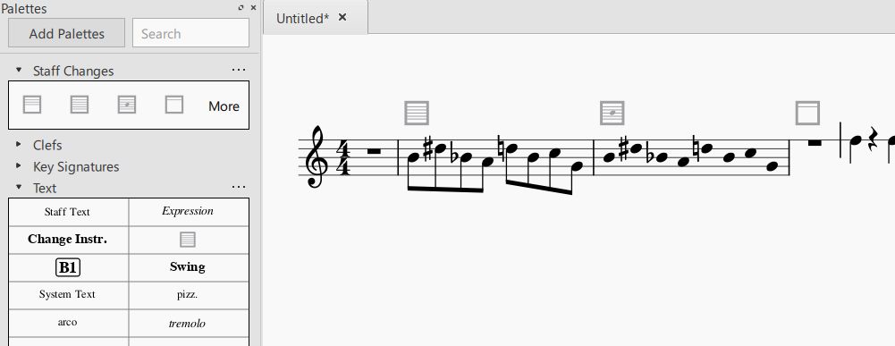
I thought of creating a very simple preview showing the number of staff lines and maybe also show if the staff is stemless. This would also change the current "S" icon to a default 5-line staff drawing.
Additional suggestion: in my opinion, the Text palette is not the best choice for this tool. I took me some searching to find it (see also https://musescore.org/en/node/305065)
I guess Staff Type Change is a kind of its own, but maybe it would belong better to "Breaks & Spacers" or to "Frames and measures" than to "Text". Just a thought. Personally, I use a custom "Staff Types" palette containing my presets, but I suppose having a separate palette just for this would not make sense for the vast majority of users.

| Attachment | Size |
|---|---|
| staff change palette.jpg | 30.42 KB |
Comments
I created a very simple implementation of this:
https://github.com/musescore/MuseScore/pull/6434
Wow. Great idea!
But as a result, the icon for a change to the 0-line staff you proposed would be empty, wouldn't it? Is that desired?
In reply to Wow. Great idea! But as a… by Asmatzaile
I thought that it would not be a problem, the thick box has enough identity. Also, there's a new PR that migrates the Invisible Staff Lines to Staff Type Change, so in that case the box would also be empty. What do you think?
In reply to I thought that it would not… by elerouxx
For the 0-line staff preview icon, I think it's true that's not a problem.
For the icons indicating invisible staff lines, I think it'd be useful to differentiate them from 0-lined staff icons and between themselves. I'd go with the way MS depicts invisible elements; making them a lighter shade of grey.
The problem is, the lines on the icon are already light grey when visible.
One possible solution would be to make the icon black, but I suspect there is a reason behind the icon's grayness; it's not supossed to be printed.
Dotted lines in the box could be mistaken for actual dotted lines; a strikethrough eye behind the staff could be too clunky. Maybe a strikethrough eye below the box? Or a slash going through the box?
In reply to (No subject) by Asmatzaile
What if invisible staff icons were not empty but had the start and end parts of the lines? That way the user could know the number of lines of an invisible staff right from the palette.

[Edit:]

Or, if these lines are too short to be easily seen, what if the icons had only start parts, but larger?
Sorry, I don't get the meaning of any of those icons, even being about twice twice the size here vs. inside MuseScore
In reply to Sorry, I don't get the… by Jojo-Schmitz
They show the number of lines and a stemless notehead if stemless is set. They are just reminders of what is changing in the Staff Type Change and the main objective is to be able to tell the icons apart in the palette instead of having only several boxes with 'S'.
Both are way too small to get that message accross, there's more space available, just make them bigger
What about this?

The number below stands for the number of staff lines the staff has, and the parentheses mark invisible staves. This would support the display of stave changes with more than 5 lines, and a way of seeing if the staff is visible or not.
[edit:]
Or instead of having a number with parentheses, for invisible staves the box itself could be empty (*with a notehead if the staff was stemless).
Maybe with bigger numbers though.
Better, could be bigger still
In reply to Better, could be bigger still by Jojo-Schmitz
The whole icon or the number?

I've tried maximizing the number size within the space available and I've arrived to this:
[edit:]

What do you think of arrows for symbolizing 'change'?
I will try to improve the icons. Honestly, I'd like to keep icons as minimal as possible and avoid too much information in such a little space. So it's good to think about what is really necessary to tell apart the icons of some 3 or 4 favorite staff 'styles' an engraver can keep in his/her palette.
Also keep in mind that the code for the icon (both former and new) is pretty simple and it would take much more effort to get far from the basic thick box and the lines. These brackets or the arrows, for instance, would require a complete rewrite.
I don't believe the 0-line staff PR would be merged now that it's possible to mark staves invisible on a staff type change - and even if there were both solutions available (0-line staff AND invisible staff lines) the purpose would be the same, so the icon might as well be an empty square in both cases, and the number of lines would not be so relevant since they're invisible. Right?
About the visibility and clarity of the icons, I think (and it was mentioned) that the color for this symbol is a bit washed out, depending on your monitor, and it can make the icon harder to read. It uses the same color as Layout Breaks, which can be accessed and modified in advanced preferences (ui/score/layoutBreakColor). A darker color makes much easier to identify the lines inside the box so maybe the default color should get a little adjustment, as suggested by others.
In reply to I will try to improve the… by elerouxx
I understand what you say about keeping it simple.
I thought of the numbers mainly because of the limitation to display only up to 5 staff lines.
I also suggested the arrow because I think that way the icon will convey better its meaning. This is especially important for newcomers searching for it and stumbling upon it in the Text palette (Layout/Layout & Formatting in the future).
But if that's going to require you time you don't have for, I am completely with you. In my opinion, the icons you've made are already better than the original one.
I decided to keep it simple for the time being and try having it ready for 3.6. Just rebased, tuned and updated.
Now allows up to 6 staff lines (important for tablatures). Unfortunately, at that icon size, more than that would be too much and too hard to read, but it's just a visual hint - you can always edit the icon 'Label' (tooltip) in the palette by right clicking on it if you want to add some more information.
I also centered the lines in the square to look better and cleaner, and added an empty square for invisible staff lines. If the zero-line staff type https://github.com/musescore/MuseScore/pull/6422 is merged, it will look the same as the invisible staff lines icon, but it will serve the same purpose. Again, there is also the tooltip to help if it is really necessary.
One thing to think is, how would this icon look when the Cutaway property migrates to Staff Type Change. Maybe a 'C' or a 'X' in the middle of the square? Or a scissor? :D
About cutaway staff changes: symbols in the center of the icon would interfere with the notehead used to mark stemless staff changes. How about literally cut icons? ;)

Fixed in branch 3.x, commit f2a71c178e
Fix #308912: Add a simple preview icon to Staff Type Change
Automatically closed -- issue fixed for 2 weeks with no activity.