Leland font problems
First, thank you sincerely for the "massive engraving improvement", which it really is. The Leland font looks great on the whole, but there are some issues which need to be fixed, among them are the following:
Short list:
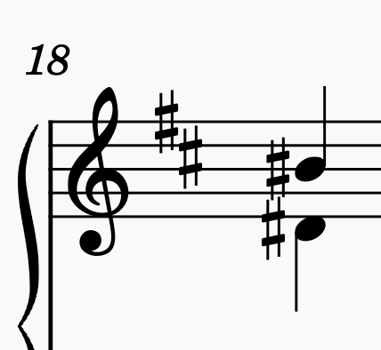
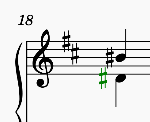
(1) Sharps on an interval of a 6th are getting stacked on top of each other.
(2) Rests and flags are sometimes clashing.
(3) The whole note is too narrow (doesn't look like a whole note should).
Comments:
(1) Sharps on 2 notes a 6th apart are not allowed to be stacked, they have to be staggered. The attached images, the first shows the problem, the second the correct position (lower sharp moved left 0,6). I posted this elsewhere on the forum as a bug at https://musescore.org/en/node/322164 , because this definitely breaks an engraving rule, but someone there pointed out that it's a problem only with the Leland font, so I'm posting it here.
(2) The layout suffers from flags and rests requiring so much horizontal space in order not to clash, and in fact note heads do sometimes clash in auto-layout with 16th rests (and higher subdivisions) because the rests are too wide. 8th note flags (and higher subdivisions) show this same problem.
(3) Whole notes are supposed to be wider than all the other note heads. This new whole note is only a teensy bit wider than all the other note heads. Can anyone show me engraved music uses whole notes that look this way? I've seen the half-note head used for whole notes as in the Bach-Gesellschaft edition (a practice fortunately nobody uses anymore). I assume this narrow whole note must make some layout issues easier to handle or be based on some elegant width calculation system, but unfortunately it looks a bit wrong. A proper whole note would be better. The old font was correct.
Thanks for your kind attention to these matters.
| Attachment | Size |
|---|---|
| Screenshot 2021-06-13 at 22.55.19.png | 25.95 KB |
| Screenshot 2021-06-13 at 22.55.35.png | 27.45 KB |
Comments
The whole note's look is on purpose and by design. That concern had come up before.
In reply to The whole note's look is on… by Jojo-Schmitz
So it's by design. One can easily guess that. What does the designer have to say about it? That's their answer? That it's by design, and basta? That is not a convincing argument. The complaint isn't going to go away. It looks wrong.
In reply to So it's by design. One can… by neo-barock
Simon Smith and Martin Keary designed it and want it to look that way. OpenSource is not democracy...
If you don't like it, use Bravura or Emmentaler or Gonville.
In reply to Simon Smith and Martin Keary… by Jojo-Schmitz
Sure, that answer always works for open source software: "It's free, if you don't like it, use something else." :)
(3) The whole note doesn't cause an engraving error, it just goes against a well established engraving tradition.
(1 & 2) These cause actual engraving problems. I'm not sure if the stacked sharps is a font problem or a MuseScore problem. THat's why I also posted it in the bugs forum.
The designers should improve their font.
In reply to Sure, that answer always… by neo-barock
That whole note goes back a long, long time...it is more "traditional" than we realize. You will find it in innumerable publications engraved using Leland Smith's SCORE. The font we now see in MuseScore is largely based on the glyphs used in SCORE, and while this iteration of the font strives to improve--while respecting the spirit of--the original, the SCORE glyph library (which, in turn, was based on Schott's music symbols that included this beautiful whole note), is quite unbeatable in legibility and overall balance.
In reply to That whole note goes back a… by mlito75
Right. Yet the music symbols of Schott are based on a font which was sold by Breitkopf & Härtel. That was one of their business branches way back...
In reply to Right. Yet the music symbols… by wolframd
And narrow means more notes on the page means less paper means more profit, so… I guess that’s it.
I ended up being mostly happy with MScore.
Taste in fonts is entirely subjective, as you presumably realize. Yes, the whole note in Leland is narrower than in many other fonts. It's part of the look they were going for - consistency with look of classic editions created using the greatly respected "Score" engraving program. But it's not out of the question that it would be redesigned if enough users voice their subjective opinion they that too personally prefer wider whole notes.
The accidental stacking is more complex. The "rule" you quote about sixths isn't actually a thing, at least not in absolute terms. See Gould, p. 88. The rules are subjective but have more to do with overlaps based on the particular shapes of the accidentals in question, not anything absolute about the intervals themselves. As long as the vertical strokes don't touch, it is considered acceptable and proper. As Gould says, "slightly offset the lower accidental so that the vertical strokes don't join up", and that's exactly what we do here. But it's also recognized that it's not good to have them interlock too much, so we have a threshold for how much we allow, and the shape of the Leland sharp is short enough that it comes out just below that threshold.
MuseScore is quite smart about how it stacks accidentals, trying to preserve horizontal space while also avoiding overlaps. The particular case you show isn't "wrong" exactly - there is no collision, no joining of vertical strokes. Whether there should be a larger offset to prevent the interlocking in this case is another subjective call.
It's worth considering whether to extend the sharp slightly, or tweaking the algorithm to lower the threshold for the interlock. But in any case, again, it's not a bug per se, just another subjective decision to be made.
In reply to Taste in fonts is entirely… by Marc Sabatella
Hi Marc. Thanks for the thorough answer. I appreciate those nuances. The stacked sharps present the biggest problem here. Rather than tweaking the deep inner workings of MS or altering the font, would it be possible to put a control in the Style under Accidentals so users could simply disallow this interlocking? Although these sharps are not clashing, they certainly do look wrong (and not just to me), and they happen all over the place in scores having a lot of sharps. Altering the x-position of the lower sharps in every case means if the font changes or MS layout rules change, all those sharps are going to be whacked later, so it would really be best to fix this as a layout parameter sooner and not later.
In reply to Hi Marc. Thanks for the… by neo-barock
You say they look wrong "not just to me" - can the other people with knowledge of engraving conventions and have expressed their opinion to you be convinced to post here? That would help.
I wouldn't really favor an option that special-case interlocking of sharps on sixths, since similar situations can occur with other accidentals on other intervals and with other fonts. I'd recommend just making the threshold be a style setting.
In reply to You say they look wrong "not… by Marc Sabatella
"I'd recommend just making the threshold be a style setting."
^ Thank you, that is exactly what I'd like to have: a control allowing us to get rid of these stacked sharps.
The other opinions are coming from other composers (not young any more) who don't use MuseScore, so no. I'm surprised nobody else has brought this up, but it's true that younger people who never composed by hand tend not to even know about these things.
In reply to "I'd recommend just making… by neo-barock
I’m sure Mrs Gould feels flattered by throwing her into the “younger people who never composed by hand” crowd, but this is not quite true ☺
In reply to Read what I wrote. I said… by neo-barock
.
In reply to Taste in fonts is entirely… by Marc Sabatella
Honestly, Gould's book is based on rules which imply to british engraving and especially to engraving rules by Chester. Of course it is extremely good and profound. But ... there are some rules which are rather peculiar regarding other traditions of engraving, e.g. german traditions. One example: in Germany you will have a hard time finding editions stemming the b' in treble clef upwards, but Mrs. Gould states this a a rule...
And I do second .functions comment that it is quite unusual not to have a larger offset between the sharps. Chords with more than two notes should have the uppermost and lowest accidental vertically aligned and octaves.
One problem with SCORE in earlier versions was that the distance between ledger lines and accidentals as well as between accidentals always was to small, one had to correct this manually all the time...
I hope I did use the right wording as I am a german...
In reply to Honestly, Gould's book is… by wolframd
Thanks for you comments! I'm a bit curious about one aspect - the statement "in Germany you will have a hard time finding editions stemming the b' in treble clef upwards, but Mrs. Gould states this a a rule..." . It sounds like you are saying, middle line B on treble clef would be written downstem in Germany, but that Gould says it should be up. But, that's not what Gould says at all. She points out that the stem direction for this note can depend on the surrounding notes, but also, that some editions always go downstem. She certainly doesn't say they should always be upstem. And, it's true that many publishers do vary the middle line stem according to context, not just in Britain. Still, it's probably true the majority go with always down, and MuseScore, for the record, does this as well.(unless beamed with upstem notes of course). As I recall, there was experimental code added to MuseScore 4 a few months ago to add the context-sensitivity, but no one seemed to like it and I believe it was removed.
FWIW I like the narrower whole note. It wasn't until this came up that I actually started noticing in how many published scores I see that same kind of narrower whole note.
In reply to FWIW I like the narrower… by BarnieSnyman
BarnieSnyman, I believe you, but I haven't seen that myself. Who is publishing scores with narrow whole notes? Do you have links / examples? Thanks.
In reply to BarnieSnyman, I believe you,… by neo-barock
I took some photos... one from our church hymnal and the other from one of my old Chopin-books... (I've seen more examples, but I either cannot recall where exactly, or the books aren't within reach at the moment)
In reply to I took some photos... one… by BarnieSnyman
Thank you for sharing the photos. I just checked several of my hymnals, and lo and behold, they too have the narrow whole note! Obviously, I never noticed this before. And I'm an organist. Amazing. It looks like on this point too I stand corrected. Thanks.
In reply to Thank you for sharing the… by neo-barock
Most editions of the "Neue Mozart Ausgabe" (NMA) by Bärenreiter are written with SCORE (of course some are too old to be written with SCORE), so you will find the narrow whole notes all over these editions ;-)