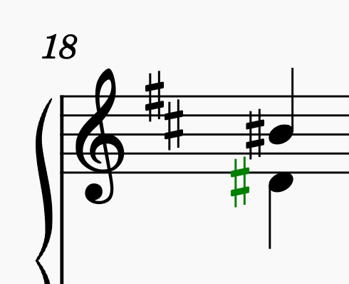
incorrect alignment of sharps for 6ths in MS 3.6
Sharps on notes a 6th apart are incorrectly aligned. The first image shows the problem, the second the correct positions (lower sharp moved left 0,6)
Sharps should not be horizontally aligned like this (basically on top of each other) for any interval smaller than an octave. This problem started in MuseScore 3.6
| Attachment | Size |
|---|---|
| Screenshot 2021-06-13 at 22.55.19.png | 25.95 KB |
| Screenshot 2021-06-13 at 22.55.35.png | 27.45 KB |
Comments
After a short look it it only occurs with the Leland musical font, doesn't it? If you change the font to another with format->style...->score it's aligned correct? Maybe report it also here: https://musescore.org/en/forum/4488.
In reply to After a short look it it… by kuwitt
Hello kuwitt, yes, it's a problem with the Leland font, thank you for checking. I have posted it to the engraving forum along with a couple of other issues here https://musescore.org/en/node/322168
I suppose the stacking has to do with a thinner vertical stroke used in the Leland font, but that doesn't seem like a problem in the font, rather a problem in MuseScore. The conditions for placing sharps should not allow stacking on any interval smaller than an octave, no matter what the font is.
In reply to I suppose the stacking has… by neo-barock
That is definitely not true. Consult Gould or any other reference to see how accidental stacking rules work, but there is no rule remotely like that. See my reply to your other post on the subject. This is definitely something that can be revisited subjectively, but there is no rule being broken here.
In reply to That is definitely not true… by Marc Sabatella
You may be right, but that doesn't change the fact that it simply looks wrong. See my other response. Please provide some way to disallow these stacked sharps. I suggest a control under Style > Accidentals
In reply to You may be right, but that… by neo-barock
Saying it "looks wrong" is pretty much the same as saying "it's subjective". Whenever there is a choice between two valid ways of doing things, one of them will look wrong to some people but not to others, and vice versa. That's the nature of subjective things.
So, again, I'm not saying this couldn't be changed if enough people voice their own subjective opinion on the matter and a consensus emerges that it would be better to tweak the shape of the sharp or the threshold used in the algorithm. So best to see if you can get others - preferably others with some familiarity with engraving principles - to weigh in as well.
Although also, software isn't a democracy, what utlimately matters is what our engraving expert thinks, but I find he's open to input.
In reply to That is definitely not true… by Marc Sabatella
What's true is that when there are only two notes as shown, the sharps are supposed to be staggered. If more accidentals are involved, they might be interlocked to save horizontal space, but not with two notes as shown. Whether that's a "rule" doesn't really matter. It's what musicians are used to seeing on the page.
In reply to What's true is that when… by neo-barock
Each publisher, each edition, each engraver uses different rules, so there is no One True Standard that musicians are used to seeing, Look at two different editions of the same work and you'll see different accidental stacking for the exact same chord. I absolutely agree it's important to stick within the norms so musicians are not surprised with things they haven't seen before. But what I am saying is, this is within the norms, even if it doesn't happen to match whatever specific edition of whatever specific work you are comparing this to.
In reply to Each publisher, each edition… by Marc Sabatella
A way to prohibit this interlocking as a Style parameter would be very helpful. I will leave it at at that. Thanks.
This is not quite true (Gould, p.88) as accidentals a seventh apart are allowed to be stacked if offset slightly. The MScore font gets this right:
It also does this for sixths when both are flats, despite Gould allowing them to fully align; upper flat and lower sharp or natural get fully aligned.
It does correctly offset the sixths by the full amount if both are sharp, so this is a Leland issue.
To me those stacked sharps (with a slight offset) look just right and fine. The offset one looks odd, to me.
So MScore AKA Emmentaler (at a 7th) and Leland (at a 6th even) look the same in that respect, which is good IMHO
Esp. when considering that one target of Leland was to not use more space than Emmentaler, to not screw up layouts.
In reply to To me those stacked sharps … by Jojo-Schmitz
"To me those stacked sharps (with a slight offset) look just right and fine."
I don't know what scores you've been looking at. It's not common. Look at any random sampling of scores, and the majority of them will have sixths like this with staggered accidentals. "It looks fine to me" as an opinion is fine, but pretty worthless. Ehrlich gesagt halte ich das für Schwachsinn.
In reply to "To me those stacked sharps … by neo-barock
It is an opinion. Just like your's.
Your's is as schwachsinnig as mine.
In reply to It is an opinion. Just like… by Jojo-Schmitz
Lieber Herr Schmitz, wir haben hier eine gewisse Meinungsverschiedenheit. Was ich sage, stimmt mit der Mehrheit von Partituren überein. Ende.
In reply to Lieber Herr Schmitz, wir… by neo-barock
Maybe. It still lookes fine to me. Accidentals as close as possible to the note they belong to without collisions.
And apparently Elaine Gould sees it the same.
In reply to "To me those stacked sharps … by neo-barock
This entire thread is odd to me. There seems to be an opinion that musicians are stupid. They seem to not be able to actually play something musically. We have to mark up every note of a score. They are not smart enough to see a grouping of notes and play what they see. Heaven forbid that they should have to play a hand written score where all alignment standards are off the table. Do you know whose opinion is worthless? Quite possibly everyone's but the person trying to read the part at the time. That person will figure it out, believe it or not. Rules can be argued all day long. To what end? Rules are broken all the time. I look at both of the accidental alignments and know exactly what to play. There are so many far more important things to worry about.
In reply to This entire thread is odd to… by bobjp
No. Nobody ever said anything about musicians being stupid or unable to interpret what they see. Such an extrapolation is bizarre and totally misses the point.
In reply to No. Nobody ever said… by neo-barock
Your point is that you don't like the way stacked accidentals line up. That's fine. Your point is that " It's what musicians are used to seeing on the page." This seems a bit broad to me, and just maybe not possible to prove.
My point is that if you are going to speak for (all?) musicians, maybe give them some credit for knowing how to read music. Because they see all kinds of different things.
In reply to "To me those stacked sharps … by neo-barock
Actually, it should be relatively easy to do a study on this - like literally going to IMSLP and finding scores different eras, different publishers, and trying to find examples. Also for people who have access to other notation programs, checking the results there (and checking across different fonts). I certainly did that sort of thing quite a lot when I was developing the current accidental stacking algorithm. But that was years ago, and I can't say I remember all the details. See #1464: Faulty vertical alignment of accidentals at chords for more background, and also https://musescore.org/en/node/3325#comment-97139 and other comments in that thread.
Anyhow, I think if any change is to be proposed, it should be accompanied by actual examples from the literature and analysis f the rules that appear to be followed.
It's probably harder than you might imagine to find examples, though! Took me a while to come across a case like this (two notes a sixth apart with sharps, no seconds or additional accidentals to confuse matters). But FWIW, the very first example I found was this, from an edition of Chopin etudes (https://ks.imslp.info/files/imglnks/usimg/7/7a/IMSLP168185-PMLP01969-FC…):
Second-to-last chord, does exactly what we do with Leland (not quite as much offset, actually, I think it's not as good as what we do). Maybe a fluke, but I suspect what you'll find is this interlocking arrangement is not really so unexpected after all.
In reply to Actually, it should be… by Marc Sabatella
You're right. After checking a dozen scores on my shelf, I find many instances of the interlocked sharps. It seems that newer editions with wider spacing don't do it, but the older editions cram in as much as possible. Peters does it in all the piano music. Bärenreiter and Henle seem to avoid it, though probably someone can find counter-examples.
So I'll just have to eat my hat for my claims that it's the majority. It appears to be the default in notation software, to stagger. MuseScore staggers in all the other fonts.
But it's a matter of style, as you said, which makes a lot more sense than saying it's a matter of "opinion", because when the music is printed with wider spacing, these 6ths-sharps will certainly look better staggered. When as much music as possible is crammed onto a page, then not. That's a style parameter.
So ultimately, I think putting a parameter control in the Style to handle this for any font would be ideal, if it's not too much trouble. Otherwise I'll just continue scooting them over manually.
Thanks.
In reply to You're right. After checking… by neo-barock
I agree, and recommend you file a Suggest to the issue tracker for this. Again, though, I don't think it should be an all-or-nothing stagger or not, nor should it be limited to sharps on sixths, it should simply be a setting to control what the threshold is for allow this interlock. Thus for fonts with larger sharps, it might affect kick in on sevenths; it would also handle other accidentals like the microtonal ones, or similar cases involving naturals or flat depending on the size of the glyph, Because in the end, that's what it is about - the actual overlap produced by the actual glyphs from an actual font on an actual score, not some arbitrary rules about offseting for certain combinations of accidentals and intervals.
FWIW, though, I did keep checking a little longer after finding the initial example, and stopped after finding a total of five cases. It was 4-1 in favor of the interlock of sharps on sixths. These were indeed mostly older editions, but not exclusively.
In reply to I agree, and recommend you… by Marc Sabatella
Not to forget Gould, basically the core guide of modern engraving, is also in favour of that (though she often does seem to have tight spacing in mind in her recommendations).
In reply to I agree, and recommend you… by Marc Sabatella
Thank you, I have added the suggestion to the issue tracker here https://musescore.org/en/node/322481 I hope the wording is correct.
In reply to Thank you, I have added the… by neo-barock
Better: #322481: Style control of accidental interlock threshold
In reply to "To me those stacked sharps … by neo-barock
Hello, to me it looks fine, too!