Designing the Mixer for MuseScore 4
Hello everyone. It's been a few months since I last communicated anything about our development plan and it feels like the right time to begin getting back in touch.
Behind the scenes, we've been doing a lot of haggling, organising and pitching to figure out what our next moves for MuseScore should be. It's been a lot of work but we've now landed on a solid agreement and I'm going to be publishing our plans over the coming weeks and months. As we continue to work through our development and design roadmap and I'll be making sure to let you know how things are progressing. First off, if you don't already know (because it's been spoken about quite a bit in the main development group chat), we're now committed to making MuseScore 4. We've decided to do this because there are certain aspects of the existing system that are in need of an overhaul: most notably, the audio engine. In addition, we would like to make comprehensive adjustments to the interface to include things that have been widely requested by our users over the last two years.
In this first post, I'm going to focus on what is needed from a design point of view to facilitate a new audio engine. Higher quality (or 'more realistic') audio playback has topped all our polls and surveys over the last year. Here are two things we are planning in order to support this request:
:: VST support
:: A revamped audio interface
Since we are currently at the early stages of figuring out how this should work from a technical point of view, the purpose of this post is to focus on the second point: when we do have vastly improved audio capability, how could we best expose this to the user to allow them to take advantage of it? Or to put it another way, what is the goal we want to reach?
Here are some principles I have in mind when designing the ideal interface:
:: Choosing sounds (whether VST or SoundFont) should be fast and simple
:: The interface should be made more flexible to support each user's unique workflow
:: The ability to edit precise values, such as velocity and dynamics, should be more exposed, more powerful and easier to use
For the purpose of keeping the discussion focused, I'm going to talk about just one improvement that touches on the first two of these issues: the mixer.
Even in its current state, the mixer is an interface element that users have repeatedly asked us to improve. One of the most common complaints is how much space it takes up compared to the mixer from MuseScore 2. Another issue with it is that it does not co-exist well in the same panel as the inspector. Moreover... it isn't the nicest looking thing to look at either, is it? I seem to recall once comparing it to a late 90's Flash game on NewGrounds.com...
In a recent post on this forum, MaBlo, who spent a lot of time proposing a new high-level UX for MuseScore 4.
https://musescore.org/en/comment/997102#comment-997102
One of the suggestions that MaBlo made was to combine aspects of the 'Synthesiser' (where SoundFonts are selected and various other effects are located) with the mixer, so the user can access all audio output options from one place. This was a great suggestion and - in addition to some of the principles I just mentioned - has helped to inform the V1 design proposed below.
HOW WILL THE MIXER DESIGN PROCESS WORK?
In order to keep this discussion focused, I have removed other aspects of the new design from my mockups and kept the focus squarely on the mixer. The idea behind this post is for users to be able to point out gaps in the design, while also making requests for alterations. The mixer is something I think we all feel strongly about and this initial proposal will need to be changed multiple times before we reach a fully fleshed-out version. Here is how I intend to follow up this thread in a few weeks:
:: Collect feedback from the comments section
:: Speak to those building the audio engine to uncover any practical obstacles or requirements
:: Propose a V2 mixer and post another update on MuseScore.com at a later date
THE V1 MIXER DESIGN
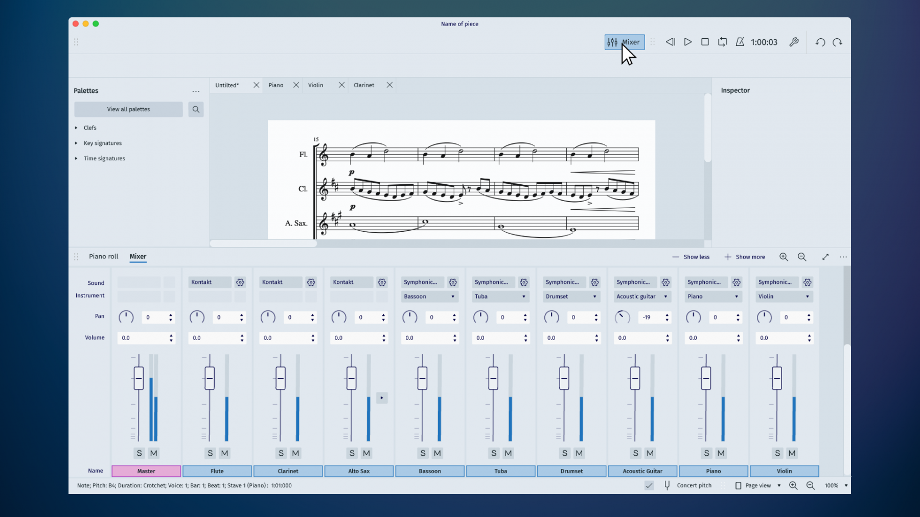
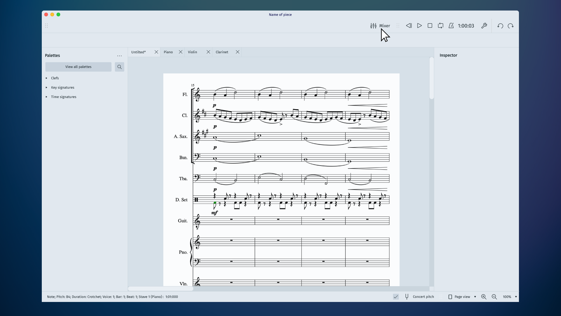
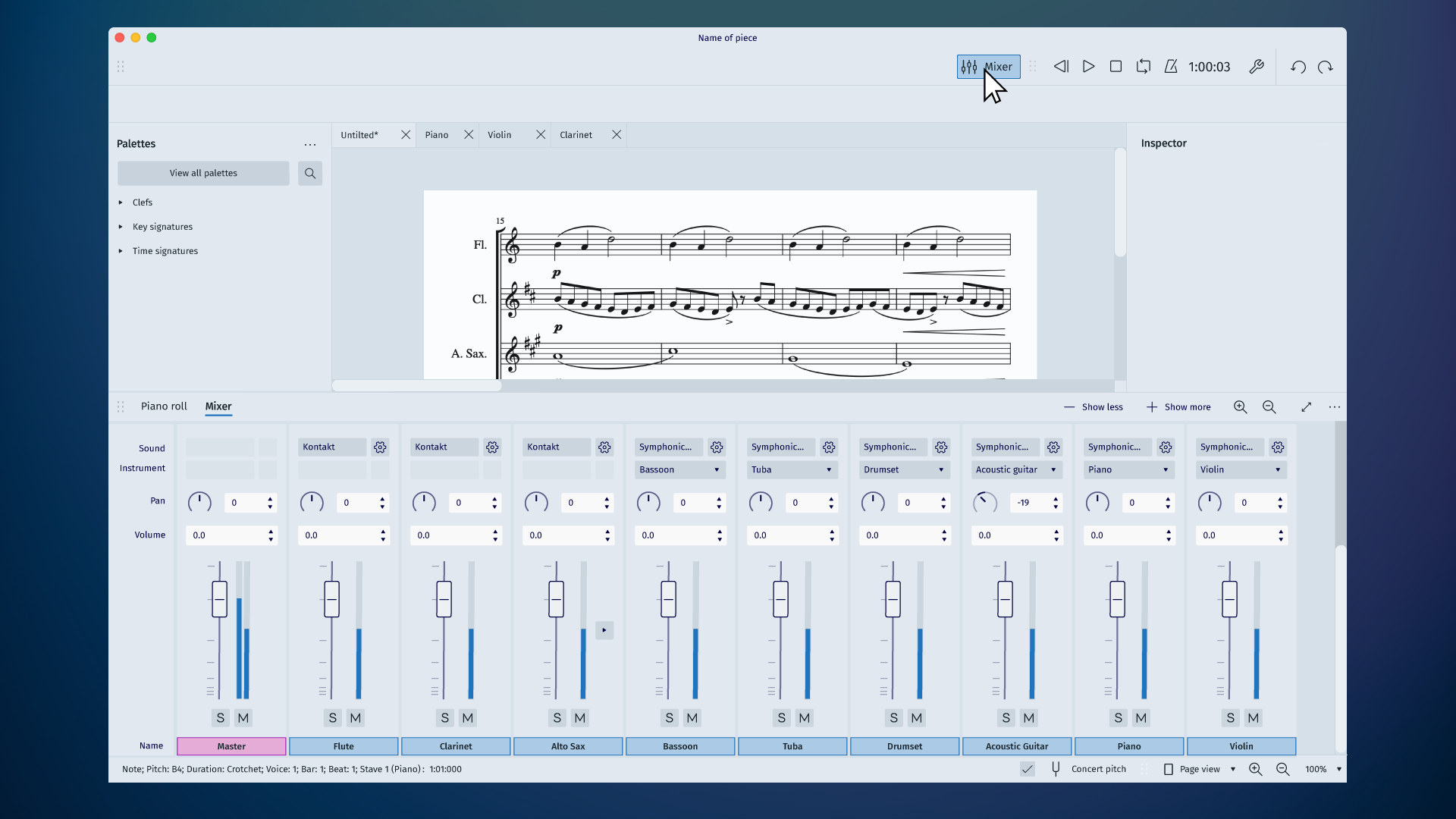
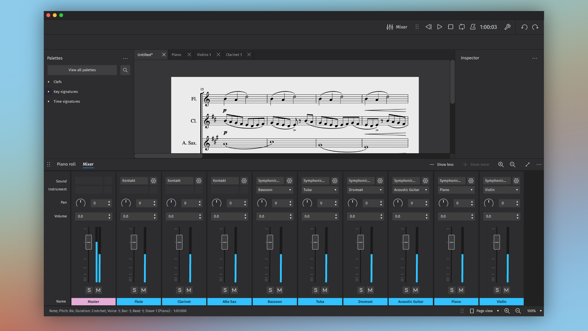
So with all that out of the way, the rest should be pretty straight forward to explain. First of all, we think it makes sense for there to be a dedicated button which users can press to show and hide the mixer (how we make space for that button will be the subject of a different post). In the image below, you can see the mouse hovering over the 'Mixer' button in the top bar.

Using this button, the user can now toggle the mixer ON and OFF quickly. This is the proposed default state (and position) of the mixer, which is taking inspiration from other leading DAWs in the industry. The Mixer is by nature a horizontal beast, and since a user will very often be working with more than 10 instruments in a piece of music, it makes sense for it to stretch across the width of the app. But, again, this is only the default. There's a lot more to talk about.
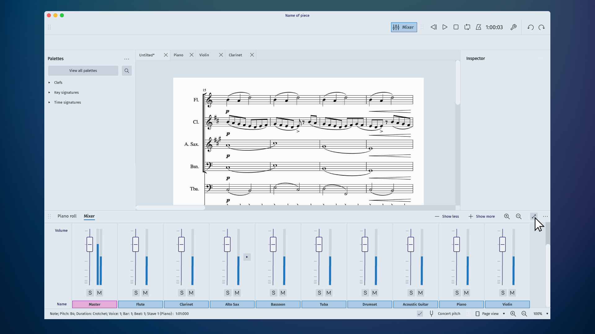
Before delving into the specifics, I should also point out that the mixer window should be both resizable and scrollable. In the image below, you can see the user resizing the window to show only the volume, mute and solo controls. The user can still scroll to access other parts of the mixer if needed.

If the user wants to undock the mixer, that can be done by selecting the button on the top right of the mixer (see image below)

An undocked, minimal version of the mixer would look like this. It can be minimised further by pressing the 'Show less' button. Pressing the 'Show More' button would gradually expose more functionality until all available options are visible.

Regarding the selection of VST's or SoundFonts, the ideal would be a simple interface, where the user can simply select their preferred sound type by clicking on the area shown below.


The above system will most likely require an additional interface that allows you to set up and save sound profiles. We don't know enough yet to be able to predict with certainty what those interfaces will need to be but the aim is to avoid making them compulsory. Ideally, the user should be able to select sounds using the mixer and should not have to spend time reading the manual or exploring the settings menu in order to do so. This is how many modern DAW's work and we don't want MuseScore 4 to more complicated.
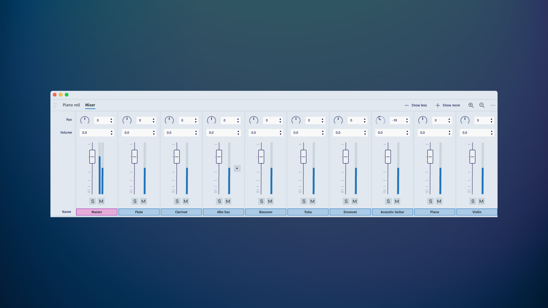
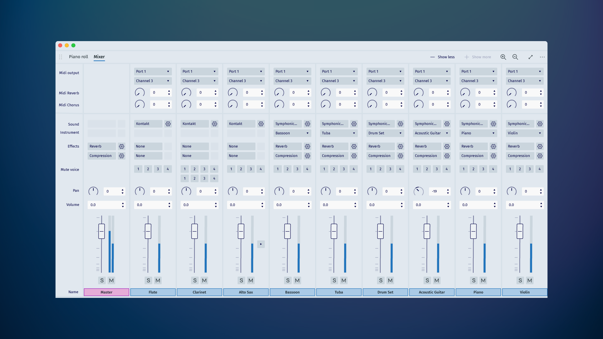
Here is a view of the mixer with all available options switched on:

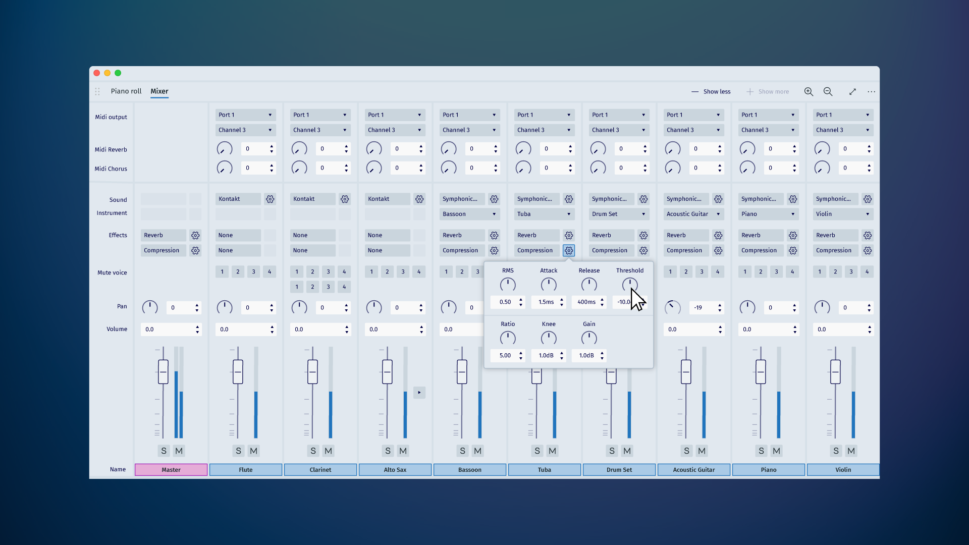
Here is a proposal for how we gracefully integrate existing effects into the mixer for easier access:

And lastly, here is the docked mixer in Dark Mode:

Here are two final points about this design:
First: We are investigating things like output channels/busses and have not yet incorporated them into the design. Comments and requests about this specific area would be appreciated.
Second: certain options seen here would be incompatible. For example, if you select a SoundFont, then you can choose a specific instrument. However, if you choose a VST, like Kontakt, the Instrument option would be disabled.
That's it for this post. I hope you enjoyed it. I'll be posting a follow-up soon. I know there will be lots of questions. For example, you may have noticed a 'Piano Roll' tab. What's that about? And why is there a wrench icon? Hold on... are those scrollbars??? Wait! Come back... I have more questions! COME BACK!!!
See you next time!
Tantacrul
| Attachment | Size |
|---|---|
| 01_Mixer_Community_Post_Activating_Mixer.png | 181.98 KB |
| 02_Mixer_Community_Post_Activating_Mixer.png | 159.29 KB |
| 03_Mixer_Community_Post_Resizing.png | 166.86 KB |
| 04_Mixer_Community_Post_Undocking.png | 167.12 KB |
| 05_Mixer_Community_Post_Undocked_minimal.png | 158.04 KB |
| 06_Mixer_Community_Post_Select_Sound.png | 159.06 KB |
| 07_Mixer_Community_Post_Select_Sound.png | 179.87 KB |
| 08_Mixer_Community_Post_Maximised_Version.png | 145.28 KB |
| 09_Mixer_Community_Post_Effects_Settings.png | 158.56 KB |
| 10_Mixer_Community_Post_Dark_Mode.png | 164.4 KB |
Comments
Ooh color me intrigued
Is soundfont a combination of fluidsynth and zerberus in the UI? And the mixer applies to both backends?
Am i right in interpreting this that i can have whole different synths on different instruments?
In reply to Ooh color me intrigued Is… by Joshua Pettus
Yes. I think this is wise. We'll probably still have to expose finer controls for these things somewhere, but I don't see a need for regular users to know what either Zerberus or Fluid is.
As for the idea of having different synths on different instruments - this is possible with VST's (when you have an audio engine with channels) but I'm not sure about SoundFonts. If not, them this will obviously need to be tweaked.
In reply to Yes. I think this is wise… by Tantacrul
Makes a lot of sense to me. As for finer details i belive both support reverb and chorus, but i understand not wanting to clutter the interface.
(Edit) nevermind its right there in your proposed expanded view
With soundfonts, im sure some clever programmer will correct me, but i suppose you can go crazy and have diffrent synths with different fonts by having as many instances as you want. So long as your RAM holds out XD
One thing, I regularly miss with actual mixer is, that it doesn't seems to follow the rules of other window views (like inspector, play panel and so on) concerning the integration of the view, see for example #279228: Mixer: size issues and other issues about the size integration.
I, for one, am very happy to see scrollbars (https://musescore.org/en/node/2406—look how early that node number is!), the piano roll in exactly that location instead of as a separate window, and what I assume is a "Customize Toolbars" button.
Tantacrul...you are a lifesaver. This is all I ever wanted from Musescore.
Edit: Well, add channels with routing and automation and we have ourselves a whole DAW. Which would be amazing.
I really like it! The colors and the interface in general is so nice!
The integrated effects in the mixer for easy access is really good too!
A suggestion: Instead of the 'Show less' and 'Show More' buttons, why not something like the icons on Ableton Live Mixer where you can turn on or off different sections of the mixer?
In reply to I really like it! The colors… by Dexter Bass
Probably a wise idea. The more I think about it, the more I feel that 'show more' will bug people.
In reply to Probably a wide idea. The… by Tantacrul
Depends. Studio One have something like the 'show more' button, but the mixer only have 2 states: 'All options' or 'few options'.
If I did not misunderstand, in your design, the 'show more' button will have various states until to reach the 'All options'. Maybe that is not very comfortable.
In reply to Depends. Studio One have… by Dexter Bass
You understand exactly what I was thinking. There are some apps that do it but I think it might be a bit painful in this instance. The pro argument is that the interface is much simpler that way. The con is that users might end up with lots of settings they don't care about :)
In reply to You understand exactly what… by Tantacrul
Yes! It's more easy to understand just like that.
I like the Ableton Live approach, but is not that easy to understand at first look.
Amazing! I like the idea! I would also suggest to replace "show more/show less" by the individual modules directly. Maybe I would also place them in the same place where "show less/Show more" is written. I also like the idea of a scale that gets smaller towards the bottom so that the volume can be fine-tuned towards the top.

I would also like to see the colors of the instruments below being individually adjustable. I would also like to see a bit more detail in the sliders and maybe also in the knobs - not so simple, but other users might have a different opinion. I don't want to be misunderstood here, I really only mean more details at the two - slider and knob. Like in the picture below maybe
How would the subchannels look like?
I just noticed that the volume "0" value isn't at top. Is this on purpose? Is it supposed to be set up like on some mixing consoles, so that there is a "normal/default value 0" and can be overdriven a bit and otherwise just decreased? I like it when it is on purpose!
Why does the clarinet in the second last picture have 8 voices? A function that I do not know yet?
In reply to Amazing! I like the idea! I… by MaBlo
Ah! 8 voice clarinet!
That was actually meant to be for the Piano but I changed the instrument order around so they wouldn't feel disordered and completely forgot to change the voices with them :)
You know there's a time limit on editing these posts? I think I need special privileges, so I can correct that mistake!
Regarding volume settings. I'm just going on the standard for DAW's. '0' would probably be a little lower down actually. If you went above this level, you would be 'pushing' it. Obviously this is a useful concept, because it doesn't force users to have to decrease the sound of everything in order to bump the sound of one thing (although that is a better practice). This will all get refined as we figure out the engine itself.
Regarding the style of the controls. I'm flirting with a more modern approach across the app. Nothing is nailed down yet and I don't have anything against Skeuomorphic controls in principle.
In reply to Ah! 8 voice clarinet! That… by Tantacrul
Ah, that sounds good! I didn't know the time limit either, I just read it in the MuseScore design group.
I am really excited to see what the V2 mixer will look like.
Maybe you could also think about instrument groups. I don't know how many other users would like it, but for my work with MuseScore this would be an advantage, for example to make all strings quieter or all brass louder at the same time.
Of course, if there were buses, that would work, too, I think...
Interesting idea. Seeing Musescore improve so quickly. I wish I could contribute in creating some "improved" sounds for the instruments (when I mean improved I mean a bit more realisitic and not so instense vibrato in winds and bowed s.) , like recording instruments as VSCO. Well that will probably never happen hehe... Alright end of my story.
Tantacrul,
Please could you consider adding "Mixer Groups" as seen in Ableton Live?
Also, thank you - MuseScore has developed so much since you started helping out!
In reply to Please could you consider… by markthemooste1
Nice idea. Will take a peek :)
In reply to Please could you consider… by markthemooste1
This is similar in Studio One, or not?
This all sounds really good but I think it’s important to remember that MuseScore should first and foremost be simple, there’s lots of talk about things I don’t understand so I’m hoping there will be some sort of simpler mode (like the current basic or advanced layout) where those of us who just want to write music in a nice program and use a mixer in a fairly standard way will be able to do this easily.
In reply to This all sounds really good… by mark1029
Essentially, this will be an easier app to use than the existing version. If you don't use the mixer now, it will not be forced upon you. If you do use the mixer, the default version will be shorter and better integrated into the UI. For those who want more technicality, it's available to them. Absolutely agree that the inclusion of new features needs to be done in a way that doesn't overwhelm people who just want to write some notes on a score.
Brilliant stuff, I'm hyped! I just wanted to ask if we'll see beta versions of the audio engine in Musescore 3 or is it being developed entirely with the new UI elements for Musescore 4. Since the audio engine is the biggest thing that bugs me about Musescore at the moment I'm veeery exited about this.
This looks great! One thing that has always bugged me about the mixer is instrument selection. When you go to pick an instrument from the soundfont you get every possible choice for however many soundfonts you have active. Is it possible to have a division by soundfont or by instrument type like how instruments are added to the score? It's a little thing but I think it would make a lot of lives just a bit easier.
In reply to This looks great! One thing… by therealpaulebutts
I couldn't agree more. It's rather annoying to activate a new soundfont and have little to no idea which sounds come from which soundfonts.
SHOW MORE/LESS OPTION: I have no idea if this is a bad or good idea, but what if you implemented a slider instead of separate buttons? The slider would have "SHOW" over the top, with "LESS" on the left and "MORE" on the right. Maybe there would be a few notches on the slider so each level of additional options would be a fixed setting. In any case, it would give immediate feedback as to how MUCH less or more options there are to display. It's not possible to know that if you incrementally have to keep hitting the Show More button but a slider could indicate this easily. Just a thought!
In reply to SHOW MORE/LESS OPTION: I… by Daniel W. Boothe
Example: LESS ---||-------- MORE (Just slide button to the left or right as needed)
In reply to Example: LESS ---||--------… by Daniel W. Boothe
Good idea! It maybe can work!
In reply to Example: LESS ---||--------… by Daniel W. Boothe
I think there must be the possibility to say exactly which areas I want to show. Just more or less could show a lot of unnecessary modules that I don't want to see at the moment or don't want to see in general. For example just the panning or just the MIDI options without everything in between.
ADD RITARDANDO AND ACELERANDO SO WR DON'T HAVE TO DO IT MANUALLY!!! I KNOW HOW TO SIMULATE IT BUT MAKE IT AN ACTUAL OPTION, IT WILL MAKE IT EASIER, MAKE SO WE CAN EDIT THE RATE IT DECLINES(OR RECLINES)!!!!! MAKE IT HAVE SIMILAR MECHANICS TO THE CRESCENDO AND DIMINUENDO(DECRESCENDO)!!!!! C'MON, MAKE IT EASIER FOR US!!!!!
In reply to ADD RITARDANDO AND… by Machodave_215
Your caps-lock key is stuck, get it fixed, now.
Then please realize that ritardando/accelerando has got nothing to do with the mixer, so is completely off topic in this thread.
In reply to Your caps-lock key is stuck,… by Jojo-Schmitz
Number 1, I purposely typed it all caps. And 2, I didn't even know this was for the mixer, why a thread for just one specific thing?
In reply to Number 1, I purposely typed… by Machodave_215
Number 1, that doesn't make it better at all, why are you shouting at us then?
Number 2 why don't you just read the title and initial article of this thread?
What do you think why do threads do have a topic?
In reply to ADD RITARDANDO AND… by Machodave_215
from the Mixer? :-/
In reply to from the Mixer? :-/ by Dexter Bass
Didn't know this was for the mixer.
In reply to ADD RITARDANDO AND… by Machodave_215
this post is about the mixer. You have a plugin to cover your demand https://musescore.org/en/project/tempochanges
In reply to this post is about the mixer… by pere
The plug didn't work, it was just randomnesd.
In reply to The plug didn't work, it was… by Machodave_215
Feel free to open up a new topic where you post your issues with the plugin. It is working for a few thousand people across all MuseScore supported platforms, so perhaps we can figure out why it doesn't for you.
In reply to Feel free to open up a new… by jeetee
Don't feed the troll :-/
Make it to where an instrument with two staves is treated like another Instrument.
Musescore looks as cool as your videos like that.
Love this idea, but it seems a bit large and covers up a lot of the score. I think I'll submit some designs of my own as well, but I think one thing that would be a good thing to include is including an option to type out a value similar to FL Studio since setting a value out of 1 or 100% is easy to do without much thought.
This is my mixer idea for a compressed mixer view. It is pretty basic, and also not the most pleasing thing to look at since it was just a quick photoshop, however I think the idea gets across. The volume sliders would be the things compressed or expanded when resizing vertically. Right clicking could also bring up options or if there aren't options, just automatically open an option to type the value.
In reply to This is my mixer idea for a… by mandoiu
I believe it's not much different than the mixer with the score above it. It's just more compressed ( and surely not aesthetically nice but yes that was quickly made ).
In reply to This is my mixer idea for a… by mandoiu
Nice. Thanks!
Will there be a way to open mixer through a keyboard button instead of hovering the mouse over the button to open it? Just asking because for some it might be tiring.
In reply to Will there be a way to open… by [DELETED] 32872726
Yes. There should eventually be hotkeys for everything. At the moment, it's F10. I'd prefer to promote that to a key that isn't potentially taken over by the OS.
In reply to Yes. There should eventually… by Tantacrul
How about 'M' , also fits with 'Mixer' (lol) but I suppose it's already used for something else...
In reply to How about 'M' , also fits… by [DELETED] 32872726
Used for multimeasure rests
In reply to Used for multimeasure rests by Jojo-Schmitz
Feels like a bit of a general priority / overview of all shortcuts might be in order. Not necessarily in this instance. This is one telemetry might help a lot with.
In reply to Feels like a bit of a… by Tantacrul
Only that infos about those are no longer collected with 3.5
In reply to Only that infos about those… by Jojo-Schmitz
Still, hopefully we got a few months worth of useful data.
To be clear: there already is a shortcut, F10, and you can reassign it if desired. I would be wary of a whole scale reassignment of all shortcuts, they are only "shortcut" because lots of us have memorized them. But, shipping multiple sets you can easily switch between is something we've talked about and partially implemented, I'd be fine with a "legacy" set being continued to be provided if we did redo them.
As mentioned, "M" is currently for multimeasure rests, but people hit it by mistake all the time, and realistically, one should only very rarely to toggle this manually since it is handled automatically when generating parts. I'd certainly be OK with stealing M for mixer, but we also need to thing about the other separate windows that are all currently function keys, and there is a certain logic / consistency in that.
In reply to Still, hopefully we got a… by Marc Sabatella
I sometimes accidentally hit it when entering note input mode (N). The first time that happened put me in a bit of a crisis...
I’d vote for an optional vertical layout that could be docked to one side, with the channels running horizontally one above the other. I know this would require vertical scrolling if there are many instruments, but that’s precisely the situation where the score itself is likely to want the whole height of the screen.
Don’t get me wrong, I’m very happy to see this whatever shape it takes.
In reply to I’d vote for an additional… by scott.1
Finale has this in their "Studio View". It vertically scroll with the score. However, they unnecessarily flip the volume slider from vertical to horizontal, even though it can clearly fit in the space they've allocated. I don't use Finale, so I can't speak to how well this feature works in practice.
As a Linux user, I wonder how VST compatibility will work... On LMMS, Windows' VST work pretty good with Wine as long as they are 32 bit. Will it be the same with Musescore? Often I create a midi file with Musescore and then use a mix of VST and soundfonts on LMMS to have a more realistic sound for orchestra or wind band. It would be great if I could use only Musescore.
This sounds fantastic. It would be wonderful if there were an articulation mapping function that would allow one to assign a different soundfont/VST/MIDI channel/keyswitch/etc on a per-articulation basis for the instrument. It would be awesome to be able to control BBCSO and other major orchestral libraries with this.
Such an implementation could perhaps even pave the way for support for NotePerformer (I seem to recall the NotePerformer devs saying to another forum member a couple years back that they would be happy to support MuseScore if only there were third-party audio engine support and patch/articulation control via MIDI). Even to be able to just get soundfonts and VSTs working with various articulations and set those up to be triggered appropriately would be a boon.
In reply to This sounds fantastic. It… by Kalzarius
+1 to articulation assignment. And having NotePerformer for Musescore would be wonderful.
In reply to +1 to articulation… by graphos
Unfortunately NotePerformer seems to be only for WindowsOS... While Musescore is for many more.
In reply to Unfortunately NotePerformer… by [DELETED] 32872726
For Mac also I think. Only no Linux
In reply to For Mac also I think. Only… by MaBlo
Why do this to me :') (Linux user)
In reply to This sounds fantastic. It… by Kalzarius
Yup. Musescore 4 needs to allow users to work with the intricacies of composing for acoustic instruments. There need to be strong support for automation to control VSTs, and a good way to control articulations and instrument changes. I'm not sure the way it's done currently is the best way...
A while ago I requested a huge overhaul on bracket function that would include mixer groups. I don't know that my suggestions will be implemented (easier bracket placement, option to display system objects above top stave of certain brackets, mixer groups, etc.), but it seems to me that brackets would be a convenient of grouping the mixer because it shows a relationship between the score and the playback. After all, brackets appear on the score for the sole purpose of organizing the staves for the ease of reading. If they are meant to represent the organization of the staves to a real orchestra, would it not also makes sense for them to represent the organization of a virtual orchestra?
Hi, and thanks already now for the great work (the new palette is simply wonderful)!
About outputs and busses, I like the Reaper and Pro Tools design, where the highest slots are for 'insert effects', and the lowest for the busses / output. In other words very similar to your design with all the options switched on, but with an additional section for audio outputs / busses. Reaper's design is even simpler, as I/O and sends are combined together.
About the vertical layout, I definitely prefer the horizontal layout for mixing. However, in most DAWs I find it practical to have some basic controls (Mute/Solo and a volume knob) on the left-hand side of the tracks. However, in that case I'm wondering whether the vertical 'mixer' / 'tracks basic control' element should be visually linked with the staves or not, for example when resizing or scrolling the staves.
In reply to Hi, and thanks already now… by graphos
The second paragraph here captures what I was really getting at, and is a better idea.
MuseScore becoming 1/2 Notation Program, 1/2 DAW.
In reply to MuseScore becoming 1/2… by Sunny2019
Suits me. I am trying to learn to use Cakewalk, but my Midi cable isn't working and their staff view is terrible, so I have to try to use the piano roll. It would just be easier if I could use Musescore.
In reply to Suits me. I am trying to… by ♪𝔔𝔲𝔞𝔳𝔢𝔯 ℭ𝔯𝔞𝔣𝔱𝔢𝔯♪
I can't even figure out how to add notes in Cakewalk!
In reply to Suits me. I am trying to… by ♪𝔔𝔲𝔞𝔳𝔢𝔯 ℭ𝔯𝔞𝔣𝔱𝔢𝔯♪
I know that I am late but you should try LMMS. It is what I have been using for a long time, and it is also open source.
In reply to I know that I am late but… by sr3323
I also use LMMS for smaller projects.
Hello
I really like all the ideas about the new mixer. What I have not found is a individual adjustment of the voices in one line/instrument. I choral music it is very common to have 2 or sometimes 3 voices in one line. For practice it is extremely useful for the singer to make their voice stand out and have the other voices somewhere audible in the background. I have worked around this for 5 years by duplicating the individual voices into separate lines and for practise - hide the individual lines but have them play and mute that compact choral lines. This is somewhat awkward to maintain, because every note appears twice. It would be awesome to include a new concept for this in 4.0. Many singers will highly appreciate.
In reply to Hello I really like all the… by M.Thum
https://musescore.org/en/node/58031
In reply to https://musescore.org/en… by ♪𝔔𝔲𝔞𝔳𝔢𝔯 ℭ𝔯𝔞𝔣𝔱𝔢𝔯♪
Thanks for the link. I tried this way back with 2.0. I abandoned it then since the mobile app did not support the channels. This seems to be still valid. Also musescore.com does not allow to adjust voices. A desktop only solution is not working for the choir practise use-case.
Sometimes I just want to adjust the mixer settings of one track/instrument. Opening the entire mixer window and scrolling around to find the track can be annoying when there are lots of instruments in the score.
Some DAWs I've worked with (Reaper and Ardour) have an option to display a single mixer strip down the side of the screen. This strip updates to show the controls for the last track that was selected. Would something like this be possible in Musescore?
Or even if just clicking an instrument in the score will make the main mixer jump to that track would be helpful
I think that it would be really cool if there was an option to record each instrument part from a mic in the mixer.
VST / Kontakt support for Musescore? That would be incredible - I recently migrated to doing more work in Logic Pro simply to have access to more instrument/sounds but I still prefer the focus and ease of Musescore for composition, it's a really elegant design.
Thanks for the brilliant work!
In reply to VST / Kontakt support for… by MandolinTrex
My question is in regards to initial sound selection. Yes, I can push the first letter of the sound assuming I know what it is. Horn. Is it "H", or "F", or in one of my fonts "S" for solo horn? Strings are the worst. In other software, I select the sound button for a staff in the mixer and a window pops up with a list of basic sound groups. WW,Strings,Brass, Keyboards etc. If I select Strings I get a window that lists different string instrument groups. Violin, viola,cello....guitars...etc. If I choose viola, I get a list of viola sounds. Much faster than scrolling through the entire list all the time. I suspect that if this were possible at all, that it would only be so for default fonts. But even so...
In reply to My question is in regards to… by bobjp
You mean select the corresponding mixer box of an instrument so you can find it quickly? I had some ideas about this:
While keeping the mouse inside the
mixer window, scroll to change "box". (or just navigate around without clicking and sliding a bar all the time like now )
When selecting a symbol (note, rest, measure etc.) of a certain instrument, Musescore automatically selects the corresponding mixer "box" of that instrument so instead of having to search it through the mixer, you can also find it through the score.
Those are for faster navigation... Now I want to also suggest something about muting and solo-ing (lol)...
I believe that when somebody wants to mute specific instruments, but many, it is really tiring to go around and mute/(solo) the instrument one-one... That's slow if you have a huge orchestra and want to mute half of the instruments... More like parts. Thus I have three solutions. I had suggested another one (they said it's similar to Sibelius but not sure if it has been scrapped)...
Have a new mode for muting: A button in the mixer (and perhaps a button when right clicking on the score area) will allow to enter that mode. When on that mode, all parts will be highlighted with green (if not muted) or red (if so). Then we can click anywhere on those areas to mute/unmute. Perhaps that's too little for a mode but you might like that idea.
Have a special window IN THE mixer window, which will be just the mute/solo buttons . Meaning they won't be with the other stuff.
This one can be really fast if combined with my scrolling idea above (No1): while having selected a box in the mixer ,you can press a key to mute/solo while changing boxes.
I think trying to be fast with the mixer isn't possible now , at least for me. Actually I say that because it could get faster in my opinion. Well, we'll see in the new update.
In reply to You mean select the… by [DELETED] 32872726
Oh wait you talk about soundfonts... My bad... But still consider the above stuff I said. Selecting a sound for an instrument is also really slow...
What I would suggest is:
Have a special window for changing sounds: it will look like the instruments window: the one side will show the available sounds (with a search bar) while the other will have the instruments in the score you are... Below or next to their names will be the sound which the instrument currently has. To change it simply just select a sound from the list and it will be seen next to the instrument name. If you want to go to the next instrument, simply,again, select the next instrument by either scrolling or clicking the area with its name on it. Just like when you want to remove or move up/down an instrument in the instruments "menu" window.
Having Musescore to automatically categorize the sounds seems to hard but perhaps possible(?). For now.. how (much) do you like this idea? :P
Tantacrul: I know there will be lots of questions.
...
So when is it released? :P
Not sure how I missed this post! Then again, it seems you missed my own Mixer design proposal.
In my design, Mixer controls are only displayed for one instrument at a time (i.e. the one that is selected in the list on the left of the dialog). This makes my design much more compact than the "show everything" approach used in the current Mixer as well as in your proposal.
> The Mixer is by nature a horizontal beast
I disagree. As you can see from my proposal, arranging the instruments vertically instead of horizontally has numerous benefits, including:
Accessibility
My design is also very accessible. Users are first encouraged to select an instrument, and then presented with the controls for that instrument and no others. This reduces the number of keystrokes required to navigate the dialog by an order of magnitude compared to a flat design such as yours. (If there are
Ninstruments, and each hasMcontrols, then it takesM*Npresses of the Tab key to fully navigate a flat dialog, wheres in my design it is closer toM+Nkeystrokes.)Further improvements
@Startled Bee began implementing my design on GitHub. He added volume sliders and mute/solo buttons to the instrument list for quick access and to enable side-by-side comparison, while still displaying more complex controls for the selected instrument only.
I could imagine taking this a step further and allowing users to choose which controls appear in the list (for quick access) and which are relegated to the area on the right and displayed for the current instrument only (to save space).
Comparison to your design
I appreciate that a horizontal design like yours is useful for people with a multi-montor setup who have no shortage of screen real-estate. However, for single-monitor users (i.e. the majority) I believe a compact design is more favourable as it enables you to see more of the score.
I think it was a good idea to dock the Mixer at the bottom of MuseScore's window as this increases the number of instruments displayable with a horizontal design, and minimizes the need for awkward horizontal scrolling. However, it leads to lots of wasted space when there are only one or two instruments in the score, and awkward scrolling is still required when there are too many instruments to fit on the screen. My design uses minimal space regardless of the number of instruments in the score, and horizontal scrolling is never required.
I appreciate that your horizontal design is closer to the look of a DAW, but I would argue that the vertical layout I proposed is more consistent with other areas of MuseScore where instruments tend to be displayed vertically. That's how it's done in the Instrument and Parts dialogs, for example, and of course instruments are also presented vertically in the actual score itself.
In reply to Not sure how I missed this… by shoogle
What about a "new/other" mixer approach as an additional second mixer maybe?
.png")
For now, it is only a suggestion that needs further thought and has no claim to completeness. There are still some arrows, subtleties and so on missing, but the Idea for now...
Muted instruments are greyed out, solo instruments, for example, are highlighted in red.
Selecting the instrument would open the instrument settings.
The arrangement of the instruments in the upper part is determined by the order below or the order in the score.
The instruments in the upper part could be moved from left to right and by scrolling over the instrument e.g. the volume could be changed.
The lower area could also be built up with TreeView or something like that. Depending on the number of instruments, the size of the icons could be adjusted (or overlaid)
In reply to What about a "new/other"… by MaBlo
Interesting idea! I've thought before that it would be cool to drag instruments around a 2D "concert hall" (or "stage map") to arrange them how you want, and then have the audio pan adjusted automatically to come from those directions. There could even be a delay added to the left or right channel so the sound arrives at one ear slightly before the other for a more convincing illusion.
However, it would be difficult to make such a design accessible and to give to all the same functionality as the existing one, so I agree we still need something more conventional as the primary Mixer. Maybe we should start a new thread to discuss the "stage map" idea?
In reply to Interesting idea! I've… by shoogle
I don't imagine it would be difficult to make this design accessible. Via the lower panel with the instruments, one could access the settings of each instrument just by using the keyboard. I have chosen the piano: Then you press e.g. a key combination to select the instrument in the 2D map above and can move the instrument back and forth in 2d map above with the arrow keys.
Yeah maybe a new thread...
In reply to Interesting idea! I've… by shoogle
New thread https://musescore.org/en/node/311595
In reply to New thread https://musescore… by MaBlo
Thanks for the link! For the sake of those following, the new thead is to discuss the stage map mixer idea, which is very different to the V1 Mixer design proposed by Tantacrul in this thread.
In reply to Not sure how I missed this… by shoogle
The work I did on mixer code last year was fully functional. And I also had some code that allowed you to do nice things with groups of tracks. (Move them altogether or independently with different rules.) My approach was to use as much of the standard QT elements as possible and, to my mind, this made the mixer feel more like part of the main application and less like a bolt on. Part of the motivation was to make the mixer more accessible, though at the time I didn't get very far with that. (The Mac plays differently from other platforms and I wasn't in a position to test on multiple platforms.) The code on GitHub is fairly clean, but it might be a fair bit of work to do reintegrate it into MuseScore now as I believe quite a lot of associated code has changed. (I did a fairly root and branch overhaul of the mixer code, both front end and a bit further below because, in my view, it needed tidying and simplifying.)
In reply to The work I did on mixer code… by Startled Bee
@Startled Bee @shoogle
It is a pity your code did not get a rebase. Try this makeshift plugin while waiting for MS4.
Hi @Tantacrul . I want to mention first that I recently installed a "nightly version" of the Musescore 4 software (Windows 10) and I have to say that I'm loving the new direction in which the UI Design is going thus far; I was hooked once I saw the home page and the Qt design of the score preparation wizard and the inspector panel was flowy and intuitive. You guys keep of the good work. Ok let me switch this conversation to the propose mixing design.
MASTER MIXER
Yes, I like the design direction this is heading. Not only it replicate how most DAW display individual tracks with in a project (which in fact is a copy of the hardware mixer board), it also have a very simplistic style of displaying essential and advance information which will help appeal both beginner and advance users. There are some features, though, I was hoping that this mixer will implement as well.
An aux track (sometime called busses in other workflows) is a track that receives a copied audio signal from an original track. The main purpose of this workflow is to able to create and manipulate certain FX without affecting the original audio signal. So, basically I can make an Aux track dedicated to a reverb effect and only EQ or Compress the sound of the reverb without messing with a flute and a clarinet being sent to that track. Also, the sent signal should have a volume and panning gauge. You can also use it as a way to group multiple track in to one fader.
The idea is to be able to create a vertical skinny strip (which I call folders) between tracks in which you can label and drag tracks and other folders into. Main function is collapse and expand -- similar to how Windows collapse and expand folders and files in the navigation bar of File Explorer -- so
So, to put it simply, instead of left clicking a voice part to mute it, you can right click it and that will command a pop up window showing a mini track mixer of the selected voice. This give the opportunity for the user to change instrumentation; add FX; and control panning, volume, audio signal sending (see 1) specifically geared to the selected voice without needing to separate voicing into different stave within a score. So, essentially it is another way of grouping instruments under one track.
How I visualized this was that all new tracks are automatically put into stereo tracks with two bars signal meter (similar to the master fader). Once the user press the mono button, the audio signal is converted into mono and the meter will change to one bar.
This is a handy tool to have to set / automate the volume of a track before it hits the list of FX.
DYNAMIC MIXER
This is something complex I was brainstorming that could be a neat selected feature to have on the Master Mixer. How I imagine this to work is that if a track have any audio or midi signal (So basically a clip in a sequencer view), then that track and any aux track(s) and folder(s) connected to it will appear on the mixer board. But, if is doesn't have any signal it will disappear. This will work in both pause and play. This should help save up screen space and help the user focus on a section of the music where only a few instrument are played without scrolling so much on the Master Mixer.
:)
S. Daz
In reply to Hi @Tantacrul . I want to… by SketalDaz
Folders / Grouping Tabs


Aux Send - I haven't worked with Midi Output, Midi Reverb, or Midi Chorus, but they probably may be included with the Aux track as well.
Voice Tracks
Other Track Type and Switches:
- Audio Tracks
- Take Tracks (Similar to Voice Tracks)
- Midi / Audio Recording Switch
- Write Automation Switch
- Read Automation Switch
In reply to Folders / Grouping Tabs … by SketalDaz
MINI MIXER & TRACK LIST TABS (Score View)
Flute (Bubble Selection)
.png")

.png")
Flute w/ Voice Track
From Flute to Clarinet (Staff Selection)
Note: I believe the Track List can benefit with the "dynamic feature" I mentioned along with the Master Mixer. They both can have their own check option to activate this feature.
In reply to MINI MIXER & TRACK LIST TABS… by SketalDaz
Looks good!
In reply to Looks good! by ecstrema
Thanks! This is good to hear, cause I'm constantly coming back here to have fresh view of how a score writer and a sound designer would easily use these feature. I just hope the ideas wont be too difficult for the team to implement into coding (which I imagine will have minor challenges, but won't be "brain wreckingly" hard overall).
In reply to Thanks! This is good to hear… by SketalDaz
It doesn't look any harder (coding-wise) than the new inspector.
@tantacrul, did you have a look?
In reply to Hi @Tantacrul . I want to… by SketalDaz
Last Set regarding this.
EFFECT RACK & CONTROL BOARD
Effect Rack in Score View - Opening

Effect Rack in Score View - Control Board

Effect Rack in Score View - Voice

The purpose behind this concept was to create an option for users to increase their view of their Effects Chain. This is where a Control Board can be created, which a user can assign a knob or a check box to a parameter of multiple Effect plugins. This can help them control and automate multiple Effects under one board -- without the need of opening multiple windows to change parameters. This may also be use to assign knobs / check boxes to VSTs with complex parameters.
UPDATE: "The Control Board" may also have a tab version along with the "Effects Rack", "Piano Roll", and "Master Mixer". That way the user can create Boards w/ knobs and check boxes that are link to different parameters from multiple effect plugins in multiple tracks.
I will say I hope the VST/Soundfont selection isn't a dropdown menu. I have a shit-ton of separate soundfonts that would make that a nightmare to navigate. A dialogue or, better yet, a file explorer may be better.
Sibelius user here:
1) Soundsets are important, and one thing I find very useful is the ability to save sound-configuration with project, or have a soundset that is shared between projects. This should be a checkbox in save-pref.
2) Although choosing sounds in the mixer for vstis might not be available, the importance of setting midi-channel is needed. (typically for a multi-instrument vsti)
3) Noteperformer-support/AI: AI is just in it's infant sages, and will be huge. Just saying.
4) Mono-button: Is crucial for delivery of audio-files where definition of voices is first priority.
In reply to Sibelius user here: 1… by G-Sun
You can already save synthesizer settings (including soundfonts) to a score in Musescore 3. It just, ah, requires you to load it manually when you open the project. Though I think you know that...in which case, could you restate the suggestion for #1?
Not sure if this is the right place to post - but it seems logical. Others can move this - if necessary.
Currently I'm struggling with the Mixer in 3.6. This seems to be muddled with the scores, and also the Synthesisers.
Ideally I'd like to see the possibilty of any instrument from any sound font being available in the notation editor. Usually that would be a set of defaults - for example a flute in the General Midi soundfont, and generally one might hope, just as with GM, that if the overall sound font was changed or updated, that the instruments would remain the same. In practice I know it might be more complicated than this because of additional factors, such as articulation.
Maybe some form of library of what's possible might make sense too, and could contain even more data/metadata.
For examples:
Soundfont 1 - Classical Orchestra -> flute -> tuning 440
Soundfont 2 - Baroque Orchestra -> recorder -> tuning 415
Soundfont 3 - String quartet - > violin -> tuning 440
Most scores would have a default soundfont - with "standard" instruments, but it should also be possible to "borrow" instruments from other soundfonts. For example, in a baroque style piece one might use the Baroque Orchestra - Soundfont 2 - but "borrow" a violin - consordino - with the tuning lowered to A=415 for some special instrumentataion.
Underlying the notation system there might be a DAW (sequencer) and a synthesiser, but I don't see why some of the lower level aspects could not be brought up to the notation level - even if most people didn't use those.
So far, while using the nightly builds, I was able to load in VST3 instruments and effects, but Musescore wasn't able to see anything that used the slightly older VST2 format (which most of my virtual instruments are). Will the final release allow the use of VST2 instruments?
In reply to So far, while using the… by jfmusicaddict
The word seems to be no, it's not just "slightly older" but completely incompatible technically and legally (license-wise) speaking.
In reply to The word seems to be no, it… by Marc Sabatella
Okay, thanks. Fortunately, my most important virtual instruments will still be compatible — just not most of my effects.