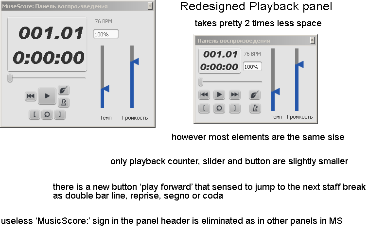
Redesign of playback panel and screen workspace
In every multipanel editor optimizing screen workspace is a key feature. As I mentioned on MS forum, I find that design of some panels are quite far from being optimal. The most ugly I consider the Playback panel that is frequently used. I've rebuilt the design of this panel trying to conserve the size of smallest elements (I started from smallest variant of the original panel). The result can be seen in attachments. New panel is pretty a half of old one, but the readability is improved and the size of most used vertical sliders is exactly the same. A new button is added - see explanations in the attachment (old_and_new_panels) file. In addition new panel can be scaled more accurate.
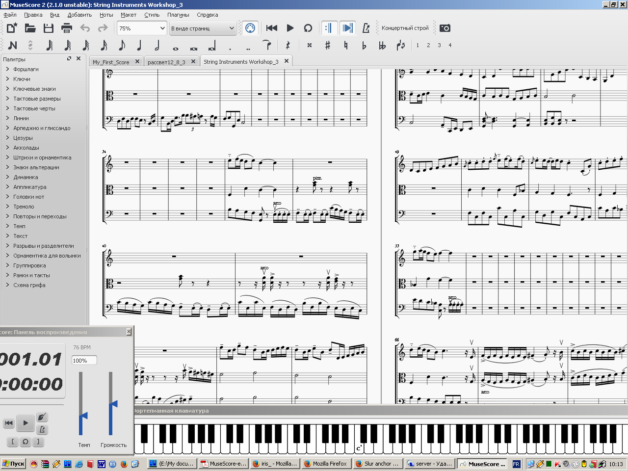
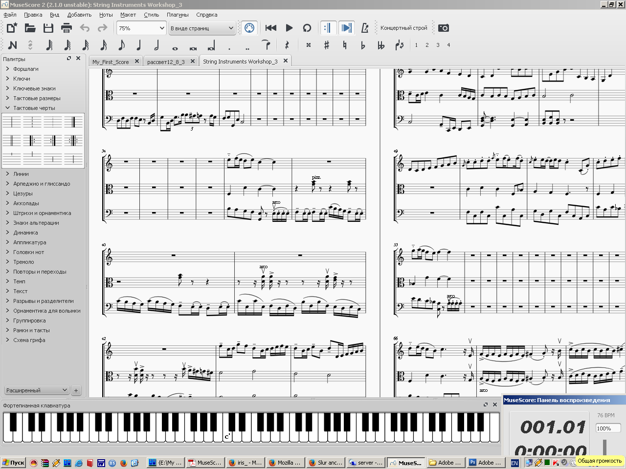
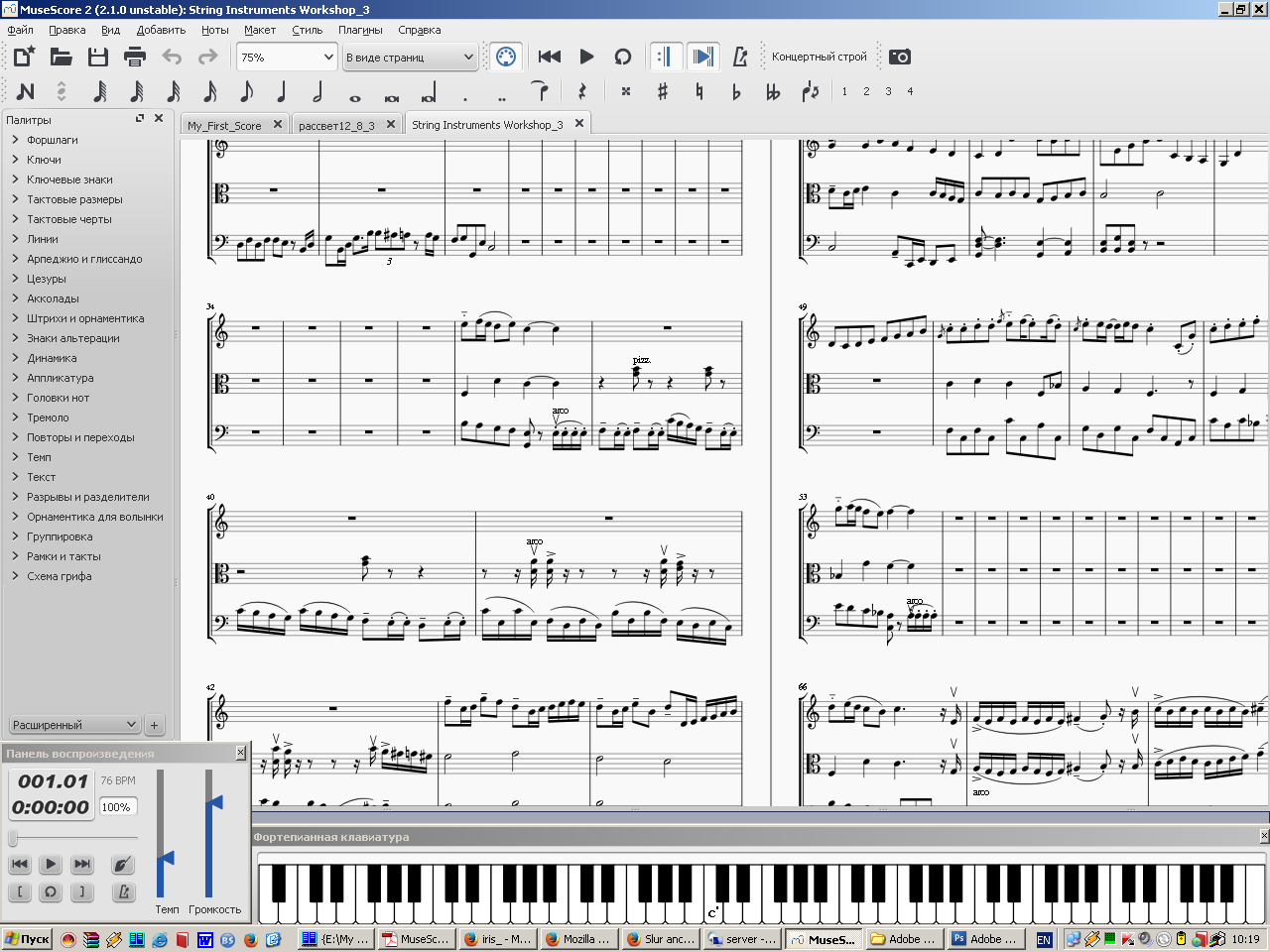
There are 4 screen layout examples with old and new panels.
Second point I'd like to evoke is panel anchoring. Now I cannot anchor and set the size of the main screen and panels around as I wish. For example Piano panel cannot be anchored in the bottom right corner, it slides in the bottom left. And cannot be offset the bottom of the screen.
Hope the MS team might use my ideas in the nightly buildings... )
| Attachment | Size |
|---|---|
| Old_and_new_panels.png | 31.04 KB |
| New_panel_in_bottom_right.png | 168.84 KB |
| Old_panel_in_bottom_left.png | 163.69 KB |
| Old_panel_in_bottom_right.png | 162.94 KB |
| New_panel_in_bottom_left.png | 170.77 KB |
Comments
I like it.
I like it, too! Is it only a mockup, or have you actually written the code for the new design? If so, you can contribute it to the code base at GitHub—see https://musescore.org/en/developers-handbook/git-workflow.
It's only design that is part of my profession. Since 25 years I don't write any more any codes. ) So I hope be followed by MS team.
@ etranger , I really like your design of playback panel , but I quiet not understood your second point of setting the size of panel and the example you cited regarding the piano sliding to bottom left cause I am able to anchor it to bottom right corner as well.
See https://github.com/musescore/MuseScore/pull/2453
The suggested changes would be a great improvement. Fantastic work, etranger.
I think etranger's tweak is an improvement over current design.
I actually have seperate complaints with the current design of the play panel:
Now when stretched horizontally, would give more resolution to all sliders. Also I think there is no longer really a need to include the words "Tempo" and "Volume" if group like this, because the conductor hand & metronome icons and the "bpm" would make it clear that that slider and box are tempo-related, while the Volume icon and the "dB" would make it clear that slider and percent are volume related, since they belond in the same QGroupBox:
![play-panel-grouped-by_Position_Tempo_Volume.jpg]()
I'm sorry if is is appropriate to bring up here. Maybe I should start my own feature request thread and lobby (but then again I don't know if that is a productive use of time, since will never have agreement on these ui things).
I like it. It makes sense. :-)
https://github.com/musescore/MuseScore/pull/2463
@ericfontainejazz (and everyone else), what do you think of the mockup (ignoring the colors) posted at https://musescore.org/en/node/105156 ?
For https://musescore.org/en/node/105156
* What I'd really like is for most of the panels to be dockable. Since already have a docked panel containing buttons for "Rewind", "Start", "Loop", "Metronome", I'm wondering if maybe simplest to just have the additional buttons & number boxes be able to fit in another 1-button high dockable panel. That would really save space, cause then could just keep the playback panel docked.
I think this Change Request is in the air. I posted a similar request in the Feature Request forum, yesterday.
My request went a bit further and by requesting additional functionality. Also I added a mockup too, which is inspired by many of the Digital Audio Workstations out there. My screenshot is included.
My mockup is based on a dark theme (common among many high end applications and now even Windows 10). The philosophy is to leverage horizontal screen space and make the Play Panel look more like a traditional audio player to appeal to the user.
I am happy to discuss this further if there is a need.
Cheers,
Dave
Sorry, just saw your post after I responded below. Thanks for sharing.
Cheers,
Dave
Great mock-up work Dave. How well are your Qt skills to turn this into a pull request?
My pleasure, Thomas.
I am new to MuseScore; almost finished my first transcription of orchestral work (80 pages). Thanks to MuseScore I found my love for music and composition again.
I am looking into Qt, but I have no skills in it yet. So I may need some time to get up to speed before I will commit to anything. I am thinking of contributing in future.
Please allow me to try to wrap up some redesign suggestions for the Play Panel:
I suggest to extend the panel with settings, so one can choose to include or exclude:
See my sketches in the picture attachment. I removed the dark theme to avoid discussions about color. I only use accent colors (blue) to accentuate active buttons and logic grouping (shades of gray). Of course, a lot of explanation is missing, but let's see how it goes here first.
The gist is: there is a full function, compact sized separate panel (row 1), there is also a full version with minimal height and maximum length (row 2), and finally there is the minimalist version to dock into the main window (row 3). So effectively there is one panel, that can be docked and resized (row 4).
Cheers,
Dave
(My suggestions shouldn't be treated as any sort of requirement...I'm just another user and part time contributor.)
I like what I'm seeing, *especially* image #4 which I believe will be very useful for users on space-limited screens (e.g. small netbooks and tablets).
I'm thinking implementing a way to switch between #1 & #2 will be harder than it looks, however if you implement #3 & #4, then there would no longer be a strong need for #2, because someone who wants a thin version will get that when docked.
One thing about #3 that I think maybe I didn't communicate properly. There are already "Play", "Rewind", and "Loop" buttons in the top panel already, so I would think the docked panel should only include things other than "Play", "Rewind", and "Loop".
My suggestions shouldn't be treated as any sort of requirement..
You are correct, wrong terminology and that is also not up to us, my apologies.
One thing about #3 that I think maybe I didn't communicate properly. There are already "Play", "Rewind", and "Loop" buttons in the top panel already, so I would think the docked panel should only include things other than "Play", "Rewind", and "Loop".
This is how I see it work together. If the floating Play Panel as depicted in row 1 is dragged to the main window menu, it will change size to fit the docking space and becomes the panel in row 3. So either there is a docked play panel or a floating one which means no play panel in the main window if you use the floating panel.
Also, but not addressed in the sketches, if you provide settings to change which buttons to show and which ones to hide, you will provide maximum flexibility to the user.
Cheers,
Dave
Good, I like that!
Good. That concept could probably be extended to every other panel element...I imagine many people who never use many of the uncommon buttons (e.g. 128th, 64th, longa, double longa, double flat/sharp, voice 3/4, etc.) might be better off if they could customize their panel to keep clean and tidy. But that is not something for you to worry about...but it would be nice if the code for selectively selecting and displaying panel buttons could be reused for these other panels.
Good. That concept could probably be extended to every other panel element...
Precisely, I was thinking about that too today and I am working on some suggestions, nevertheless :). The more we can compact the interface, the more space we have to create and view score.
Cheers,
Dave
The pull request has been closed. I hope an improved play panel will go into 3.0 in the near future.
@RobFog could you post the link to the pull request?
See comment 7. Here are the relevant pull requests:
https://github.com/musescore/MuseScore/pull/2453 → https://github.com/musescore/MuseScore/pull/2463
Hi Eric,
I think your design is really useful and great. Do you plan to implement it someday?
I liked my design, but I don't think that is what the people wanted, so probably won't implement it.
Are you kidding? I think 100% of the people who have commented on this issue would be in favor of replacing the current design with yours from comment #9. Some had other suggestions, but we all agree that we need something better, and I think we all would also agree that your proposal would be a tremendous improvement.
ok, well if apparently none of the other redesigns materialized, then I guess could give #9 a shot...although I do have a bad habit of saying I'll do something and then never doing it. I'll wait a few days first. I will make it a QDockWidget for sure.
That would be awesome! You've been taking on a lot, but if you have time for this, I applaud you.
I like Eric's design a lot as well and I think the Play Panel could really do with a cleanup. The only nitpick I have with Eric's mockup is that "The slider would be a little microcosm of the score, containing a tick for each measure, and maybe indicating voltas, repeats barlines, & rehearsal letters (in very small print)" probably would be over-engineered and too detailed UI.