Engraving improvements in MuseScore 4.0
In MuseScore 4.0 we have made many engraving improvements, some of which will have an effect on the appearance and layout of scores created in earlier versions. These fall into four major categories: beams, slurs and ties, horizontal spacing and page layout, plus a variety miscellaneous issues.
An unavoidable consequence of making these improvements is that it is not possible to open a score from a previous version of MuseScore and have it look identical; this document aims to list all of the changes in detail, so you know what to expect when migrating scores from earlier versions.
Where the algorithms that determine the default positions of an item have changed, it becomes necessary to reset some manual adjustments that may have been made to those items. This is because those adjustments may no longer make sense relative to the new defaults. If we have done our job properly, many of them should not longer be necessary! In brief, the following adjustments will be reset when importing an older score into MuseScore 4.0:
- Stem lengths
- Offsets of single-note tremolos
- Position of endpoints and handles of slurs and ties
- Layout stretch
More details about these, and all the other changes to expect besides, can be seen below under the 'changes to expect' heading at the end of each section below.
While we do preserve as much of the manual customisation of styles and item positions as we can when migrating old scores, we would certainly encourage that you manually reset everything anyway, to see how all the new defaults and redesigned algorithms work in combination (even just as an experiment!). There are so many interrelated aspects to engraving that it is well worth trying this to see the overall picture. For example, many of the spacing and padding defaults have been changed to work well with the overhauled horizontal spacing algorithm, but we will preserve those from existing scores even though they might not make as much sense any more.
This reset can be done quite simply:
- Open the Styles dialog (Format -> Style..., or right-click an empty part of the of score and select 'Style...')
- Select everything (Ctrl+A) and then Format -> Reset shapes and positions (or Ctrl+R); the other 'Reset' options in the Format menu may be of interest, too.
1. Beams
NOTE: Several beam features are currently incomplete: Cross-staff beams (which are drawn completely incorrectly), feathered beams (not yet reimplemented), grace note beam positions, two-note tremolo positions, and manual beam adjustments.
New beam placement algorithm
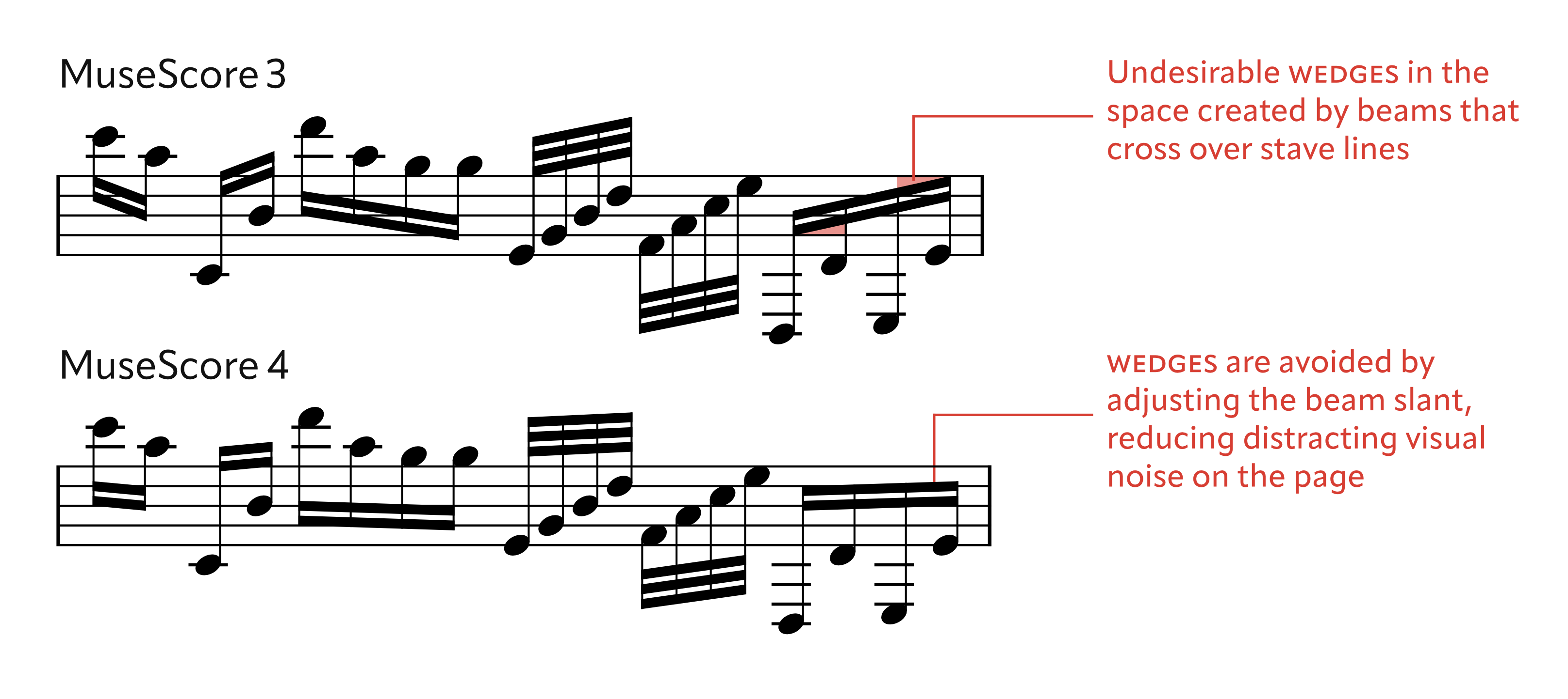
Much of the code for positioning beams has been rewritten. The length and direction of stems, and the placement of beams, are now determined according to more logical and rigorous rules. Many of these principles are documented in Ted Ross' book The Art of Music Engraving and Processing which, though very hard to find these days, has long been considered the most comprehensive text on this particular subject. (In Behind Bars, Elaine Gould refers readers to this book if they wish to learn about the intricacies of beam slants and positioning.)
One of the main aims of the algorithm is to avoid what Ross calls wedges, which occur at the intersection of the inside of a stem (at the beginning or end of the beam), the beam itself, and a stave line, when the beams are poorly positioned. (We only concern ourselves with these at the start and end of beams, not in the middle, because then it would be impossible any beam to ever traverse a stave line.) The main rationale for this originally was that, when printed, these would fill in with ink, causing an uneven and possibly unclear appearance. While this is less of a problem with modern printing, the fact remains that, since beams are very common items in notation, removing these wedges greatly cuts down on distracting visual noise on the page.
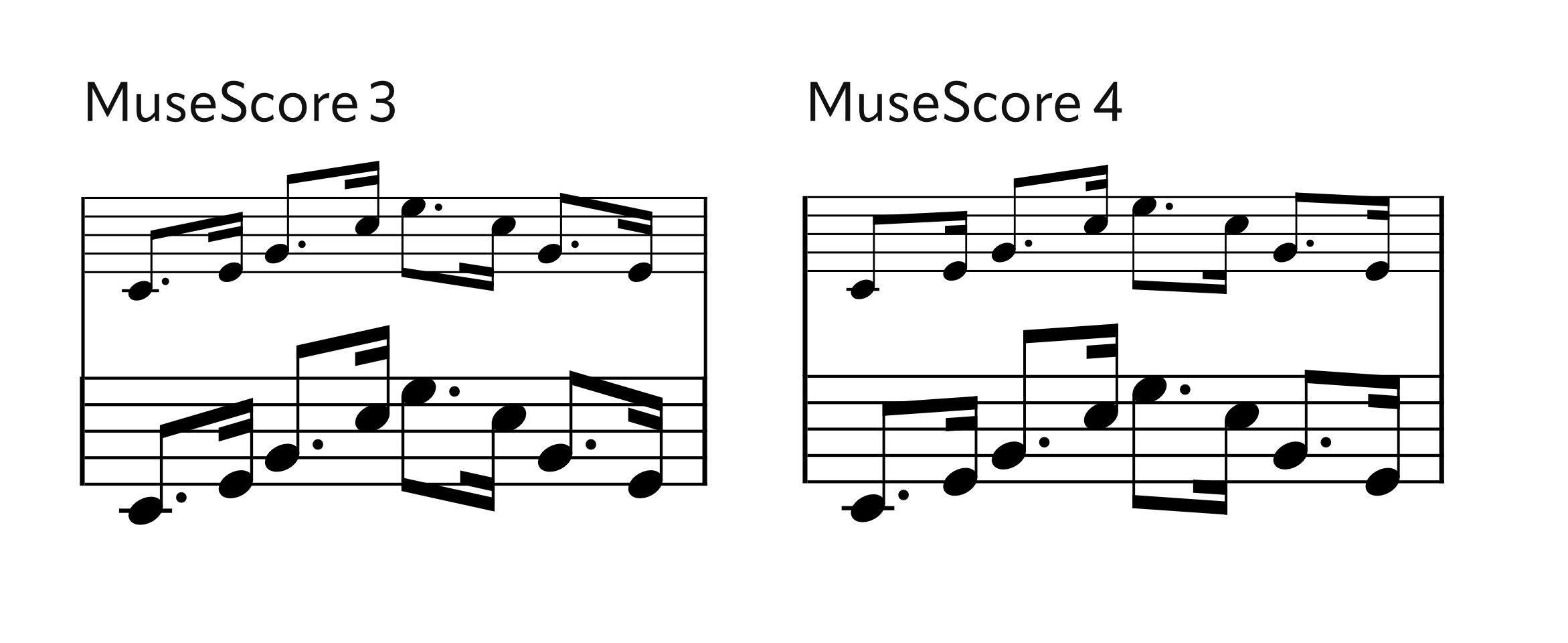
The following illustrates some of the differences. It can be seen that, in general, beam slants are shallower when the beam is within the stave (to avoid wedges), but also many other inconsistencies from MuseScore 3 have been ironed out:
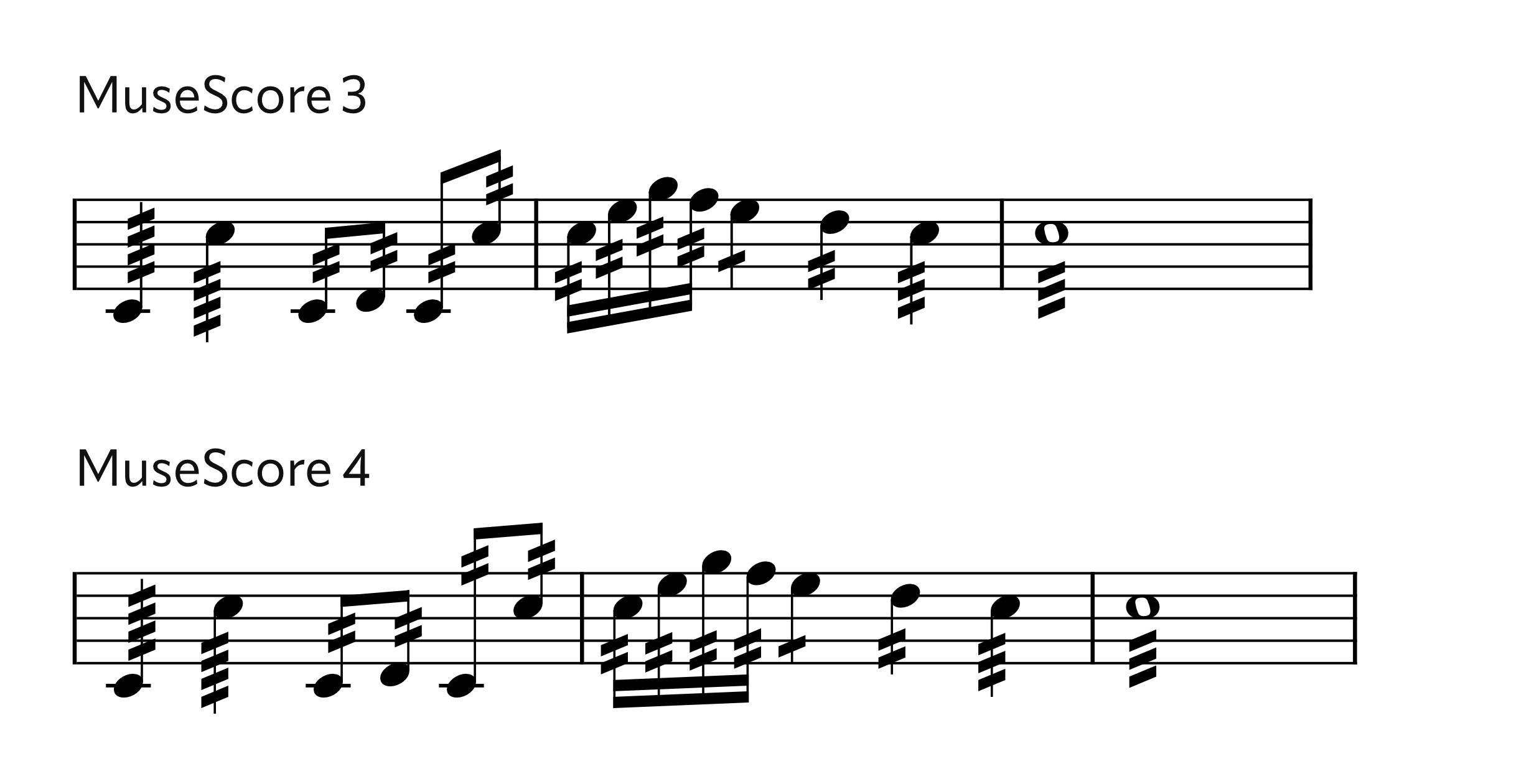
The way that stems are shortened when they extent outside the stave has also been refined. Previously MuseScore gave inconsistent results, particularly where beamed groups were involved, and sometimes also over-shortened notes with flags.
Two-note tremolos are positioned following the same rules as normal beams. Single-note tremolos are now more consistently placed (at a defined distance inside the stem or innermost beam, and with a minimal padding from the notehead):
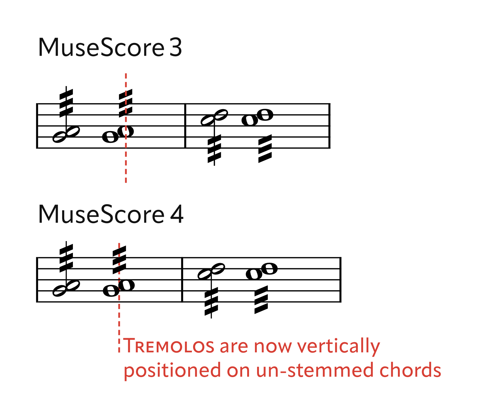
Tremolos on unstemmed chords (whole notes, for example) containing seconds are now horizontally centered on the position where the stem would be:
Altered beam settings
In order to have beam placement rules that can be applied consistently, certain limitations have to be placed on the vertical spacing of beams. Previous versions of MuseScore allowed the thickness of the beam, and the distance between beams (which represented the size of the gap, not the actual distance from one beam to the next), to be set to arbitrary values. In MuseScore 4.0 the beam thickness can still be set, but there are only two options for beam distance: standard (0.75sp from one beam to the next) and wide (1sp). The latter option is rarely seen in print but was popular for a while with some publishers in the late 20th century.
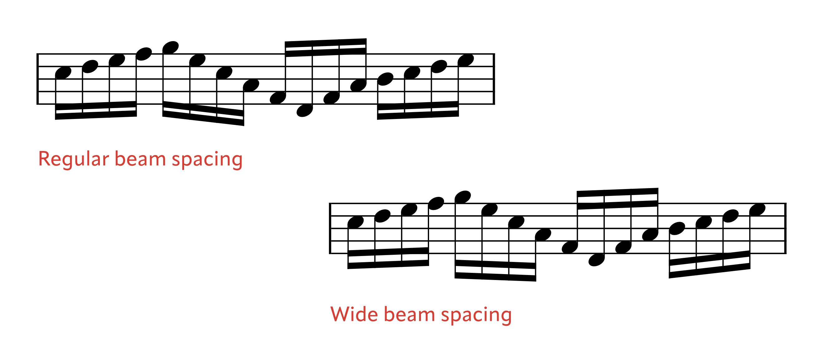
Previously the distance between beams could be set, as a percentage of the thickness of the beam. For the new beam algorithm to make sense, the distance from one beam to the next must be either 0.75sp (regular) or 1sp (wide), otherwise none of the new rules make any sense. The UI has now been changed to only allow 'regular' or 'wide' options. Beam thickness can still be changed, but the beam distance is then automatically calculated from that so the correct beam distance will result.
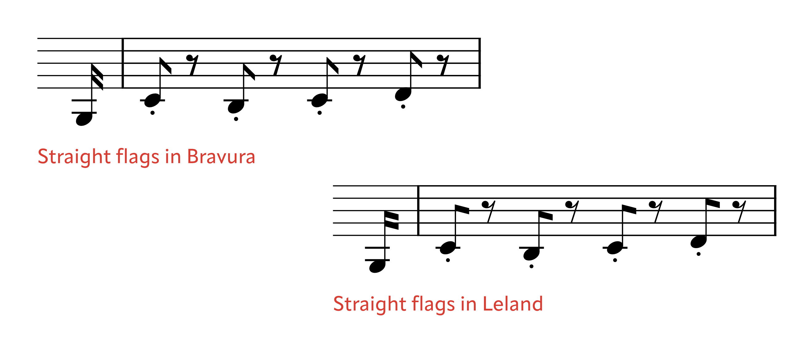
A new option is available for straight flags. These are quite commonly encountered in scores up until the mid-19th century, when they were largely replaced by the more familiar 'curly' flag, but then became fashionable again in the mid-20th century for some contemporary works. SMuFL fonts can make these symbols available as stylistic alternates to the normal flags. (Bravura's are more like the 'old' (19th-century) design, and Leland's more like the 'modern' one.)
The length of fractional beams is now correctly scaled on resized staves:
Changes to expect
The default placement of all beams, and the length and direction of stems, will all be recalculated. In scores from MuseScore 3.0 or later, beams with a custom position will retain that position; this is possible because beam positions are expressed as absolute values, not as offsets from an algorithmically-determined starting position. (Before 3.0 they were expressed as relative values.) The 'Reset shapes and positions' function can be used to see how the new default would look, for these beams. Custom beam direction is also retained.
The position of single-note tremolos will be recalculated, and manual adjustments made to these will be lost.
The beam distance setting, now removed in MuseScore 4, will be mapped to 'standard' or 'wide' according to whether its value is less than or greater than 75%.
2. Slurs and ties
New slur and tie placement algorithm
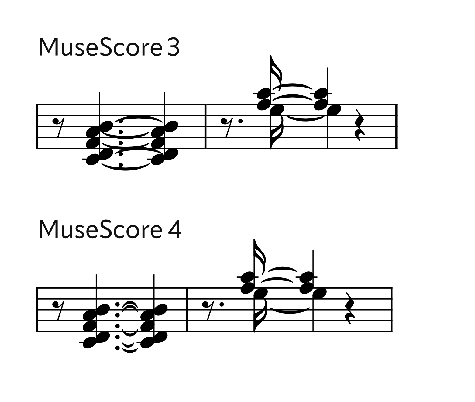
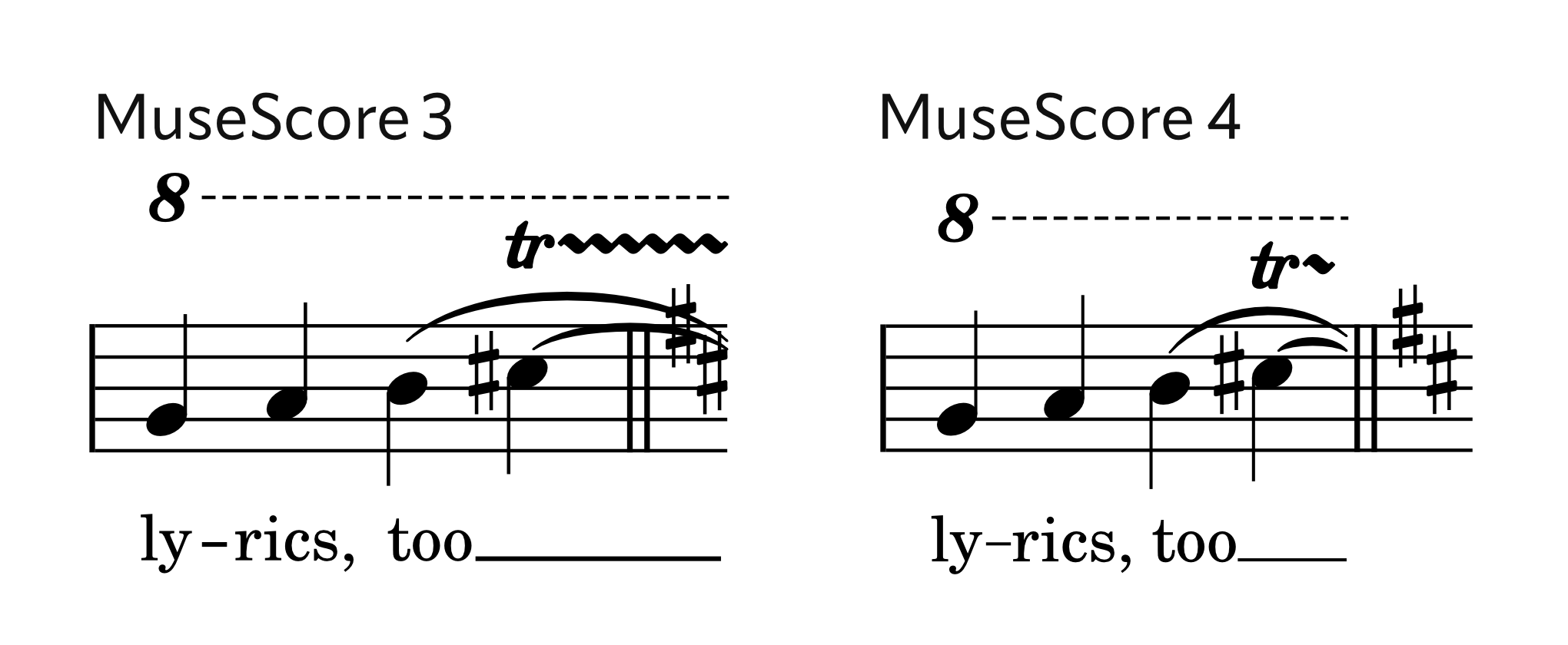
The default positioning of slurs and ties has been greatly refined. The endpoints of ties will now automatically clear dots, flags, stems, noteheads and stave lines, with even complex chords containing seconds being elegantly handled. The direction of ties is also more intelligently decided when chords contain seconds, or when ties go from a chord to a single note or vice versa.
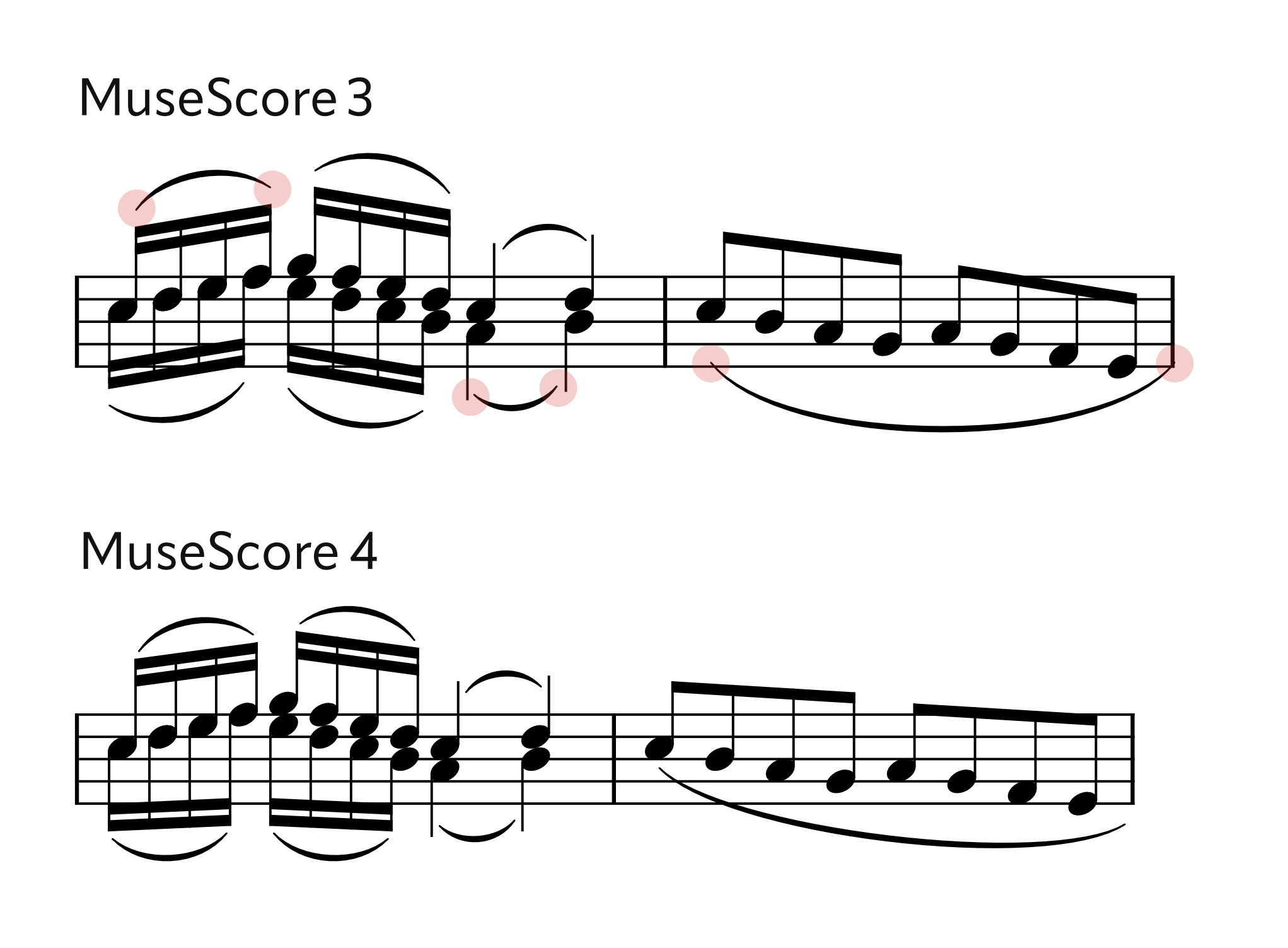
The endpoints of slurs are more intelligently placed according to their context (whether they are at a notehead, a stem, a flag, over a beam, or floating at the start or end of a system), and will clear stave lines in the same way as ties. The algorithm for adjusting the slurs to clear collisions with the notes they span has also been made more intelligent.
Slurs and ties crossing a system break will now end just before the final barline, rather than at the end of the stave, meaning that they will no longer collide with the barline or with any key signatures or time signatures following it. (In fact, this applies to all lines: see Lines crossing systems, below.)
Changes to expect
The default placement of all slurs and ties will be recalculated. Unlike with beams, slurs and ties which have been manually reshaped and repositioned will be reset. Fortunately, many of those manual adjustments will no longer be necessary.
The direction of slurs and ties will be retained. (Between 4.0 and 4.3, the direction of ties in chords was reset to 'auto'; this is no longer the case in 4.4 and later.)
A bizarre piece of logic in MuseScore 3 had slurs that were longer than one whole bar would always appear above the notes, regardless of stem direction. This has been corrected.
3. Horizontal spacing
Improved justification algorithm
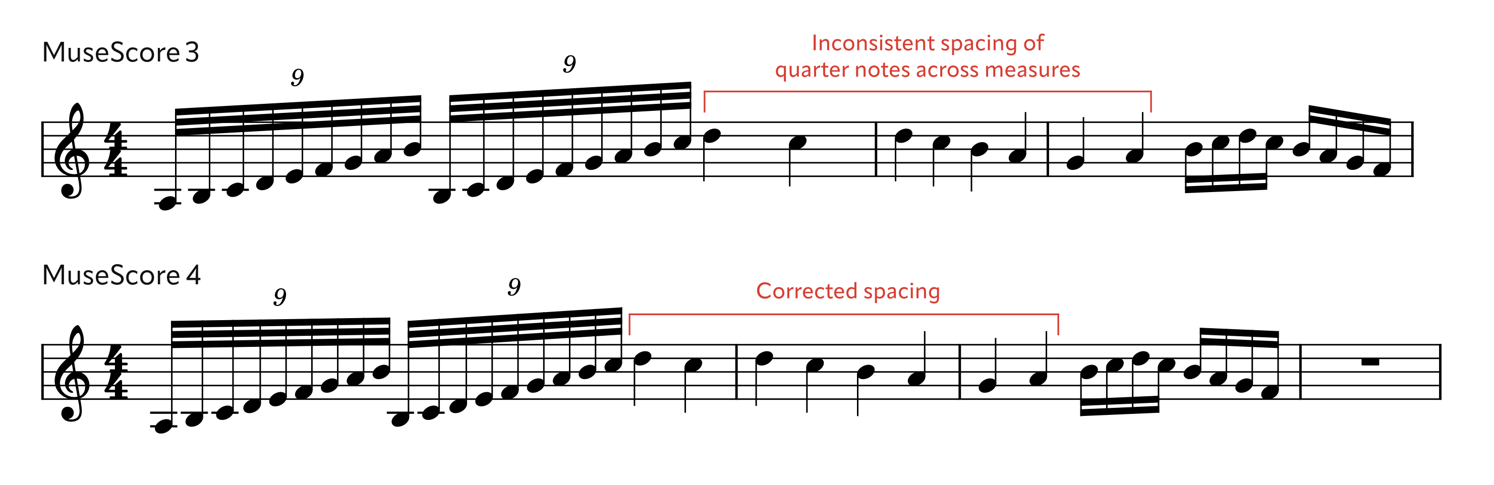
The two fundamental changes are that a) the entire system is now justified proportionally (previously each bar was considered separately, which could lead to jarring inconsistencies from bar to bar), and b) the minimum note distance setting is now properly treated as just that - the minimum space two notes can be together. Previously it was being incorporated into the calculations of the proportions for different rhythmic values, which was another source of inconsistent behaviour and wasted space. Its default value is now larger than before; the previous very small value was only necessary to mitigate some of these problems.
In this example it is clear to see how the quarter notes used to be differently spaced from bar to bar, according to the context of each bar; now they are spaced equally:
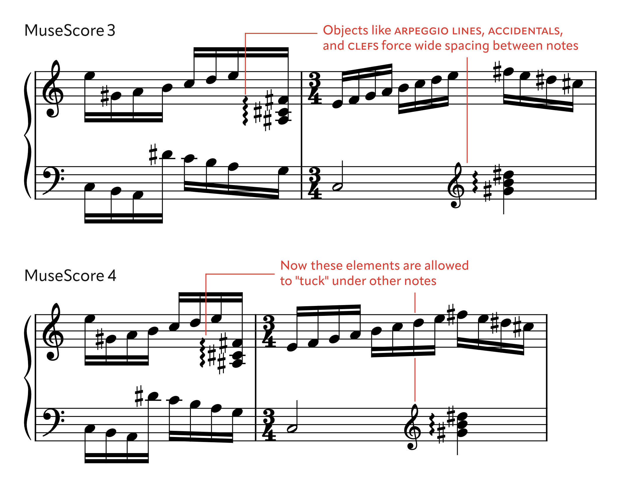
Another widespread problem was that objects could not generally tuck above/below other items, creating a lot of wasted space; furthermore, space was often created for items when it was not even required on the stave on which those items appear:
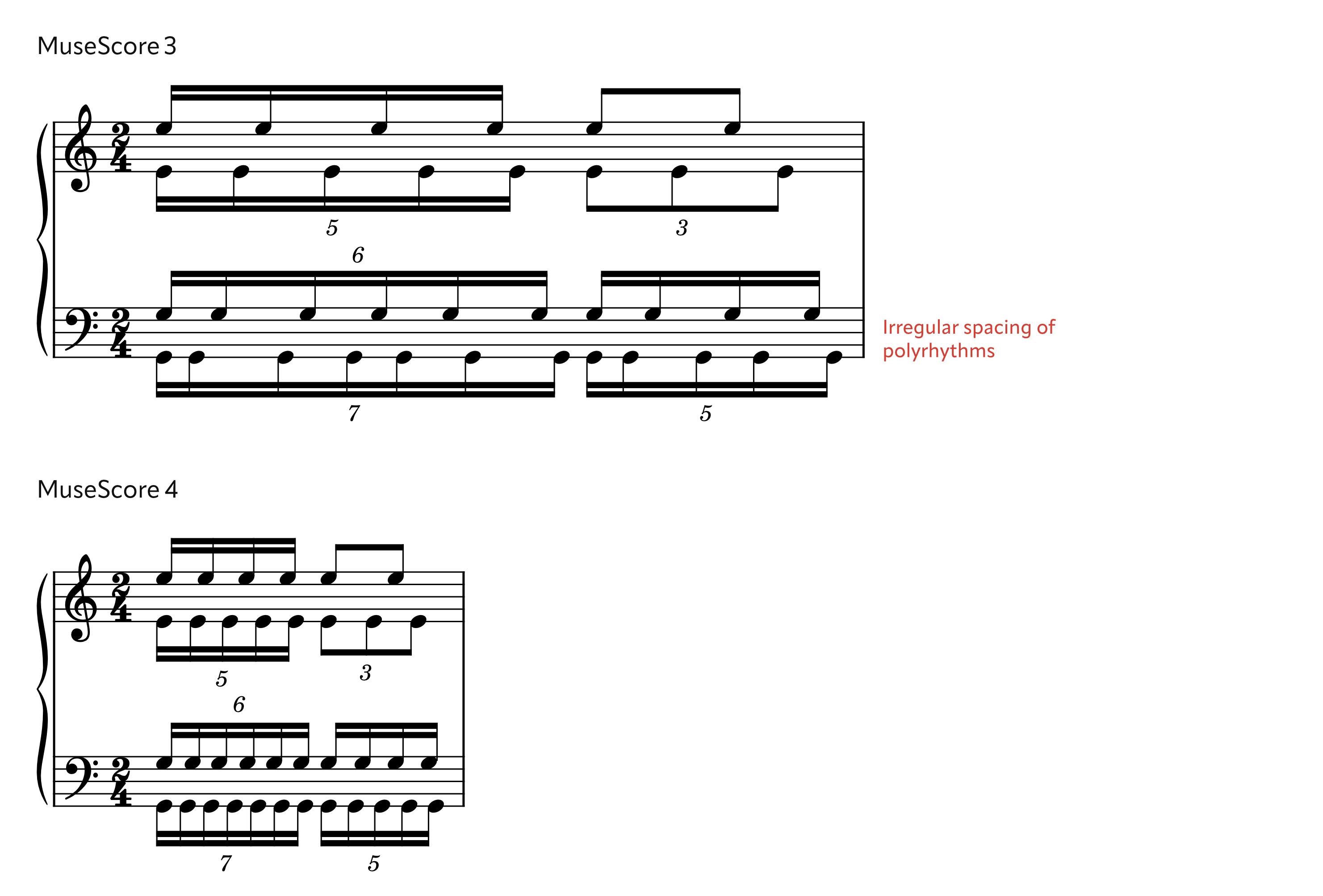
For this same reason (among others) polyrhythms, even in simple ratios like 3:2, have historically been very poorly spaced (irregularly, and with a large amount of wasted space) in MuseScore. Now any number of simultaneous polyrhythms can all be spaced smoothly:
The 'Local relayout' option on beams has been removed in MuseScore 4. This was sometimes used in the past to regularise the spacing for a single voice/part (though it would not reclaim any wasted space). This workaround is no longer necessary.
The spacing of cross-staff notation is now adjusted (where possible) so that the stems are equally spaced, rather than the noteheads; this gives an optically superior result.
(illustration to follow)
The 'Spacing 'setting (in Style -> Measure) has been renamed 'Spacing curve' and its new default is 1.5. A fuller explanation of how the new spacing routine works, and how it is configured, is to follow.
Minor changes affecting horizontal spacing
(See also Page layout, below.)
Many small changes have been made to the layout and spacing of items that will have small but potentially cumulative effects on horizontal spacing.
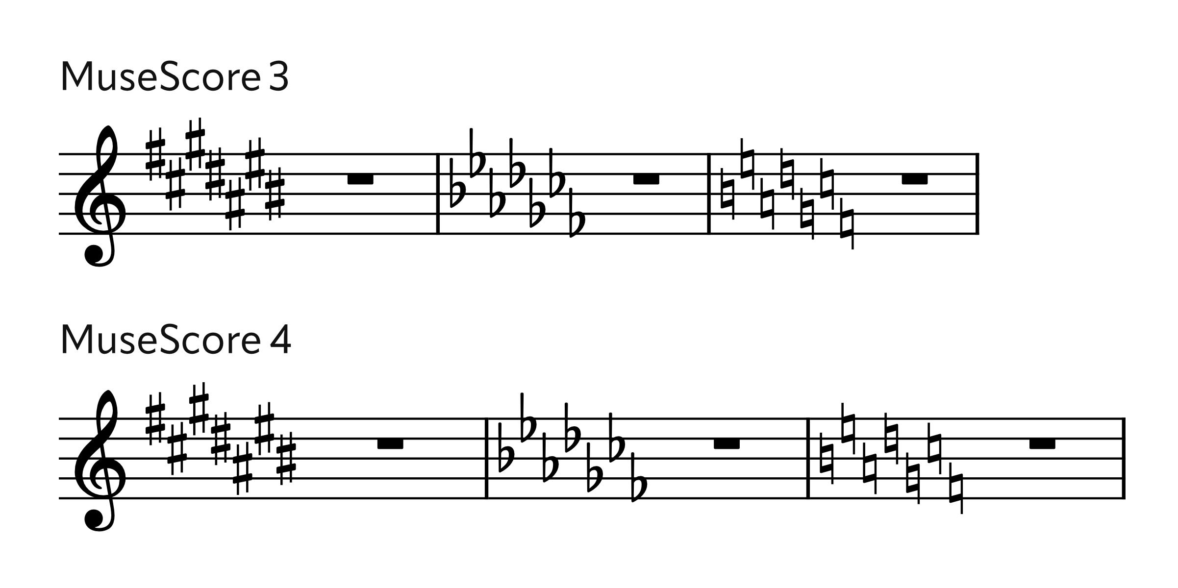
The spacing of accidentals in key signatures has been improved. These were generally too close before: a constant value was being used, taking no regard of the shape of the glyphs themselves. Now the bounding box if each symbol is considered (as well as the SMuFL cutout data, where available):
Key signatures and time signatures at the very end of a system now have a small amount of padding to the right, rather than ending flush with the end of the stave:
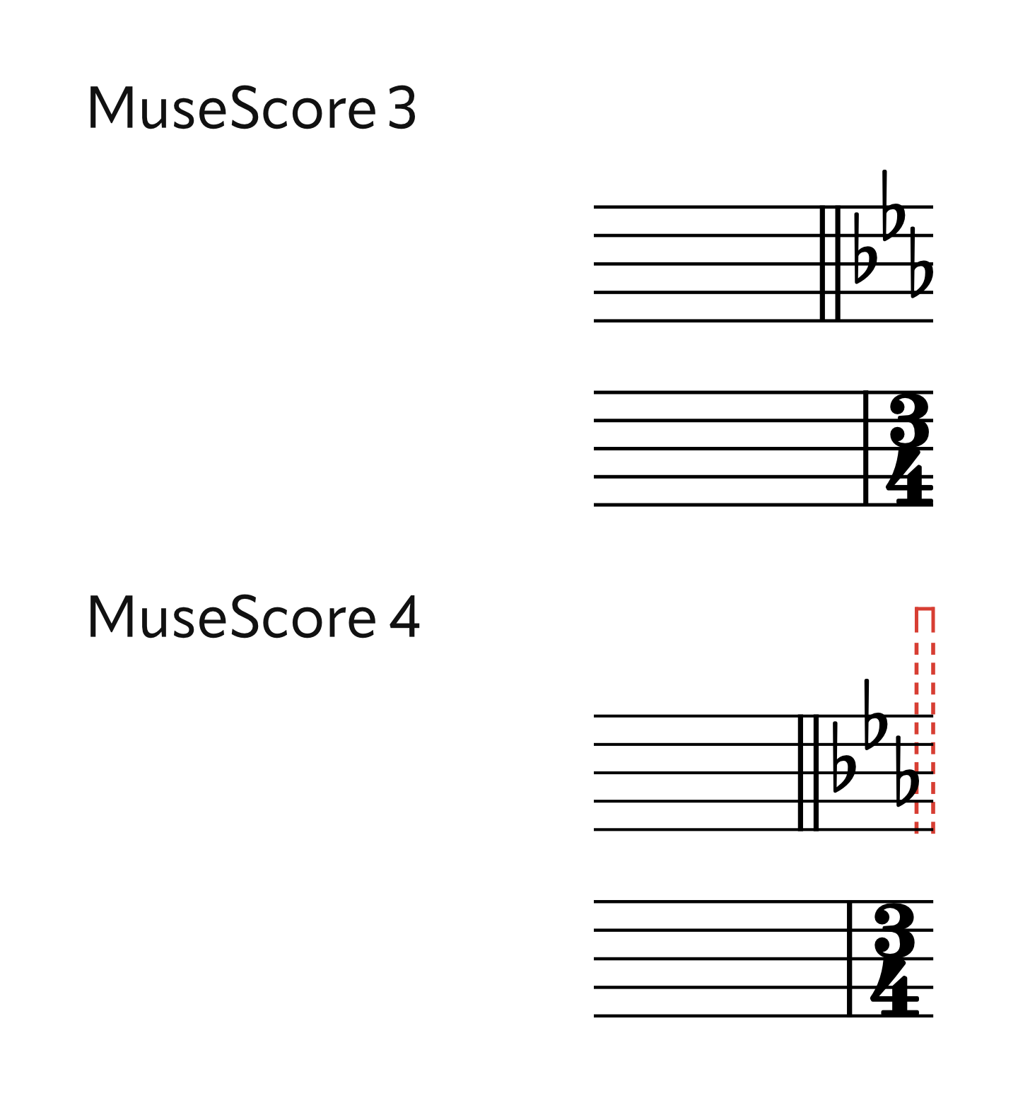
Invisible time signatures and key signatures no longer cause spacing inconsistencies:
MuseScore 3.6

MuseScore 4

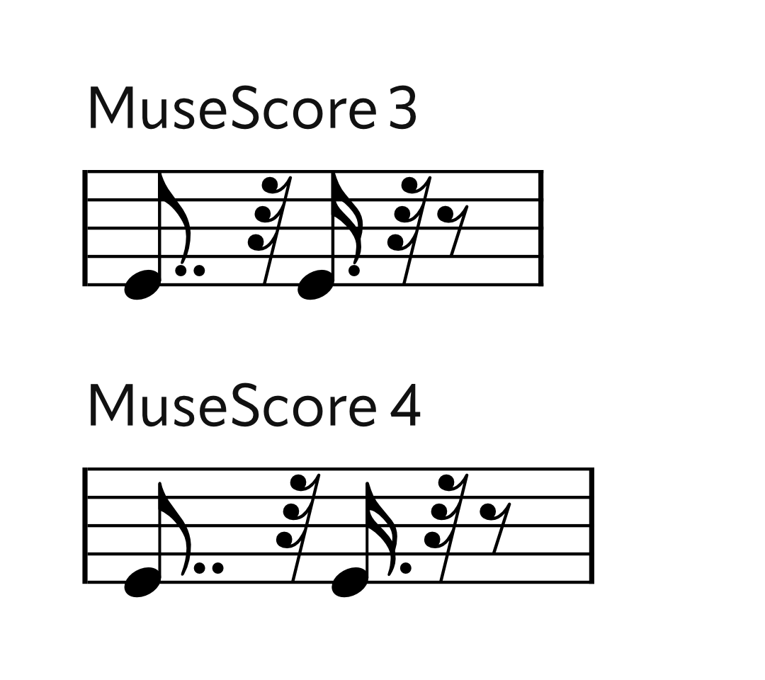
Augmentation dots are offset rightwards to clear flags, where necessary. Previously some stem lengthening occurred in certain cases to try to mitigate this, but this was usually insufficient and caused inconsistencies, so now the stem length is left unaltered:
Grace note ledger lines were previously too long (not properly scaled with the rest of the note). Admittedly, the difference is tiny!
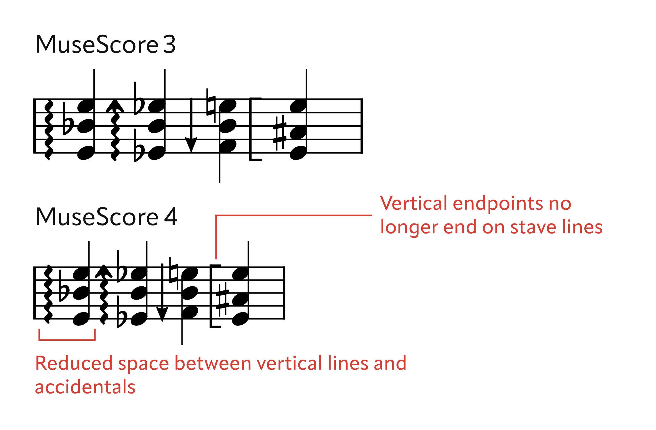
The space between arpeggio lines and accidentals has been reduced, and also now takes into account the shape and position of the accidental, the presence of arrows and brackets, etc. The default vertical endpoints are also adjusted in order to not end exactly on stave lines:
Changes to expect
Layout stretch will be reset when scores from earlier versions are migrated to MU4.
None of the other changes individually cause seismic variations in layout, but even the smallest thing can, in certain circumstances, completely change the layout of a score. Some increase the amount of space required while others reduce it (the latter generally being preferable, or at least less risky).
4. Page layout
At score creation, where many instruments are added, the stave size will be reduced enough so that all staves can be shown on the first page. This is purely avoid the perplexing situation of a system continuing beyond the bottom of the page (or worse, being bumped to the second page because of the presence of a title frame - and then often not fitting there anyway); the user will most likely want to manually adjust the page layout options thereafter.
Margins, headers and footers
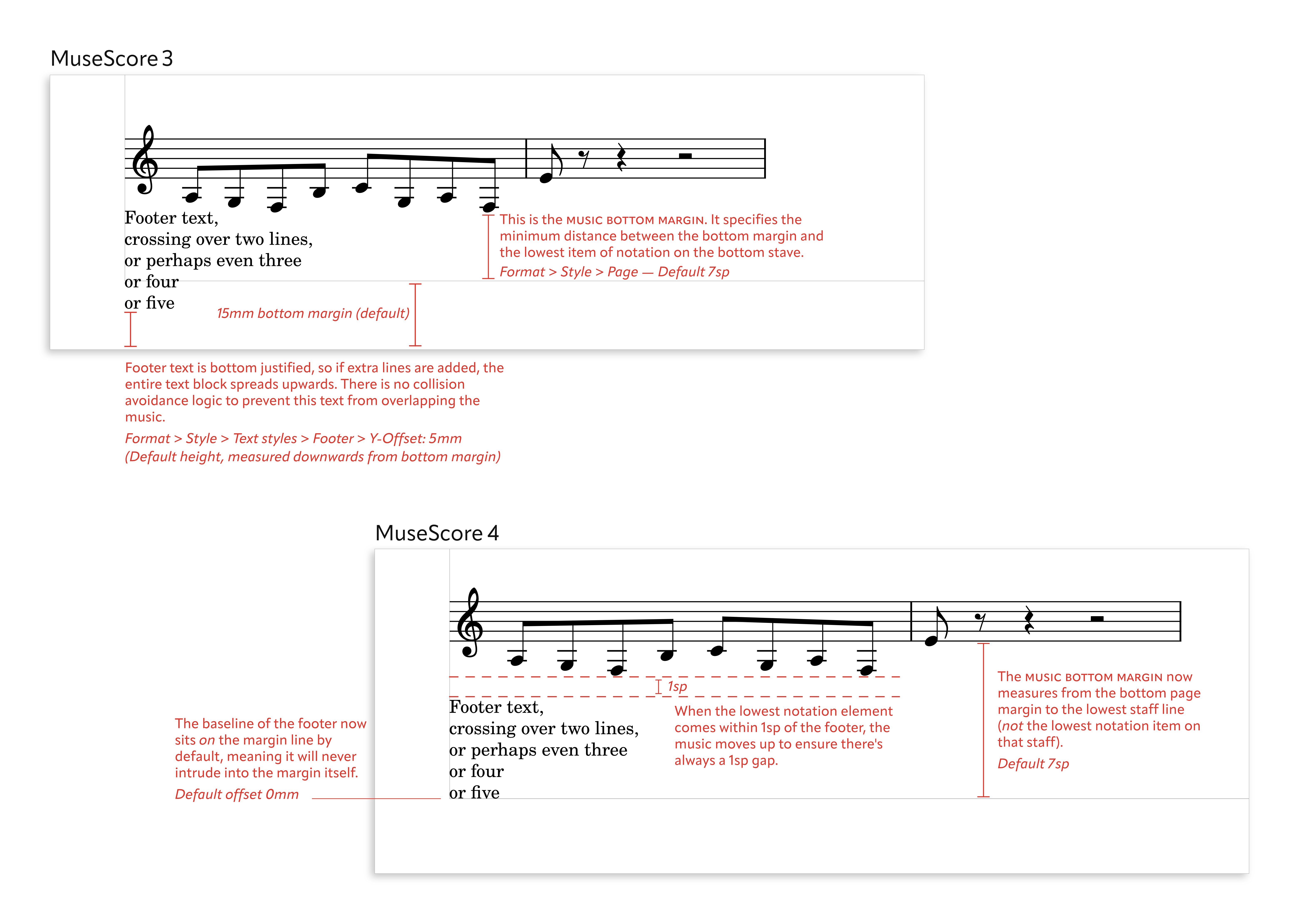
The behaviour of headers and footers has been made more consistent and rationalised. Footer text was previously offset downwards from the bottom of the body of the page into the bottom page margin (unlike header text, which sits at the top of the body of the page). This was, presumably, so that the music would not collide with it. However, this strategy potentially fails as soon as footer text becomes more than one line long (the footer spreads up from its origin point), and also makes its behaviour inconsistent with header text, which sits inside the body of the page.
Footer text is no longer offset by default, so it will not intrude into the margin, but the music on the page will now automatically clear any header or footer text, whatever its height. Text frames at the top of the page will also automatically clear headers, if necessary.
All systems in a score now have a consistent left origin point, except for the initial system, which has an optional configurable indent. Previously, the staves of each system could start at a different position, depending on the length of the longest instrument label shown on that system, or on which brackets were present, giving an inconsistent 'ragged left' layout. The indentation is now calculated according to the longest label and applied consistently through the score. Here, for example, all four systems now have the same left origin:
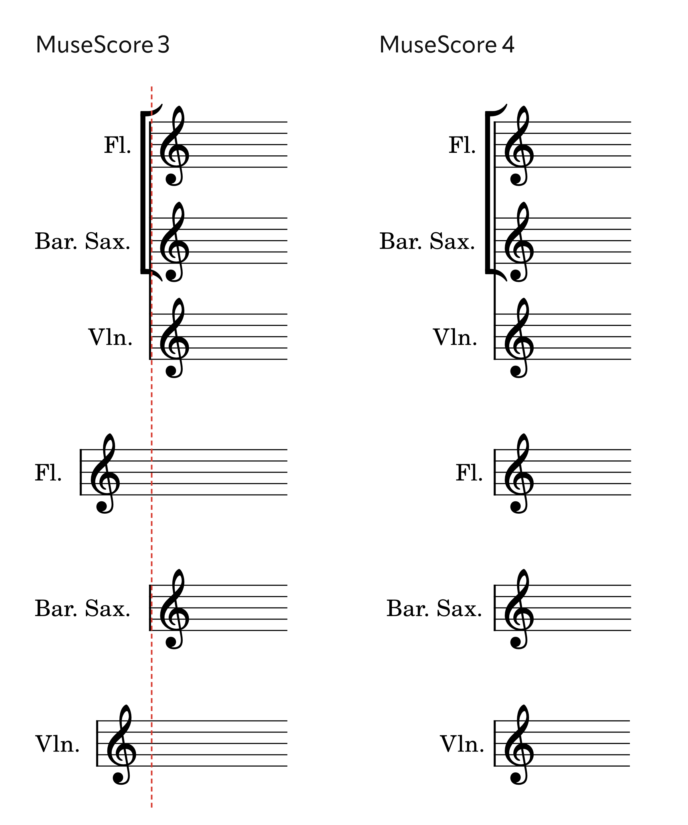
Where there are no instrument labels, brackets and braces are now positioned in the left margin (the staves will begin precisely at the left margin), as is the policy in most traditionally engraved music.
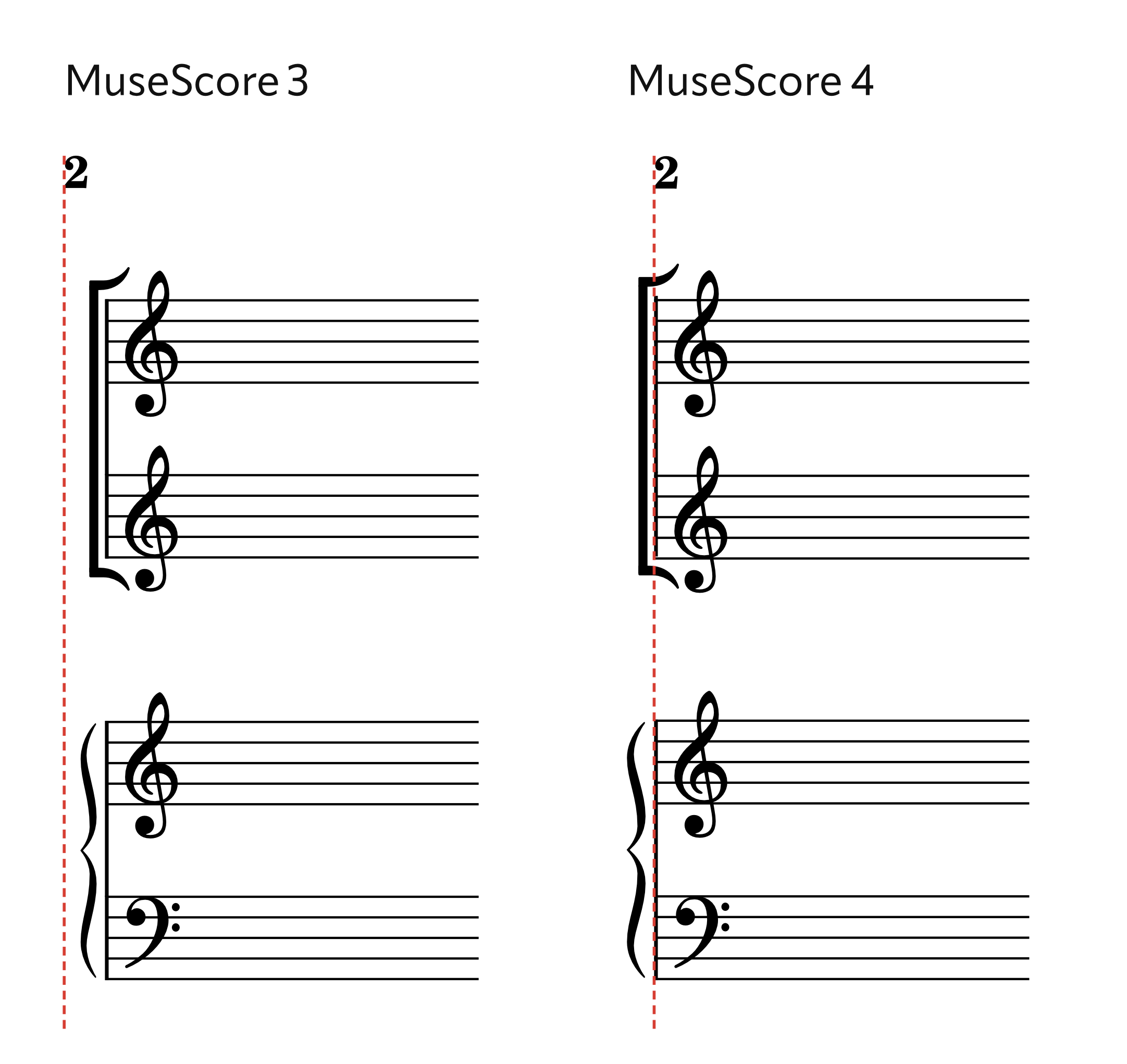
Connected to this, the correct brace symbol is now selected for each system independently, based on the number of staves shown for the instrument on each system, not on the total number of staves used anywhere for that instrument.
(image to follow)
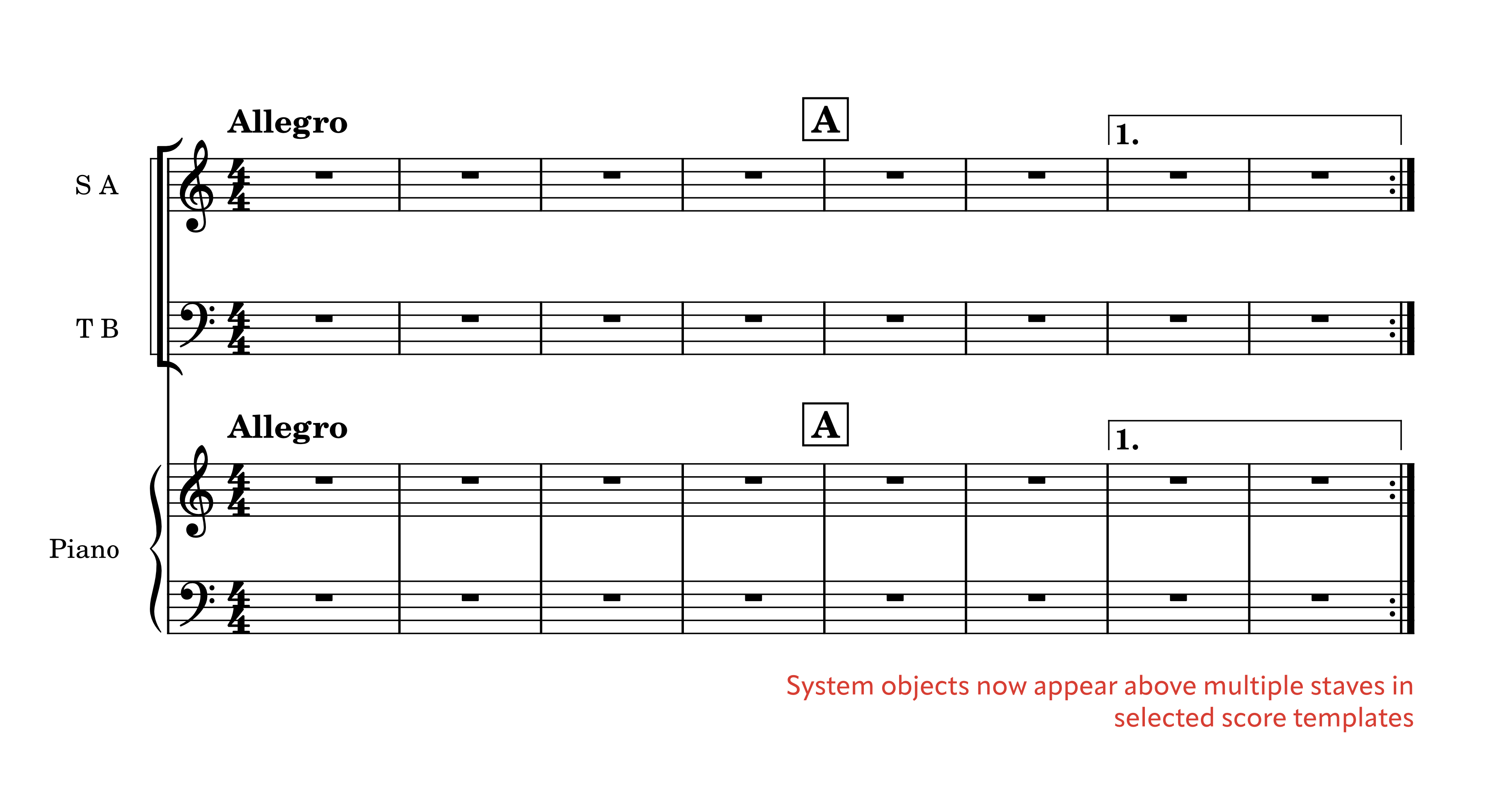
System objects
MuseScore already had the concept of system markings: items which appear at the top of the system but which apply to all staves and extract to all parts (tempo markings, rehearsal marks, bar numbers, voltas, etc.) What it so far lacked was the ability to duplicate these markings at specified points further down the score, as is customarily done in, for example, orchestral scores (where a second instance appears above the strings), or chamber or choral music with keyboard (where a second instance appears above the keyboard part).
Much of the groundwork for this has now been laid, and by way of a preview, can be tried out by opening certain templates supplied with MuseScore 4 (Classical Orchestra, Symphony Orchestra, SATB + Piano/Organ). In these templates, system markings (except for bar numbers) are defined as being duplicated above the string section, or the piano. Eventually it will be possible to configure which types of markings should appear, and where, for all scores.
Changes to expect
If instrument labels are present throughout your score, and you have 'Hide empty staves within systems' turned on, the horizontal extent of systems may change. Sometimes a system will have more space than before, sometimes less.
There may be slight differences in vertical justification due to the new header/footer spacing settings.
If there are no instrument labels, systems will have slightly more space, as the brackets and braces will extend into the margin.
A minor fix: the 'last system fill threshold' now applies to the final system before a section break, not just to the very last system in the score. The previous workaround (using a frame) is no longer necessary.
5. Miscellaneous
Dynamics
Dynamics are now rendered using the Musical Symbols font (i.e. Leland, Bravura, etc.), rather than the Musical Text font (Leland Text, Bravura Text, etc.).
The Musical Text font is intended for music symbols that appear in the context of running text; this could be music examples (like single notes or simple rhythms) in an academic book, or in footnotes. The symbols are designed to work at this scale. Dynamics may seem to fit in this category, as they often appear in combination with text (e.g. poco f cresc.) but they are properly considered as musical symbols, which are designed with proportions that match the size of all the notation around them, rather than appearing text they happen to be alongside.
The SMuFL specification gives 20pt as the nominal size for normal-sized notation on a stave, so to retain this proportion, dynamics should be at this size. Since some users use the 'Dynamics' text style for strings that combine dynamic symbols with text, this style now has a default of 10pt (which matches the default size of Expression and Technique text), and the dynamic symbols are sized at double this value. If a Dynamics text item consists only of a single dynamic symbol, but the item has its justification overridden to 'left', this will be removed.
SMuFL also allows for the provision of metadata that specifies the optical centre of dynamics symbols, which enables them to be centred on noteheads in a more sophisticated manner than simply using the bounding box (which can give results that look slightly off-centre, given the stylised italic nature of dynamics). MuseScore will now use this data, where it is provided. The exact placement of the dynamics relative to the noteheads will vary from font to font, and is an aspect of each font's design.
Metronome marks
Notehead symbols for metronome marks use the Musical Text font (as before), but now are sized in a 5:3 ratio relative to the text string in which they appear (i.e. they will be 20pt in a 12pt text string). The metronome mark symbols in Leland Text itself have been resized from the version included with MuseScore 3.6 (they were previously too large, but 'looked right'; conversely, those in other fonts such as Bravura would have looked too small, but now these symbols should look right in all SMuFL fonts - except for MuseJazz Text which requires an update).
(image to follow)
Lines
Lines at the end of a system now stop before the final barline, rather than continuing to the end of the stave and thereby colliding with the barline and any key signatures or time signatures that follow. (This also applies to slurs and ties; see above.)
Lyrics extension lines in lyrics are now omitted if they are very short (less than 1sp).
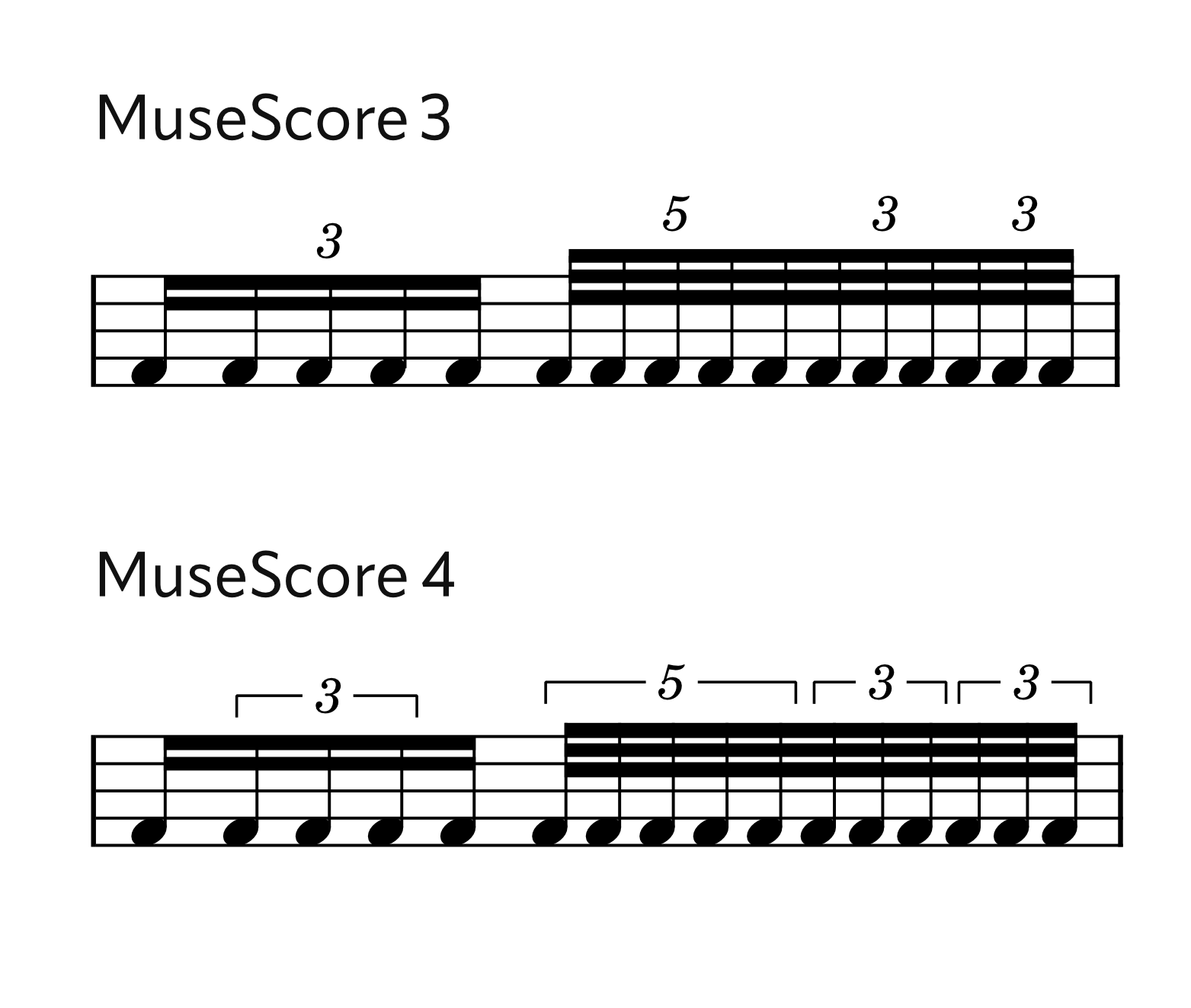
Tuplets
The automatic placement of nested tuplets has now been fixed. Previously, an outer tuplet would cause autoplace to ignore inner tuplets and collisions would result. Additionally, an obscure bug would cause the numeral of an outer tuplet to become small if each of the outer tuplet's units were themselves tuplets.
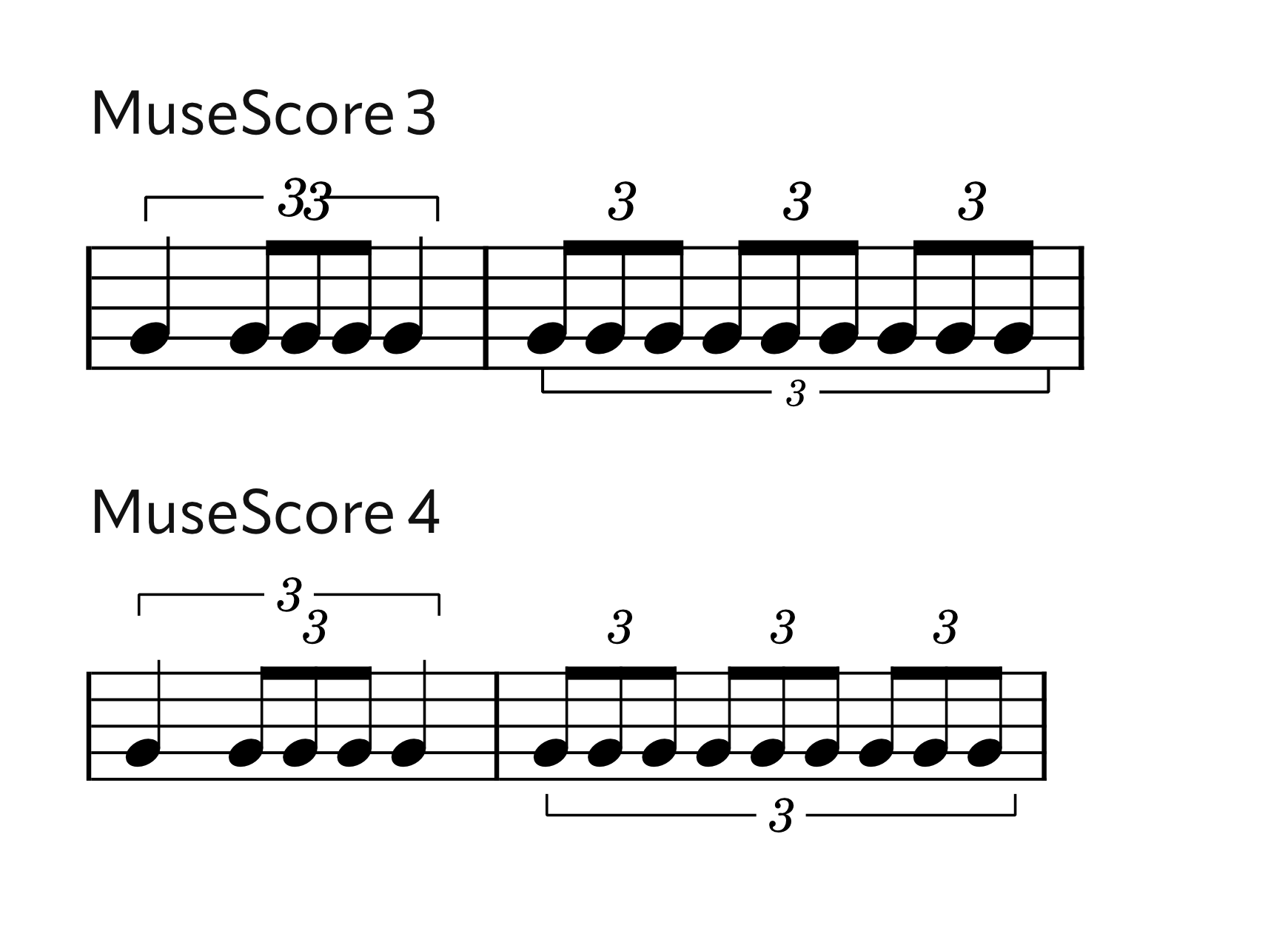
'Auto' bracket mode is now more intelligent: tuplets as part of a beamed group will receive a bracket, except where they are simple and have their own secondary beam:
Changes to expect
Some style settings have updated defaults in MuseScore 4. A full list is being maintained on the MuseScore GitHub wiki. In general, the style settings of an existing score will be preserved as far as possible during the migration process.
One exception is that the 'Dynamics' text style will be set to 10pt (the previous default was 11pt), which now matches the default for Expression text, and dynamics symbols will now be taken from the Musical Symbols font rather than the Musical Text font. The This may mean dynamics appear different in size, but the difference will be very slight. In the rare situation that the Musical Symbols and Musical Text font were from different families, this does mean that the design of the dynamics will change accordingly.
Dynamics will also now be centered optically on the noteheads to which they are attached, assuming that the SMuFL metadata is present for the font being used. Again, these changes will be slight. To better illustrate this change, dynamics symbols which have a local override to their justification will have it removed; dynamic symbols which are combined with text (e.g. "pp cresc.") will not be affected, however.
Comments
Oh my ...! All these examples are great improvements!
Excellent work!
This is all fantastic stuff! Thanks to oktophonie and everyone involved in implementing all this! Tons of little (and not so little) things that really add up to a really big improvement overall. Will be interesting to see if it's enough to impress the MET (Music Engraving Tips) folks or not, but it certainly should be :-)
In reply to This is all fantastic stuff!… by Marc Sabatella
Thanks, Marc! Of course engraving people are never really impressed - I'm living proof ;)
In reply to This is all fantastic stuff!… by Marc Sabatella
To hazard a guess, I expect the following response on MET in general:
This is of course my general expectation. There may likely be individuals who won't fit into any of these prediction-boxes.
Wow. That looks so much better. Congratulations and thanks.!!!!
Automatic beam angle reduction. Anti-wedge technology! Wonderful!!!
The before-and-after example looks really good.
I've spent a ridiculous amount of time manually reducing MuseScore's beam angles—largely for anti-wedge purposes, and because unnecessarily steep angles look unattractive to me.
MuseScore 3.6.2 lacked Style settings for beams. I hope MuseScore 4 will offer some, particularly for beams that display above and below the staff.
scorster
In reply to Automatic beam angle… by scorster
Glad you like! It would be good to know what style settings you feel are lacking in particular. The beams have been rethought from first principles so there is a lot of flexibility in the system, but the question, as always, is what aspects of the configuration to expose, and how.
In reply to Glad you like! It would be… by oktophonie
Many thanks for all these splendid improvements!
About beams: in Msc 3.6.2. Using Windows I made macros in AutoHotkey to set 'Grow left/right' to 1.08, 1.16 or 1.25 to cater for situations with four beams and to ensure both ends of all beams are attached to stave-lines. See Gould, Behind Bars page 18 and 21. Will the new mapping to 'standard' or 'wide' have the same results?
In reply to Many thanks for all these… by [DELETED] 135427
This is actually now done automatically in very limited circumstances for 32nd-note beams. Here the first beam is very slightly widened for the reason you mention:
In general, for this reason (and for avoiding wedges) when there are 3+ beams within the stave they will generally be flat by default, as it's then up to the user how to handle it. The starting placement will be one where all beams are attached to stave lines, with the rare exception that for 4+ beams (when flat) it's possible sometimes for one of the inner beams to float in a stave space. If you want to make adjustments in the same way as you've been doing so far, that will still be possible - except that the feathered beam options (which include the 'Grow left/right') are not working in the alpha release, but will reappear soon.
'Wide' beams are actually more flexible, since the distance from beam to beam is 1 stave space, e.g.:
In reply to This is actually now done… by oktophonie
Thank you!
Fantastic that this functionality keeps intact in the near future! Slight changes in the beam distance enlarge the possibilities to influence the optimal beam angle. I use also macros to change these values if needed in steps of 0.01 space.
I have a pixel-ruler installed on my PC for the sole purpose of measuring the horizontal note-spacing in order to correct it. Maybe I'll keep it installed until MS4 is released. Or maybe I'll uninstall it now and stop correcting my MS3-scores' horizontal spacing, and just port them all over to MS4 once released. Either way, thank you so much for fixing the spacing and for all the other small and dramatic engraving imrovements! Really psyched to see all of this in the final release! :) :) :)
Some great stuff in there, I knew there were a few tweaks here and there that were needed but they are some pretty significant improvements! Guessing it meant redoing all the visual unit tests too, would test anyone's patience!
In reply to Some great stuff in there, I… by Dylan Nicholson1
You should have seen all the XML import work done on this version too :)
The team have been buuuuuuuuusy!
Oh man, I'm just imagining the amount of potential time saved just fixing slurs alone (and before never really getting it quite right, and often settling for good enough.)
Wow, these are a lot of things to look forwards to! Thank you for all the hard work!
In so many cases, these are issues that I have--to the best of my ability and Musescore's capacity--tried manually--and I may add, laboriously--to correct!
So, I should expect some of the scores to look all wonky when I open the files in MS4? Lucky, my opera omnia is not so vast that I won't be able to (re-)clean them up on a case by case basis:-)
Thank you, again
-- WF
In reply to Wow, these are a lot of… by wfazekas1
There will be differences, certainly (which I've tried to list and explain in this document) though hopefully they won't be too wonky! The settings and layout of the original file are honoured where possible.
It's also easy to reset any scores to new defaults (reset all styles, reset shapes and positions, remove system breaks and so on), then you could perhaps make a new 'house style' style sheet for MuseScore 4 to apply and tidy up scores from there. Of course, if you want scores to look identical to how they did before, you can keep them in MuseScore 3.6 (or earlier) too.
About score layout in general: it should now be easier to fit more music into less space elegantly, especially once the horizontal spacing changes are completed (there is a big chunk more of that still to come) and documented. MuseScore previously wasted a lot of horizontal space, which meant having to spend a lot of time trying to reclaim it or compress things to get them to fit (or, just accepting a lumpy layout). That should be a thing of the past. So, when the time comes, reassessing the layout of your scores (in the sense of where the system/page breaks are) and understanding the spacing settings would be my no. 1 recommendation.
In reply to There will be differences,… by oktophonie
"House style"--I kinda like that; it makes it sound like I'm using real engraving software--Oh, wait, I am!
Joking aside, since the release of 3.6, I had considered putting together a "house style" .mss file, and then retro-fitting to the scores which I've done in the last three years or so, just to ensure consistency. But now, it sounds like I should wait for a stable release of 4.0. And thank you for your advice in the third paragraph.
Is there a reason for the stems of the 8th notes to be shorter than those of the quarter/half notes? It does not feel right.
In reply to Is there a reason for the… by Miguel Vicente…
There is a reason (complex and laborious to explain), basically arising from the fact that notes with no beam can have their stems shortened in a linear fashion (once the stems extend out of the stave past a certain amount, shorten by 0.25sp, and then an extra 0.25sp for each scale step, up to a certain limit) whereas for 8th notes it's not quite so simple, as some adjustments are made for beams falling on or around the outermost stave line for various graphical reasons.
Regardless, the discrepancy that arises is not very desirable. I think the solution here is to start the shortening of unbeamed notes sooner (the first 0.25sp of shortening will apply once the stem extends 1sp outside the stave); quarters and eighths on the middle line will then have stems of the same length. There will still be a 0.25sp discrepancy with notes on the second-bottom space (with stems up) or second-top space (with stems down), but that's pretty much unavoidable (and is also the same as in MU3 etc). We will try this presently.
All these changes look great! I'm so impressed and excited for 4.0!
I'm not sure I like the look of either of these dotted note tie examples. The new one might be harder to read. Especially if one of the inner notes isn't tied. Probably a rare case. But still. It almost doesn't look like ties.
In reply to [inline:tie.png] I'm not… by bobjp
To me both are bad indeed. But FWIW, the new one is probably easier to fix by adding stretch to that measure, or sliding the first chord to the left, or adjusting the length of the top and bottom ties only, so some combination of these.
In reply to [inline:tie.png] I'm not… by bobjp
Echoing Marc's comment -- MuseScore 4 is indeed an improvement but unlike nearly every other amazing improvement I see here, there's still a ways to go on these ties with 2nds, etc. The E tie in second measure (assuming Treble clef) spends most of its life intersecting a staff line. It should have a deeper scoop (Gould 61). The upstemmed notes in m. 2 should probably have lengthened stems to make the ties begin at same place (Gould 61). M1 seems much harder to do algorithmically (probably giving more space would be really helpful), but the lowest note ( c ) can be tied from beginning of first notehead to last notehead and be longer (Gould 66) and the B tie can be brought up a space (ties at same position as pitch are best unless there are seconds/unisons) and begin before the dot (Gould 64 and 63 and 66).
But still so much better, and much closer to what I see in my paid notation software.
In reply to Echoing Marc's comment --… by michael.cuthbert
I definitely agree there is still room for improvement, although realistically I expect there to always be "hard" cases where manual adjustment is needed. But FWIW, theses images date from half a year ago, and there have been continued improvements since then.
Will Musescore 4 have the functionality to add a new edited Tab and instruments to the instruments.xml list in an easy way? I mean without having to edit the XML file manually?
In reply to Will Musescore 4 have the… by Nevesf
No
Wow. Great stuff!
Hello. Is it possible to make it possible to export to pdf along with the paper wallpaper?
In the mode of editing and viewing notes inside MuseScore, you can see the background in the form of paper wallpaper, but unfortunately when exporting to pdf only the white background is saved.
Respectfully.
Thank you very much for your work - Musescore is a wonderful program.
But why in MuseScore 4.0 there is no promised (https://github.com/musescore/MuseScore/pull/5935 and https://github.com/musescore/MuseScore/pull/7500) possibility to save wallpaper background notes when exporting to pdf?
Attaching a screenshot when exporting - no ability to adjust the background.
Respectfully and thankfully.
In reply to Thank you very much for your… by Serg_
Where was this "promised"?
The two pull requests you linked to were not ready to be merged.
In reply to Where was this "promised"?… by RobFog
Perhaps I didn't express myself accurately about the "promise".
But the post https://github.com/musescore/MuseScore/pull/7500 indicated (screenshot attached) that this change (export to pdf along with background) can be included in MuseScore 4.0 version.
Too bad it wasn't included in the end.
As far as I can see from various forum posts, a great many users would have been happy with this feature for quite some time.)
Are there plans to include this feature in new versions of MusScore?
Respectfully.
In reply to Perhaps I didn't express… by Serg_
Actually, if you read through the comments, it seems the developer of that feature chose not to make a version available for 4.0, unfortunately. Which isn't to say it couldn't still happen if they change their mind, it if someone else elects to take on the task. It's not a very commonly requested feature actually - comes up at most maybe once a year? - but if more users do start requesting it, I'm sure that would raise the priority.
In reply to Actually, if you read… by Marc Sabatella
Yes, it's a pity that this feature was not implemented.
As far as I can tell (by searching on this site for "background export to pdf") this request comes up quite regularly. So many users were excited about this feature.
And, as far as I understand, even preliminary solutions were offered and (almost) implemented in the development of this feature (screenshots attached).
But, unfortunately, so far so good.
Let's hope that soon this function will be added all the same).
Thank you for your response and answer.
This document is great. Thanks.
Small question for clarity: Near the top of the document, in the section beginning "This reset can be done quite simply:", you have two bullet points. Are those sequential steps? (If so, numbering them would clarify that they need to happen in order). Also, in the video released Dec. 14 at https://www.youtube.com/watch?v=U7dagae87eM, there are two "reset" recommendations given at 1:47. I believe this doc mentions the second (?) of the two discussed in the video, but if both are now recommended, it would be nice to basically mimic what the video recommends, perhaps with additional context if it's useful.
Again, thank you for everything. Musescore 4 looks really good, and this documentation is really helpful.
In reply to This document is great… by Pat Richman
The two steps do different things, so to completely reset, you need to do both. In principle, it should work regardless of which order you do them in, but the listed order is more logical/ The first, change all style settings. This will then automatically update all elements for which you didn't manually override the style settings. The second step resets your manual overrides, so the new style setting actually honored.
If you do them the other way around, in theory it still works, because the element reset will first revert your manual adjustments and make everything honor the (old) style, then the style reset will update everything. So bottom line should be, everything is now at the new defaults either way.
Even though I can't get hands-on with this software at the moment, I will say I am excited about the progress made since the last stable release. More to come means that this might be the best software known to man, especially with up and coming MuseSounds. Go team.
I'm a little bummed and worried to see nothing here about support for ties and slurs into and out of repeat voltas, which is the biggest missing engraving feature in all of the notation programs I've tried (which isn't many, but still...).
Is it still considered too difficult or too unimportant to support that basic thing, or (hopefully) was it so trivial that it didn't get mentioned here?
Anyway, I'm looking forward to downloading MS4 and trying it. The improvements look impressive! Well done!
In reply to I'm a little bummed and… by RobertKennedy
Worth mentioning that this is a list of what has been done, not a list of everything that will ever be done.
There's a lot left from MS3 that needs attention. A lot.
In reply to Worth mentioning that this… by Tantacrul
Thanks! Where is the best place for me to:
a) See whether that issue is already known / filed in MS4; and
b) upvote the issue or whatever is the right term for asserting my opinion that it's one of the most important things to do soon...
?
Perhaps someplace on github is where such issues are tracked? I see https://github.com/musescore/MuseScore/issues but it looks incomplete (i.e., this issue doesn't seem to be filed there) and I hope not to file a duplicate issue that just causes extra work.
But also, I don't even know whether it's really still an issue in MS4 because apparently MS4 doesn't run on Ubuntu 18.04 like I expected it would, so I'm so far ineligible even to try it, alas.
In reply to Thanks! Where is the best… by RobertKennedy
We have a very large planning session in January, after which we'll publish our (the internal team's) areas of focus. This will help us coordinate with active members of the dev community who are interested in building features over the coming year or so.
In reply to We have a very large… by Tantacrul
Although I'm a software developer by trade and past career, when it comes to MuseScore I'm just a user and a musician, not a member of the dev community. So I'm selfishly asking how to influence priorities, and while I know that offering to submit patches is the purest and most powerful way, I'm interested in ways that don't presume I'm a programmer (even though I am).
In reply to We have a very large… by Tantacrul
Hello Martin,
I would like this message to sound respectful in tone. I greatly appreciate what you are doing. I lost a score today and other things seem to have gone wrong by installing Musescore. I use a 2015 Macbook Pro. Just want to say that I wish you had someone looking at the number of things that go wrong and that there was some way of keeping us all abreast. I love what you are attempting to do for everyone and wish I could help out. Could you somehow give us all some more details about what you are focusing on and specifically what your major challenges are and explain how people without programming experience could possibly help out? I can't say enough about how much I appreciate this program and hope that it will run incredibly well in the near future.
All the Best,
-Brian
canadasinger@gmail.com