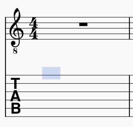
TAB: Improvment of cursor position, currently poorly centered
2.0.3 and current 2.1 dev. fbf68f4 / Windows7
As said in the title, the cursor in Tabs is currently badly centered
Check out this comparison between GP and MuseScore:
On the first string, this can still go with MuseScore. You will notice that the centering in GP is perfect, and that it is, in addition, singularized by a black frame (pretty, maybe to try, don’t really know in this moment, but not the essential for now)


The most important is now.
When you descend on the lower strings, the 3rd for example, you will notice that the cursor in MuseScore not only is badly centered but it touches, in more, the 2nd line/string. There is a risk of confusion. Well, there is confusion: I have experienced this several times, wondering, especially when you go fast, on what string am I.


This requires concentration, and at the end, fatigue and sometimes some nervousness ... because, in addition to entering the notes, you have to focus on something that normally should be perfectly precise and clear .
I let in category "Feature request", but given the possible visual embarrassment, I wondered if it was not an issue.
Same thing with the 5th string, etc.


Comments
It's also the case in 2.0.3 ?
Yes, of course (NB: the width is also different in comparison with GP)
![2.jpg 2.jpg]()
Fixed in branch 2.1, commit bacccc4c43
fix #151856: TAB: Improvment of cursor position
Thank you for reporting this one. I feel this type of issue is sometimes more important than an obscure crash.
Good centering now, really more confortable. thank you.
![long.jpg long.jpg]()
Speaking of width in the previous message, in fact, I wanted to talk about length! It is probably not necessary that the cursor be as long, with a rectangle shape, but rather towards a square shape?
Look at this photo, the cursor encroaches on the previous note.
Automatically closed -- issue fixed for 2 weeks with no activity.