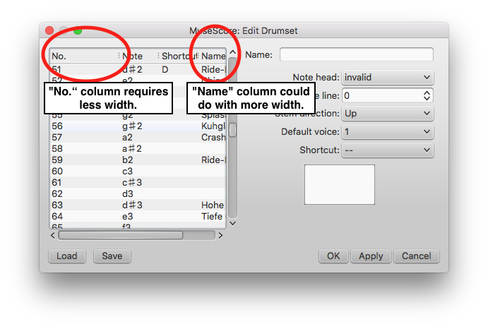
More appropriate column widths in "Edit drumset" dialogue
Looking at the column widths in the "Edit drumset" dialogue, it seems that
- the "No." column is unnecessarily wide considering it at most contains a three-digit number
- the "Name" column is the one that would benefit most from more width.
Screenshot attached for illustration.
| Attachment | Size |
|---|---|
| MuseScore-EditDrumset.png | 82.25 KB |
Comments
Probably can be done in https://github.com/musescore/MuseScore/blob/master/mscore/editdrumset.ui, but I lack the knowledge.
Yes, I'm not a programmer either but the change seems somewhat straightforward.
Obviously, the user can modify the width of the columns. But smarter proportions out of the box would help with usability. While I have some more involved ideas on how to improve the drumset editing dialogue to think through before I post them here, it would be neat to see this squeezed into 2.1.
@ericfontainejazz, would you be interested in taking this on?
Fixed in branch 2.1, commit 60e55b2704
fix #177646: More appropriate column widths, sortable columns in edit drumset
Fixed in branch master, commit 588c88fe05
fix #177646: More appropriate column widths, sortable columns in edit drumset
Yay! Thanks. :-) I'll check out a 2.1 nightly.
Column widths are looking good!
There is an issue with sorting columns: If one orders by "No", ordering happens like this: "0, 10, 100, 101, 102, 103, 104, 105, 106, 107, 108, 109, 110, 11" instead of "0, 1, 2, 3, 4, 5, …" (Screenshot attached) I'm sure that is not intended. Do you want me to file a new issue?
Just saw preparations for a release candidate for 2.1 so… ping? ;-)
Whoa, what? Where did you see a release candidate?
Sorry, meant to write "preparations for“. (https://github.com/musescore/MuseScore/commit/fecf0a760c03a1d9b16ffd69d…)
Thanks! Then I guess it's unlikely the sorting issue will be fixed for 2.1, but please do file a separate issue.
Thanks. Will do!
Automatically closed -- issue fixed for 2 weeks with no activity.