MuseJazz Font is missing european diacritical characters
MuseJazz Font is missing German Umlaute äöü and ß.
If such a character is used, it falls back to a different font.
See enclosed.
| Attachment | Size |
|---|---|
| Autumn Leaves.mscx | 41.81 KB |
MuseJazz Font is missing German Umlaute äöü and ß.
If such a character is used, it falls back to a different font.
See enclosed.
| Attachment | Size |
|---|---|
| Autumn Leaves.mscx | 41.81 KB |
Comments
Not only German Umlauts, also french accent letters (e.g. à, ê etc) as well as other special characters like µ and €.
Fair enough. But for names of composers/arrangers, etc. the special characters are perhaps less necessary.
Well, french and czech would be needed...
Indeed, MuseJazz only has the basic ASCII character set. If anyone who has experience extending with the various diacritics (?) wishes to help, that would be greatly appreciated. I gather there are semi-automatic ways of generating these characters. Note there are actually dozens, maybe hundreds of characters that could be added, based on what other fonts provide. There are additional characters used in Spanish, Portuguese, French, and other languages in addition to German, plus of course the non-Latin languages.
I gather there are semi-automatic ways of generating these characters.
Could you point to any website with instructions?
It was in the Font Forge documemtation somewhere, that's about all I remember.
Maybe this page ?
I get the sense it's still a bit of work doing that, at least when consider the sheer number of such characters needed when all languages are considered.
However, it's possible we could pull this off more collaboratively. If a few people with experience in one language other English languages can identify the necessary characters for their language, and then maybe come up to speed on the process of adding characters to a font (it;s not *that* complicated), maybe we could at least knock out the most important characters sooner rather than later? On Windows, at least, MuseScore will use a locally-installed version of MuseJazz in preference to the compiled-in version, so the reward for contributing would be the ability to use the new characters instantly, at least in your own prints and PDF's if not for scores shared with others in MSCZ format.
I'd be happy to collect the various versions created by others and copy the glyphs back into the main source if necessary. i gather that in the past, the font binary was used as the source, making automated management via SVN difficult, but but Werner has been encouraging use of SFD sources, and I do have an SFD for MuseJazz in its current form.
I'd want to tweak the kerning before anyone gets started, though.
I could do French and Spanish. Could you link to a working binary of fontforge?
I've been talking to Marc Sabatella offline. He wants to do the kerning first. I prepared a few tables for him (see enclosed).
French àáâ (same for eiou) and ç and ñ additionally for Spanish would be great. Marc asked me to do äöüÄÖÜ ß, so let's not overlap here.
I just installed FontForge on Linux (openSuse), I didn't chase a Windows binary.
So please advise.
French can use Œ and œ as well and spanish reversed marks ¡ and ¿
FontForge is inherently a Linux program; there is no native Windows or Mac version as far as I know. But there a package called fontforge-mingw that runs on Windows using some sort of Linux emulation mode or something, and that's what I've been using. As far as I can tell, the best place to get it from is http://www.geocities.jp/meir000/fontforge/. You just have to ignore the Japanese characters and scroll down to find the mingw version, which is supposed to be easier to onstall and run than the cygwin version.
I mentioned the kerning because Jörg brought it up. I did add some kerning for 1.1, but not as much as I could have as it took me forever to figure out how to get it working at all. There are definitely still some problematic letter combos where it looks like there is too much space between them. Now that I have a better idea of what I'm doing, I'd like to improve the kerning of the existing characters before we add new ones, on the theory that this might make it easier to set things up so that the new characters get kerned similarly to the ones they are based on. I know FontForge supports the idea of kerning classes, which are sets of characters that should kern the same. But I don't really know for sure how that works. It might be just as easy to adjust the kerning later, and actually, I can't be sure that "a" and "ä" really should kern the same. But it sure can't hurt to look at kerning first, so let me do that this week.
Here's a page that explains how to get it to work with Cygwin: http://fontforge.sourceforge.net/ms-install.html
Looks like Marc's link may be better.
Hello,
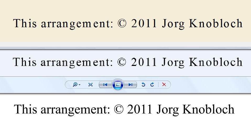
even when I use Times New Roman, the text that MuseScore prints isn't right.
I printed the line: "This arrangement: © 2011 Jörg Knobloch" four times:
1) in Open Office on Windows
2) in MuseScore on Windows
3) in LibreOffice on Linux
4) in MuseScore on Linux.
Yes, I have the MS fonts for Linux. Yes, they are a little different from the Windows versions.
BUT:
If you compare Open/Libre Office with MusScore both on Windows and Linux you notice, that the MuseScore print is somewhat suboptimal.
Look at this:
There is too much space between the "K" and the "n", in O/L Office they touch, in MuseScore they don't
There is too little space between the "l" and the "o". It looks too close in MuseScore.
Or compare the word "Printed".
So before we invest time in fixing any font or kerning, we need to assure that fonts are handled correctly in general.
My understanding is that kerning is handling by the Qt libraries, and there is little MuseScore can do about it. I don't know if 1.1 is built with the latest Qt libraries or not; I do seem to recall something about Qt having improved kerning at some point?
Anyhow, when I was doing the kerning originally, I was having trouble getting MuseScore to pay attention to it at all so I did most of my testing in Wordpad and LibreOffice. Eventually I found an option I needed to set in FontForge to get the kerning to work with MuseScore. It's entirely possible I still didn't do this right. But since your example shows differences even with Times, I guess I won't worry about that for now.
Anyhow, I still figure it makes sense to get the kerning as good as I can, probably continuing to use Wordpad & LibreOffice but also checking in MuseScore. So I'm still aiming for end of week.
My post was meant as encouragement to make sure fonts are handled properly.
I hate to say it, but printed text produced with MuseScore when using Times New Roman looks pretty bad.
And that should be fixed if possible, so all fonts will profit.
@jorgk3 Which version of MuseScore did you use for your test? For the linux one, which Qt version? Which windows version?
I tried to write the same sentence in MuseScore 1.1 (Qt 4.7.3), windows vista and I don't have the same result at all on screen, on PDF or on PNG.
MuseScore, PNG, PDF
Hi,
what am I seeing? MuseScore, then PNG then PDF?
Anyway, your questions:
Windows XP Professional. MuseScore 1.1.
Linux, openSuse 11.4, MuseScore 1.1, libqt4 4.7.3-208.1
Hang on a shake, I'll create a PDF.
Reinstating original title
OK. In Linux it looks good on the screen, as PNG and as PDF.
Next I printed the PDF.
Then I scanned the printed PDF together with the text directly printed from MuseScore, see enclosed. On top the bad looking text you saw before which was printed directly, below the printed PDF.
So in conclusion:
New Times Roman looks good on the screen in MuseScore, PNG and PDF.
New Times Roman looks good also when the PDF is printed.
New Times Roman looks bad when directly printed from MuseScore (on Windows XP and Linux).
I have a Samsung ML-1510 laser printer.
Looks like there is a problem when printing directly to the printer.
Hmmm... in lasconic samples, I would say the main point is perhaps not kerning:
Between the first and third sample the fonts seem different: the copyright symbol is elliptical in 1st and round in 3rd; the top grace of 'i' is more slanted in 1st than in 3rd; 'e' is narrower in 1st then in 3rd...
In general, the design of the font in 1st sample looks more condensed than the font in the 3rd sample.
My impression is that in 1st sample, some font substitution occurred: the app seems to 'believe' to be using the font actually used in 3rd sample and keeps the same metrics but it is actually using another font with a more condensed design, whence the 'airy' look around the individual glyphs.
This may look like a kerning issue but, if font substitution occurred, may have nothing to do with kerning at all, but rather with differences in font style.
M.
The issues with how MuseScore kerns, or whether it is sometimes doing a substitution, aside, it's definitely the case that Musejazz was in need of more thorough kerning. I've made another pass over it, looking at all letter combinations (thanks, Joerg, for the sample text!). I probably overdid it. Or more to the point, I probably should have looked at the padding around some the characters themselves rather than doing everything via kerning (I did widen a few characters' boxes). But anyhow, the deed is done, and I think it looks a lot better. There are still a couple of letters, like "r", "t", and "f", where the shape of the letter is such that it still can look weird around them. I improved "r" slightly in this respect (angled it up more). I now leave it to anyone who wants to add more characters with diacritics. You can either take turns passing it around, or all pass my your versions back and I'll collect the new characters. If anyone wants to take another look at kerning though, we will have to be careful not to step on each other there.
I've attached the SFD file and the generated TTF via a ZIP file.
Oh, one other things I keep forgetting to mentioN:
On my systems (Vista), I can make MuseJazz bold, and it looks pretty decent. I didn't actually create a seaprate bold font, but whatever Windows and/or Qt do to fake it, seems to work OK. So I used bold title in the Jazz Lead Sheet template. But the images and PDF files generated on musescore.com don't do that, so I'm guessing that server is running Linux, and the fake bold thing doesn't work on Linux. Or there is some thing that needs to be set set in FontForge to allow that. Anyone know?
Hi Marc,
thanks for the font. I downloaded it and I will look at it.
Hi Lasconic,
a different issue has crept into this thread. As noted in comment #19, there are differences between the display on the screen, PNG and PDF (which all look the same) and the directly printed output. I observed that for Times New Roman, but I assume, this issue exists for other fonts as well.
This is obviously a different issue. So should I/you move this into a different thread?
Definitely. Go ahead. Same for the bold issue. Regarding diacritical glyphs, I let you go ahead.
I downloaded the font and looked at it.
The code table is ISO 10646-1/UCS-2 (http://en.wikipedia.org/wiki/Iso_10646-1 - http://en.wikipedia.org/wiki/UCS-2), so it's a two-byte based table from U+0000 to U+ffff.
All the jazz related code points are between U+e1oc and U+e199. These are code points that FontForge displays as "Private/Corporate Use".
Characters with accents would need to be supplied in the range U+00c0 U+00ff (the German ß being at U+00df).
So the question remains: Where do we get the glyphs from?
On this subject you stated in e-mail to me ("lifting" refers to copying glyphs from another font):
====
Well, you can lift if it's public domain. Actually, it was a combination of lifting and editing. Someone else did the lifting, I did the editing. The source was pretty ugly; I smoothed out some of the outlines, adjusted the relative sizes of glyphs to match better, added kerning info (after learning what that means!), etc. A few glyphs I did create from scratch; you can probably recognize some of those as looking especially amateurish.
====
I can see putting in dots for the Umlaute äöü on top of the existing glyphs for aou, and if Laconic wants to have a go as well, he can possibly add the French/Spanish accents àáâ, etc. but how for example do we design really new glyphs, like ß (German eszett)?
Who did the lifting? From which font? Can we lift some more from there and then fix it up as you described?
OK, I will start another thread on the printing issue.
Marc, can you raise the "bold" issue if there is one. On Linux I generated this screen show, it shows the MuseScore window and the PDF window. As you can see, bold is a little bolder, not much. So what is the issue? I will take a look on Windows later.
Here's a snap shot from Windows. It looks the same as on Linux, well, perhaps the PDF is even a little less bold. So Marc, what is the issue?
The recommended way to create characters with diacritics is through reference (or composition):
1) create the diacritic(s) themselves as independent glyphs, possibly in their proper Unicode points, paying attention to the fact that, for many diacritics, Unicode distinguishes between spacing and non-spacing diacritics: the formers are actually independent characters, the latters are 'real' diacritics (usually the Unicode name is "COMBINING ...").
2) create the composite glyph using a reference to the base character and a reference to the diacritic.
For instance, rather than creating uumlaut by copying the outline of 'u' and adding to it two dots, create the diaeresis diacritic (the proper point is U+0308) then create uumlaut (U+00FC) with a reference to 'u' and a reference to diaeresis.
Using FontForge, a reference to a glyph is 'copied' by selecting the glyph in the font window and pressing Ctrl-G, and then 'pasted' by selecting the destination glyph and pressing Ctrl-Shift-V.
This has several advantages: the font itself is smaller, the rasterizer is somehow faster (it may not need to rasterize the 'u' part if it has already rasterized the 'u' itself) and any hint, anchor, etc... of the individual parts are immediately available into the composite glyph.
Additionally, when the reference to a base char (for instance 'u') is pasted into an empty glyph, FontForge also copies the metrics ensuring some consistency. If the individual parts already exist, FontForge is able to automatically create a good deal of the known composites, by using the relevant references.
Strictly speaking, the reference way should not be used for composite glyphs whose parts overlap (for instance 'ç'): TT documentation used to warn against overlapping referenced outlines; however, many fonts from reputed foundries use references also in this case and no font engine I know actually has problems with this.
Hoping it may be useful...
M.
So, I'm looking at MuseJazz again with hopes of submitting improvements in time for a 1.2 release, whenever that turns out to be. I had considered starting over with the character spacing and redoing the kerning again, plus Scribus was having problems with the font, and I just wanted a fresh start. But on further examination, it's the irregular shapes of the characters that leads to the need for so much kerning, and it turns out the most recent version of Scribus works just fine with MuseJazz,
So, the SFD file I posted still makes as good a starting point as any for adding characters. So, who is on board for helping out with adding characters? Thanks, Miwarre, for the info on how to accomplish the diacritics. I understand enough about German to handle the umlauts, and I can draw a freehand ß that probably won't look any worse than most, but that's all I'd feel up for.
I said, that I'd help, so I stand by this offer. As far as I can see, these are the tasks:
1) design an ß
2) design the diaeresis
3) create "combination" characters for äöü and ë (French) and a few others.
http://en.wikipedia.org/wiki/Diaeresis_%28diacritic%29
4) design accents ` and ´ and ^
5) create "combination" characters for áéíóú, àèìòù, âêîôû and others for Spanish and French. Inspiration here:
http://en.wikipedia.org/wiki/Grave_accent
http://en.wikipedia.org/wiki/Acute_accent
http://en.wikipedia.org/wiki/Circumflex
6) see whether one can get a nice ç by combining a comma , with a c. Well, perhaps not.
http://en.wikipedia.org/wiki/Cedilla
So who does what?
One natural division would be to say one person per language to come up with the complete list of new glyphs needed (and to test the final results in that language), one or more people to add the necessary outlines for the umlauts and accents and any glyphs that cannot be created by combining through reference, and one person to do the work of creating the combining characters by reference. Of course, any one given person might take on more than one of these tasks.
Of these, the only thing I know how to do already is add outlines. Although I don't actually speak any language but English (and whatever I remember from a couple of years of German in school), I can probably do as good a job of drawing outlines given a picture of what I am trying to draw as anyone else who is not already skilled at this. So I would be willing to do any or all outlines. I"m also perfectly willing to learn the whole combining-by-reference process (sounds straightforward enough) if no one else wants to take that on.
BTW, one language I'd like to see covered that no one else has mentioned is Portuguese.
Well, there are not a whole lot of new outlines necessary: ß ` ´ and ^ and perhaps the , for the ç.
Oops, I forgot ñ for Spanish.
As for Portuguese: if you cover the accents for French and Spanish, all you need extra for Portuguese are: ã and õ:
http://maria.fremlin.de/portuguese/acentos.html
I looked and the tilde is only used in ã õ and ñ.
Perhaps we split the work like this:
You Marc worries about the "little things" ` ´ ~ ^ and , and how to combine them, and I - being German - have a go at the ß.
Sounds like a deal?
Sounds great! You take ß, and I'll endeavor to make sure we've got all the glyphs needed for German, French, Spanish, and Portuguese, based on the links given here and whatever other info I can find. If there are any other glyphs (like perhaps the "c," or "oe" characters) that really need to be designed from scratch, I may hold off on those for now in hopes someone else may step forward. And hopefully some native speakers can give it a once-over when we're done. As for Czech or any non-:Latin language anyone else would like to see, I would say, who ever asks for it just volunteered to do the legwork :-)
I should be able to have my part done by the end of the week if I don't run into any unexpected technical hurdles.
OK, I'll endeavour to have the ß ready by the end of the week.
The ç is also needed for Portuguese, and it shouldn't be too hard to whack a comma-looking thing at the bottom of a c. So that's nothing that can wait.
French also has ligatures, mainly the "oe", but they can survive without that.
Dutch: ij
Scandi: å
Spanish: ¿, ¡
Czech: š i.e. an invers ^ on top of an s
Well, right now we're trying to focus on German, French, Spanish and Portuguese. And yes, we need ¿ and ¡ for Spanish. But it shouldn't be to hard to rotate the existing glyph by 180 degrees.
It turns out that creating accented characters is surprisingly easy. In addition to the manual method of building a character from references that Miwarre describes, FontForge provides a more automated method, where it automatically locates and combines references to the necessary characters, and then all I have to do is drag things around as necessary. I've also added the upside down exclamation point and question mark.
But I'm not sure about the best way to to deal with the fact that accented capital letters are taller than ordinary capital letters. By default, FontForge apparently does something to increase line spacing to make room for the accents, even though the values given for ascent, descent, and em size haven't changed. These vertical metrics are something I struggled with for some time to get right for 1.1, but it was more by luck that I got it sorted out. I am having trouble finding references online to how this is supposed to work in the presence of accented characters. Any suggestions or pointers would be most appreciated!
Ligatures (combinations like "oe" squished together) are also still a bit mysterious to me. I can see the basic process for creating them, but I don't understand if they are thing that MuseScore would have a chance of "automatically" recognizing and transforming, the way, say, it automatically turns "(c)" into the copyright symbol, and if so, if it's possible to make that language-dependent.
Looks like I kind of blew it when I extended MuseJazz for 1.1, in that I didn't leave room for accents above capital letters. No easy way to fix it without messing things up in other ways. I have elected to shrink the capital accented letters, so that even with accent they are no taller than unaccented letters. Not ideal, obviously, but my hope is that people won't notice (unless they do something in all caps with mixed accented and unaccented letters). I have also gone ahead added an eszett because I was on a roll, but feel free to redo it. I actually added all the accented characters and ligatures from the F2 text symbol palette (except the fractions).
The font has been temporarily renamed MuseJazzEuro so I could test it side by side with the original version. I plan to rename it back before submitting it. But if anyone wants to try it out now and give feedback, here it is.
Yeah I try it :) Thank you
Bernhard
Hi Marc, thank you for all the work invested. It's hard to criticise, when you haven't contributed anything, but, well, I'll contribute some criticism ;-)
I think the ß is too big and ugly, and also the tilde on the ñ is too big. Otherwise it looks fine. Have you not received my e-mail where I had sent you a suggestion? The ß should not be bigger than a b and the tilde not be wider than the character.
The accents on À, Í, ì and ò should be centred a bit better.
Thanks for the suggestions. I know the eszett is big and ugly; that's how it usually looks to me :-). I don't remember any email from you with suggestions on the design of the characters - was it recent? Do you think the Times version makes a good model?
I'll take a look at your other suggestions. In some cases, I deliberately pushed an accent character out of what I thought of as its natural position in order to not exceed the line height; the alternative was to shrink the letter even further. But I can try to tweak those. Not being a native speaker of any language that uses such characters, I have no innate sense of how "off" these look. So thanks again for the feedback.
Marc, I e-mailed you twice on Monday and once today. To your Gmail account and the one at outsideshore.
"The accents on À, Í, ì and ò should be centred a bit better." That means, shift them horizontally. That doesn't affect the height.
Times at least shows you that the ß is to big and the ~ to wide ;-)
Thanks for the heads up - I just found your messages in my spam folder. Not sure why; gmail usually has a pretty good hit rate. I'll trying to figure out how tell gmail you are approved. Hopefully adding you to my address book will help.
Anyhow, the reason horizontal centering affects height is that when centered a large capital letter, an accent might exceed the lone height. Moving it off center allows me to lower it a bit. But I can certainly revisit those characters.
As for eszett - are you already versed in FontForge, or do you jave some other outline editor you could use? If so, great! If not, contact me offline (assuming it works this time) and I'll give you some pointers.
Tweaks based on Jörg's suggestions:
Much nicer!
Can you submit the font as well, please.
Am I still looking at the ß, since the new one is already much better?
Thanks! As I indicated via email, I don't want to deprive you of the joy of glyph design, and I am at least half serious about that. I figured I would give it one more shot. If it's good enough as is and you're not feeling like spending time on this, great. But I would also be perfectly happy if you were to replace it with something you thought better.
The thing I don't have a sense of, not having ever drawn hundreds of these things freehand in grade school penmanship classes, is what the "rules" are for it. In particular, what is supposed to distinguish it from a capital B. I can always tell the difference when I see it, but I have never been taught exactly what is going on. So my first attempt erred on the side of ugliness - it's clearly not a B, because a B wouldn't look that strange :-). The new version looks very much like a B to me, but not the B in this particular font. Is that enough? I don't have the context to answer that.
Here is the ZIP with the SFD and TTF files. I think there may have one one more very small tweak since that screen shot, but I can't remember which character. I think maybe I reduced the size of the accent on the i-grave to make it less likely to collide with other characters. I have added only a tiny bit of kerning info for these new characters - for the most part, they just inherit the kerning of their parents. Meaning the accents can possibly now crowd other characters too much, which is a good reason to limit the horizontal size of the accents, and to keep them as close as practical to the letters vertically. People who actually use these letters regularly might want to play with them and see if there are any obvious problems with any of these letters crashing into other letters when used together.
I'll give it a shot and hope to deliver the most beautiful ß ever used in Jazz. I practised already while in the audience at a gig at a local club tonight. ;-)
Marc and myself have been working on the font and the work is nearing completion. The attached image shows all characters the font has. Also included is a view in FontForge. With these characters we are covering alphabets for the following languages:
English, Old English, French, Spanish, Catalan, Galician, German, Portuguese, Italian, Icelandic, Faroese, Dutch, Danish, Norwegian/Bokmål and Esperanto.
Note that not all characters can be entered via the F2 text entry.
Dutch users please note that the ij needs to entered as two characters.
NOT FOUND: 02
For the alphabets of the following languages characters are missing:
Romanian - http://en.wikipedia.org/wiki/Romanian_alphabet - lacking ȘȚ (with comma, not cedilla)
Belarusian - http://en.wikipedia.org/wiki/Belarusian_Latin_alphabet - lacking: ĆČ ŠŽŁ
Czech - http://en.wikipedia.org/wiki/Czech_alphabet - lacking: ČĎĚŇŘŠŤŽ
Polish - http://en.wikipedia.org/wiki/Polish_alphabet - lacking: ĆŁĘĄ
Sorbian - http://en.wikipedia.org/wiki/Sorbian_alphabet
Slovene - http://en.wikipedia.org/wiki/Slovene_alphabet
Slovak - http://en.wikipedia.org/wiki/Slovak_alphabet
Lithuanian - http://en.wikipedia.org/wiki/Lithuanian_alphabet - lacking: ĘĄŲ
Bosnian, Croatian - http://en.wikipedia.org/wiki/Gaj%27s_Latin_alphabet - lacking: Đ, đ and others
Serbian - http://en.wikipedia.org/wiki/Serbian_alphabet - lacking: Đ, đ, Š and Ž
Hungarian - http://en.wikipedia.org/wiki/Hungarian_alphabet - lacking: ŰŐ
Turkish - http://en.wikipedia.org/wiki/Turkish_alphabet - lacking: Ş (different from Ș)
Finnish - http://en.wikipedia.org/wiki/Finnish_alphabet - lacking: Š and Ž
The above languages could be covered by adding the following letters to the font:
ȘȚŞ Đ ĆČĎĚŇŘŠŤŽ ŰŐ ŁĘĄŲ (both lower and upper case).
Thanks for all your hard work, Jörg! I added the IJ and ij for Dutch, but I'm thinking we're done for now. If someone wants to design the characters needed for some language, feel free to take a crack at it if you know your way around FontForge - but try not to break anything!
Another picture of the complete font, this time with the ij ligature added.
NOT FOUND: 01.
I'm happy to add the characters which are missing for the eastern European languages (ȘȚŞ Đ ĆČĎĚŇŘŠŤŽ ŰŐ ŁĘĄŲ) as long as someone says that they want them. No need implementing something that isn't used.
I changed the Å a little (showing before and now):
NOT FOUND: 01
I enclose the font one last time.
Please let me know if anyone wants the characters which are missing for the eastern European languages.
Heads up for anyone playing with this: I just added glyphs for the solfege syllables (starting at 0xe201), for use in chord symbols in Italy and any other countries in which that is traditional. Do, Re, Mi, Fa, Sol, La, Si, plus Ut, So, and Ti. Here are the updated files.
The MuseJazz font in the SVN repository is 6 months old (both the branch and the trunk version).
Would it not be the case to update it with the latest version, so that it can be shared easily?
Thanks,
M.
Sure. Sadly I don't have access permissions to the repository, although I requested it yesterday. Perhaps Marc has.
I don't think I do either. I have installed Tortoise SVN, but haven't tried doing anything with it yet. Back when I first started working on this font for 1.1, I was the only one, and it seemed simpler for me to just email my updates to someone who already had access. Plus, I didn't (and still don't) have a build environment set up to test any changes I made in context. Long term, I know that's not the right way to go. But for the record, I did send this most recent version in yesterday just after posting it here.
I commited the fonts and the chord description files in r5277. I tested a bit and I missed the € sign and the £.
Moreover, the ï is different from the other ones (ë, ä, ö, ü)
The @ is also quite weak.
Yep. No € or £. Yes, the ï is narrower by design. Please refer to comment #50 for a complete picture of all the characters available (yes, I typed them all in!!)
Some more ideas for the @ and other characters we might want in future versions.
See JazzText in http://www.jazzfont.com/JFDemo.pdf
Please add missing Lithuanian letters: ĄąČčĘęĮįŠšŲųŽž
We should add all missing characters needed for Eastern European languages (see comment #50 with the addition of Į).
ȘȚŞ Đ ĆČĎĚŇŘŠŤŽ ŰŐ ŁĘĄŲĮ (both lower and upper)
At the same time we could add € and £ and review the @.
Don’nt forget esperanto Ĉ Ĝ Ĥ Ĵ Ŝ Ŭ
Btw, why Musescore does not just rely on system «Special characters» table .and locale
Presently my system gives direct access to any latin european character with diacritic, but they are not received by the text being typed in musescore. I have to copy/paste them...
Esperanto is already covered, please refer to comments #48 and #50.
I don't know what "system" table you refer to - remember, MuseScore runs on several different systems. If you are experiencing oroblems on your particular operating system, with your particular keyboard, then you might want to open a discussion in the Support forum - there might some simple solution. Or, it might just be a limitation in the Qt framework upon whivh MuseScore is built.
But whatever it is, presumably it has nothing to do with the MuseJazz font in particular.
Any system (Linux, Mac, Windows) give access to any UTF 8 character, (keyboard or table… in my french Ubuntu Accessoires>Table de caratères)
Of course I’ll get the useful character only if the used font provides the glyph.
So I think that (whichever the font) any UTF 8 character should be typed the same way as it is when using a terminal (kbd or characters table). I don’t understand why we shall use this «F2» window, where the quest for glyphs seems different of the one in the characters table of my system
If you have rather that I open a new thread. just let me know.
This thread is becoming too long and the last posts doesn't have anything to do with MuseJazz. I propose to close it and open a feature requests for the missing characters and a forum discussion for whatever MuseScore does badly.
In fact, I'm not proposing :)
#15556: Add eastern europe characters to MuseJazz
#15557: Add € and £ to MuseJazz, review @ character
I let you do the forum discussion : http://musescore.org/en/forum
This should go into a different thread as this one is titled "MuseJazz Font is missing european diacritical characters". So any problems with character entry should go elsewhere.
BTW, to enter an Ñ, in Windows I can hold down ALT and type 165. Or an ß comes as ALT 0223. That also works when entering MuseScore text. If you enter ALT 0142 (Ž) when entering text in the MuseJazz font, you also get a glyph, but it's the default and not a hand-written one. So the F2 panel is not necessary.
I don't have my Linux system running right now, but I read here //en.wikipedia.org/wiki/Unicode_input that there is a way to enter unicode characters. Also, the compose key will help enter certain characters.
OK, I'm typing this in Linux now.
In MuseScore during text entry COMPOSE ` a will enter an à, ss will enter ß, so that works.
As for the unicodes: The CTRL+SHIFT u, code, ENTER method doesn't work in MuseScore, so that's a bug.
Here in Firefox it works: CTRL+SHIFT u, then 0041 ENTER gives A, or 00A5 gives ¥.
This has been reported in #15561: Support unicode character entry (CTRL SHIFT u, code, ENTER) in Linux.