Differences between screen display, PDF and printed output
I noticed that when you print text directly from MuseScore to the printer, the text looks different, in fact, it can look pretty bad.
This discussion started here: http://musescore.org/en/node/12300 but I will repeat the issue:
New Times Roman looks good on the screen in MuseScore, PNG and PDF.
New Times Roman looks good also when the PDF is printed.
New Times Roman looks bad when directly printed from MuseScore (on Windows XP and Linux).
I have a Samsung ML-1510 laser printer.
Looks like there is a problem when printing directly to the printer.
The enclosed image shows a scanned pages. On the top you see text directly printed, on the bottom, the same text saved into a PDF and then printed. The former looks bad (is, me too close, Kn too far apart), the latter looks good.
In general it would be nice if on-screen display/PDF and printed result would be (mostly) the same.
Image at: http://musescore.org/sites/musescore.org/files/issues/kerning-pdf.png
Comments
So, I mentioned in the discussion where this issue came up that I saw something that I thought might or might not be related - that boldface of MuseJazz didn't seem to work on Linux. I think I described the symptoms incorrectly. First, I was only guessing that Linux was involved. It happens on musescore.com, which I was only assuming runs Linux. But it seems it may well be related to the difference between screen, print, and PDF issue.
Here is one of my charts on musescore.com:
http://musescore.com/score/23116
And here is the PDF that it offers you for download:
http://static.musescore.com/23116/248519bceb/score.pdf
It looks to me like the title has been spaced out as if the characters were boldface, but the characters are actualy displaying as regular. However this PDF is being generated, it definitely doesn't match the screen display on musescore.com, which is similr to how it appears on screen in MuseScore as well as in both direct prints and PDF files on my (Windows) system.
First of all, that's fantastic, the piece and the way one sees sheet music and video at the same time!
As for the issue:
You're saying:
The PNG image on the web, MuseScore's screen view and your own PDF (and even the printed copy) look the same.
However, the PDF that is offered for download is not the same, as the characters are thinner. Well, one would have to ask when this PDF was generated.
I downloaded the score and I am attaching the PDF generated from it just now on my Linux box.
It's a little bolder that the PDF that is offered for download.
Also see the screen shot: Top to bottom: PDF for download, my PDF, PNG on website.
Altogether I thinks it's not an issue.
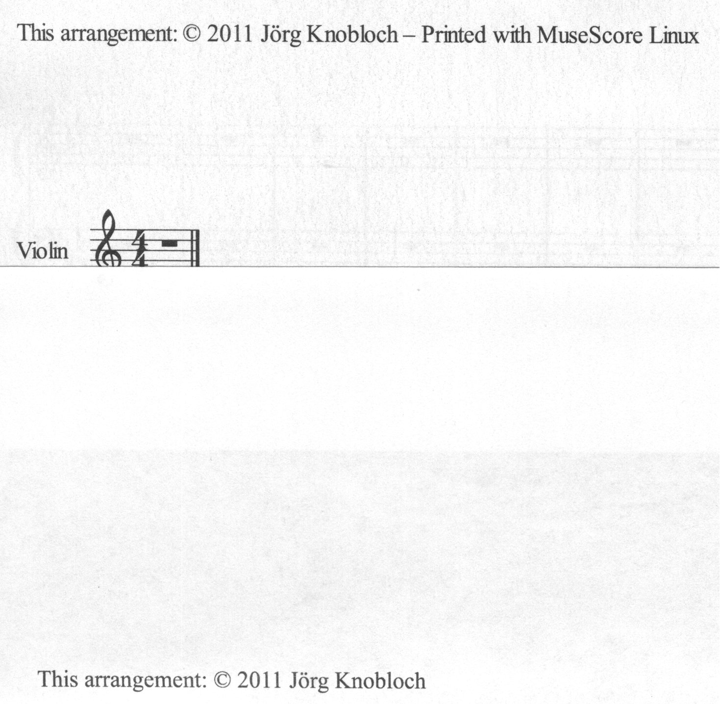
This issue of this tread is that the directly printed version looks different for both Linux and Windows when Times New Roman is used. Have you tried that? Just put any text with Times New Roman and print it. For example use a "Violin". That looks particularly bad when printed.
First, thanks for the nice comments! And yes, video scores pretty amazing things. Second, yes, if I thought this was a big issue, I'd have pointed it out earlier. I just wonder if it might perhaps in some way provide some sort of clue to what is going on: another symptom of whatever it is that causes to the same text to be rendered differently depending on how it is being rendered.
And no, I hadn't tried reproducing the print-versus-everything-else issue, but just did so and can confirm. On my system, with the word "Violin", the "i" collides with the "V" in the print, but not on screen or in a generated PDF. The latter two are not exactly the same - the PDF is a bit tighter than the screen - but either would be considered acceptable, whereas the print really is not.
I'm glad we agree!
@ jorgk3:
"This issue of this tread is that the directly printed version looks different for both Linux and Windows when Times New Roman is used."
I would say this is to be expected: Times New Roman is usually NOT installed in Linux systems (TNR not being free software): so the OS is substituting another font; which one depends on which fonts are actually installed and on how the font manager is configured.
There is no way around this; except installing TNR on the Linux box, which usually results in a copyright infringement.
M.
@Miwarre
Did you read the thread and its predecessor properly?
http://musescore.org/en/node/12300
The issue exists on Windows XP and was just confirmed on Vista (comment #3)
As for Linux. I installed webcore-fonts-3.0-1.noarch.rpm which I got from following this article
http://tldp.org/HOWTO/html_single/Font-HOWTO/ from here:
http://avi.alkalay.net/software/webcore-fonts/
It is irrelevant whether the font is really Microsoft's original Times New Roman font or some font that is just called that way.
Relevant is that a font by this name is indeed installed on my Linux system and screen display and printed output are different, just like on Windows. Please take a close look at the attachment in #13 of the predecessor thread. (oops, I tried it and could not open it, I don't know what happened to the image, I will attach it again here in a minute).
Here is the image from the other thread again, this time as JPG. It shows text printed onto a sheet of paper and later scanned in again as follows:
1) in Open Office on Windows
2) in MuseScore on Windows
3) in LibreOffice on Linux
4) in MuseScore on Linux.
You can see that what MuseScore printed looks bad.
Is anything happening? It would be nice to have this fixed.
I'll summarise the problem plain and simple:
When you print directly to the printer, the output looks terrible. Yes, the problem exists on Windows and Linux, but let's not get into the discussion about Windows fonts for Linux.
If you create a score on Windows using plain old "Times New Roman" the directly printed text looks terrible. On the screen and as a PDF it good just fine.
I enclose once again a score and a comparison between the scanned print and the PDF.
I believe this is a qt problem. It looks ok for me when using qt4.8 in branch.
Automatically closed -- issue fixed for 2 weeks with no activity.
I did a comparison between PDF and print for:
1.1 with Qt 4.7.4
1.2 branch with Qt 4.8.0
2.0 trunk with Qt 4.8.0
The problem has improved from 1.1 to 1.2, but it only looks correct in 2.0. The text in 2.0 is slightly bigger.
I guess we can leave the issue "closed" since we won't improve anything for 1.2 here.
NOT FOUND: 01